Commit graph

1826 commits

Author SHA1 Message Date
silverwind 4e5381f8ee
Don't show AbortErrors on logout (#29639)
When logging out of Gitea, a error toast can be seen for a split second.
I don't know why or how it happens but I found it it's an `AbortError`
(related to
[AbortController#abort](https://developer.mozilla.org/en-US/docs/Web/API/AbortController/abort)),
so let's hide it.

(cherry picked from commit 886e90aa82521d2c2ae17d3e177c056ae32e4aa6)
2024-03-11 23:36:59 +07:00
silverwind faac0a7c32
Style fomantic grey labels (#29458)
Fomantic grey labels in the dashboard repo lists were showing original
fomantic colors, fixed that. Also slightly tweaked the light theme
colors so it uses same opacity values as dark theme.

<img width="165" alt="Screenshot 2024-03-07 at 21 06 23"
src="https://github.com/go-gitea/gitea/assets/115237/72744d6f-2ee1-4e5d-8ba0-b482a446f535">
<img width="167" alt="Screenshot 2024-03-07 at 21 06 00"
src="https://github.com/go-gitea/gitea/assets/115237/1ba93775-e5a9-4b28-b90f-59c1e9199687">

(cherry picked from commit 114bb505a3b0819db683d4b586e950df6a17bff8)
2024-03-11 23:36:59 +07:00
silverwind 427ab550a6
Set user's 24h preference from their current OS locale (#29651)
Fixes: https://github.com/go-gitea/gitea/issues/28371

Fixed by using a JS solution that formats according to `lang`, but alters the 24h format setting as per user's locale. This will work for all tooltips:

<img width="243" alt="Screenshot 2024-03-07 at 23 03 35" src="https://github.com/go-gitea/gitea/assets/115237/6d16c71c-6786-4eda-8cdc-50ec68ba62c6">
<img width="250" alt="Screenshot 2024-03-07 at 23 03 17" src="https://github.com/go-gitea/gitea/assets/115237/4e26bbb7-12df-4b81-bd37-14705e87e8f7">
<img width="310" alt="Screenshot 2024-03-07 at 23 14 34" src="https://github.com/go-gitea/gitea/assets/115237/1ef599f0-6401-4e19-b1da-59cdfc09b0f6">

I think there is only one other place in the UI where we render such absolute dates, which is in the actions view and which I've also fixed:

<img width="275" alt="Screenshot 2024-03-07 at 23 04 00" src="https://github.com/go-gitea/gitea/assets/115237/df0fbe1f-96ee-4338-ab5e-2b10e215005d">

(cherry picked from commit f86e9a03673b70d660a4b7a1e53748757d7a45fa)
2024-03-11 23:36:59 +07:00
Yarden Shoham 6403d5fca7
Remove jQuery AJAX from the repo editor (#29636)
# Preview Tab
- Removed the jQuery AJAX call and replaced with our fetch wrapper
- Tested the preview tab functionality and it works as before

# Diff Tab
- Removed the jQuery AJAX call and replaced with htmx
- Tested the diff tab functionality and it works as before

## htmx Attributes
- `hx-post="{{.RepoLink}}..."`: make a POST request to the endpoint
- `hx-indicator=".tab[data-tab='diff']"`: attach the loading indicator
to the tab body
- `hx-target=".tab[data-tab='diff']"`: target the tab body for swapping
with the response
- `hx-swap="innerHTML"`: swap the target's inner HTML
- `hx-include="#edit_area"`: include the value of the textarea (content)
in the request body
- `hx-vals='{"context":"{{.BranchLink}}"}'`: include the context in the
request body
- `hx-params="context,content"`: include only these keys in the request
body

# Demo using `fetch` and `htmx` instead of jQuery AJAX

![demo](https://github.com/go-gitea/gitea/assets/20454870/585cd6e8-f329-4c9e-ab53-a540acbd7988)

---------

Signed-off-by: Yarden Shoham <git@yardenshoham.com>
Co-authored-by: silverwind <me@silverwind.io>
(cherry picked from commit c1331d1f7ab60249ed2f080b24f3e32093fa708d)
2024-03-11 23:36:59 +07:00
silverwind 3bdf1e0323
Update various logos and unify their filenames (#29637)
1. Checked all logos, updated 3 of them to newer versions.
2. Remove `open-with-` infix on the editor logos to be consistent with
other files.

<img width="626" alt="image"
src="https://github.com/go-gitea/gitea/assets/115237/3b2d9486-6e0a-45c6-b0e4-d38dc4c0b118">

(cherry picked from commit 9730d3a9af889f27a1026045ab650710a01841e5)

Conflicts:
	routers/web/repo/view.go
	web_src/svg/gitea-jetbrains.svg
	web_src/svg/gitea-vscodium.svg
	already in Forgejo
2024-03-11 23:36:58 +07:00
silverwind 87e7a83edf
Tweak actions color and borders (#29640)
- Increase contrast overall
- Unalias the ansi color in dark theme and copy them to light
- Add outer border
- Add border radius

<img width="1337" alt="Screenshot 2024-03-06 at 22 30 03"
src="https://github.com/go-gitea/gitea/assets/115237/11407c0f-0bb2-435e-a034-22b1f106d9b0">
<img width="1335" alt="Screenshot 2024-03-06 at 22 36 59"
src="https://github.com/go-gitea/gitea/assets/115237/267db442-0979-4acc-a79e-8579b4cb0262">

(cherry picked from commit 16f13265143ff08cb6c33e976998b262e94fe569)
2024-03-11 23:36:58 +07:00
silverwind 365fec3dc7
Update Twitter Logo (#29621)
<img width="430" alt="image"
src="https://github.com/go-gitea/gitea/assets/115237/9cf7b0a3-406b-4dd6-ab3d-d31a96b9335a">

(cherry picked from commit 8d32f3cb745124a99a8948ae771bcbb68fa3f297)
2024-03-11 23:36:58 +07:00
silverwind 02384ff9ad
Fix contributor graphs mobile layout and responsiveness (#29597)
Also removed a unneeded and actually conflicting class name
`stats-table`.

Fixes: https://github.com/go-gitea/gitea/issues/29192

<img width="445" alt="image"
src="https://github.com/go-gitea/gitea/assets/115237/787804ed-6ba4-437f-b314-f23cbe2edf7a">

(cherry picked from commit f14779592494d41b3ab04caaab53487f2f4ede5a)
2024-03-11 23:36:58 +07:00
silverwind 907c3d0c20
Replace more gt- with tw-, update frontend docs (#29595)
Tested a few things, all working fine. Not sure if the chinese machine
translation is good.

---------

Co-authored-by: wxiaoguang <wxiaoguang@gmail.com>
(cherry picked from commit 7e8c1c5ba18e1ac8861f429b825163b8210fd178)

Conflicts:
	docs/content/contributing/guidelines-frontend.zh-cn.md
	Gitea docs
2024-03-11 23:36:58 +07:00
wxiaoguang 4f66fec707
Use flex wrap to layout the PR update button (#29590)
Follow #29418

I think using "flex-wrap: wrap" here is better than hard-coding the screen width.

By using "flex-wrap: wrap", the UI layouts automatically for various
widths (even if in some languages, the sentence might be pretty long)

(cherry picked from commit ade62416917bc87810991585d7047851834ee316)
2024-03-11 23:36:58 +07:00
silverwind 2cb07e8415
Regenerate fomantic lockfile and build it with our browserslist (#29560)
1. Make fomantic build use [our
browserslist](e3524c63d6/package.json (L99)).
I found no other way than to sed-replace into it's js, the normal
browserlist config files do not work. The effect of this change is the
removal of some uneeded CSS vendor prefixes.
2. Regenerate `web_src/fomantic/package-lock.json`, this might shut up
some security scanners.

---------

Co-authored-by: Giteabot <teabot@gitea.io>
(cherry picked from commit da3b7f5039158faae4b617ca878061f8a4f3e489)
2024-03-11 23:36:58 +07:00
charles e7297d423f
Do not exceed display for the PR page buttons on smaller screens (#29418)
Fixes #29189.

This is the result after the fix at a width of 768 pixels.

![圖片](https://github.com/go-gitea/gitea/assets/30816317/626d06b3-fd5b-4392-84e1-1191c965aff5)

(cherry picked from commit c660149a7079c2b06d4ee6dce2a45804d6d4d7f6)
2024-03-11 23:36:58 +07:00
silverwind 2e9ca0597d
Replace some gt- classes with tw- (#29570)
Replace 18 `gt-` prefixes with `tw-` with perl replacement. I manually
checked them all with `rg` afterwards.

(cherry picked from commit a2e90014ec20a1085449a66061389cfe0d12260f)

Conflicts:
	templates/repo/header.tmpl
	because some of the header moved to header_fork.tmpl
2024-03-11 23:36:57 +07:00
0ko faa6cb62f7 Fix gaps for org homepage tabs 2024-03-10 19:32:58 +05:00
0ko 6739b4f590 Update look of repo/org tabs on homepage 2024-03-07 19:01:11 +05:00
Tim-Niclas Oelschläger 83e04328df
Filter Repositories by type (#29231)
Filter Repositories by type (resolves #1170, #1318)

before:

![image](https://github.com/go-gitea/gitea/assets/72873130/74e6be62-9010-4ab4-8f9b-bd8afbebb8fb)

after:

![image](https://github.com/go-gitea/gitea/assets/72873130/e4d85ed6-7864-4150-8d72-5194dac1293f)

(cherry picked from commit e3524c63d6d42865ea8288af89b372544d35474b)
2024-03-06 12:10:46 +08:00
Yarden Shoham 1e29bccddb
Fix elipsis button not working if the last commit loading is deferred (#29544)
Before this change, if we had more than 200 entries being deferred in
loading, the entire table would get replaced thus losing any event
listeners attached to the elements within the table, such as the elipsis
button and commit list with tippy.

With this change we remove the previous javascript code that replaced
the table and use htmx to replace the table.

htmx attributes added:
- `hx-indicator="tr.notready td.message span"`: attach the loading
spinner to the files whose last commit is still being loaded
- `hx-trigger="load"` trigger the request-replace behavior as soon as
possible
- `hx-swap="morph"`: use the idiomorph morphing algorithm, this is the
thing that makes it so the elipsis button event listener is kept during
the replacement, fixing the bug because we don't actually replace the
table, only modifying it
- `hx-post="{{.LastCommitLoaderURL}}"`: make a post request to this url
to get the table with all of the commit information

As part of this change I removed the handling of partial replacement in
the case we have less than 200 "not ready" files. The first reason is
that I couldn't make htmx replace only a subset of returned elements,
the second reason is that we have a cache implemented in the backend
already so the only cost added is that we query the cache a few times
(which is sure to be populated due to the initial request), and the last
reason is that since the last refactor of this functionality that
removed jQuery we don't properly send the "not ready" entries as the
backend expects `FormData` with `f[]` and we send a JSON with `f` so we
always query for all rows anyway.

# Before

![before](https://github.com/go-gitea/gitea/assets/20454870/482ebfec-66c5-40cc-9c1e-e3b3bfe1bbc1)

# After

![after](https://github.com/go-gitea/gitea/assets/20454870/454c517e-3a4e-4006-a49f-99cc56e0fd60)

---------

Signed-off-by: Yarden Shoham <git@yardenshoham.com>
Co-authored-by: wxiaoguang <wxiaoguang@gmail.com>
(cherry picked from commit 937e8b55149388840bbf6c4d7216495bc3dd2fe9)
2024-03-06 12:10:46 +08:00
wxiaoguang 221a28436a
Make PR form use toast to show error message (#29545)
![image](https://github.com/go-gitea/gitea/assets/2114189/b7a14ed6-db89-4f21-a590-66cd33307233)

(cherry picked from commit 27deea7330f83ddb37c918afbb4159053d8847cb)
2024-03-06 12:10:46 +08:00
Yarden Shoham d1dbb1f780
Remove jQuery AJAX from the repo tag edit form (#29526)
- Removed all jQuery AJAX calls and replaced with our fetch wrapper
- Tested the repo tag edit form functionality and it works as before

# Demo using `fetch` instead of jQuery AJAX

![action](https://github.com/go-gitea/gitea/assets/20454870/11126bc4-1666-44ae-8644-a6351da43514)

---------

Signed-off-by: Yarden Shoham <git@yardenshoham.com>
(cherry picked from commit 2089b974c8bf670de5c6801fa48c229fd9291a7b)
2024-03-06 12:10:45 +08:00
Yarden Shoham fcd055d74b
Remove jQuery AJAX from common global functions (#29528)
- Removed all jQuery AJAX calls and replaced with our fetch wrapper
- Tested the locale change functionality and it works as before
- Tested the delete button functionality and it works as before

# Demo using `fetch` instead of jQuery AJAX

![action](https://github.com/go-gitea/gitea/assets/20454870/8a024f75-c2a5-4bff-898d-ca751d2489f1)

Signed-off-by: Yarden Shoham <git@yardenshoham.com>
(cherry picked from commit 8a0a83a1b53f55bcc710c3b229cba1c1bcf471c6)
2024-03-06 12:10:45 +08:00
silverwind 4127fcd608
Lighten text colors on dark theme for increased contrast (#29481)
Improve contrast by lightening the text colors in dark theme by around
35%. Additionally, share some variables that had the same or similar
color, which will ease future theme creation.

(cherry picked from commit e94e2fb6c5484070d56977644213d735df9e0c10)
2024-03-06 12:10:44 +08:00
silverwind 9fc93e61f9
Improve contrast on blame timestamp, fix double border (#29482)
Before, double border on top, bad contrast on dark:
<img width="155" alt="Screenshot 2024-02-29 at 02 06 17"
src="https://github.com/go-gitea/gitea/assets/115237/fc0f1e08-a5ce-47ed-9eb6-135eed5a1abb">
<img width="126" alt="Screenshot 2024-02-29 at 02 07 28"
src="https://github.com/go-gitea/gitea/assets/115237/38ae8483-8d9b-484c-8909-d4466131ea16">

After, no double border on top, good contrast:
<img width="154" alt="Screenshot 2024-02-29 at 02 20 20"
src="https://github.com/go-gitea/gitea/assets/115237/ad91282b-e9f5-4f41-8f5e-6ba28db3beac">
<img width="147" alt="Screenshot 2024-02-29 at 02 20 38"
src="https://github.com/go-gitea/gitea/assets/115237/7ee2ec92-e72a-4981-aec3-98fc8e579bae">

(cherry picked from commit 6e1873288f86ca4de4d1943919343f342c7abcd9)
2024-03-06 12:10:44 +08:00
silverwind b295d0691f
Fix/Improve processWindowErrorEvent (#29407)
- `e.error` can be undefined in some cases which would raise an error
inside this error handler, fixed that.
- The displayed message mentions looking into the console, but in my
case of error from `ResizeObserver` there was nothing there, so add this
logging. I think this logging was once there but got lost during
refactoring.

(cherry picked from commit 6d9b7253a2de00b5dfc27550cf7e015e819d6fd2)
2024-03-06 12:10:44 +08:00
silverwind 9511485142
Apply compact padding to small buttons with svg icons (#29471)
The buttons on the repo release tab were larger in height than on other
tabs because one of them contained the RSS icon which stretched the
button height by 3px. Workaround this problem by applying the "compact"
padding to any such button. They are within 0.4px in height now to
non-icon buttons.

Before:

<img width="406" alt="Screenshot 2024-02-28 at 15 30 23"
src="https://github.com/go-gitea/gitea/assets/115237/805bb93a-6fe4-40a0-82d1-03001bee8ecf">

After:

<img width="407" alt="Screenshot 2024-02-28 at 15 38 43"
src="https://github.com/go-gitea/gitea/assets/115237/27707588-890f-4852-ab08-105a57eda880">

For comparison, button on issue tab:

<img width="452" alt="Screenshot 2024-02-28 at 15 31 46"
src="https://github.com/go-gitea/gitea/assets/115237/74ac13d5-d016-49ba-9dd9-40ed32a748e9">

(cherry picked from commit 850fc2516e67049ec195c72d861896b275bd09d1)
2024-03-06 12:10:44 +08:00
charles afc21e6aa7
Fix counter display number incorrectly displayed on the page (#29448)
issue : #28239

The counter number script uses the 'checkbox' attribute to determine
whether an item is selected or not.

However, the input event only increments the counter value, and when
more items are displayed, it does not update all previously loaded
items.

As a result, the display becomes incorrect because it triggers the
update counter script, but checkboxes that are selected without the
'checked' attribute are not counted

(cherry picked from commit 252047ed2e09e3f1f1ab394cd62995cf4cabe506)
2024-03-06 12:10:44 +08:00
silverwind 6e89eff490
Fix URL calculation in clone input box (#29470)
Ported the function as-is and added comments so we don't forget about
this in the future.

Fixes: https://github.com/go-gitea/gitea/issues/29462
(cherry picked from commit 82405f808d7b50c3580f26e5ca645e2ed6d284ab)
2024-03-06 12:10:44 +08:00
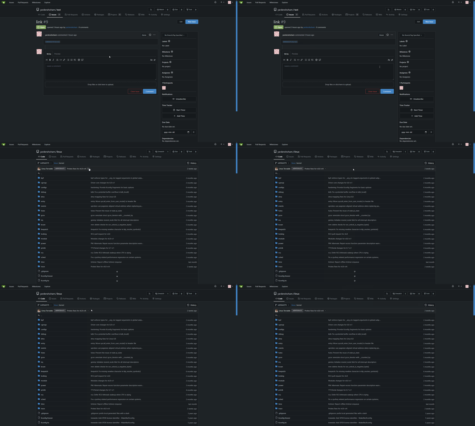
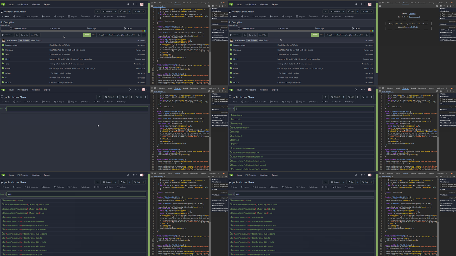
Yarden Shoham b0cadeb022
Remove jQuery from the "find file" page (#29456)
- Switched to plain JavaScript
- Tested the file searching functionality and it works as before

# Demo using JavaScript without jQuery
![action](https://github.com/go-gitea/gitea/assets/20454870/8ceef0ed-ab87-448c-8b9b-9b5c0cd8bebd)

---------

Signed-off-by: Yarden Shoham <git@yardenshoham.com>
Co-authored-by: Giteabot <teabot@gitea.io>
(cherry picked from commit 71e0f185f9773d1cc4909867a10c86f74d12ce8d)
2024-03-06 12:10:44 +08:00
silverwind ff581d5a24
Recolor dark theme to blue shade (#29283)
Now uses the same primary color as light theme. The secondary colors are
shifted towards a slightly blue shade. Could maybe desaturate a bit
more, but overall I think I'm happy with it.

Fixes: https://github.com/go-gitea/gitea/issues/27097

<img width="1343" alt="Screenshot 2024-02-27 at 22 21 46"
src="https://github.com/go-gitea/gitea/assets/115237/4163c393-b469-4a53-8f4b-1c33aa04f3ac">
<img width="581" alt="image"
src="https://github.com/go-gitea/gitea/assets/115237/e621f7f8-5679-4605-bf42-3d5ff1071e1e">
<img width="581" alt="image"
src="https://github.com/go-gitea/gitea/assets/115237/20e66493-2457-482b-b8f1-e5710934e189">

---------

Co-authored-by: Giteabot <teabot@gitea.io>
(cherry picked from commit d557fbc5a715a1920a2860cb04ae6c8fe2225182)
2024-03-06 12:10:44 +08:00
Lunny Xiao 15660334ba
Use tailwind instead of gt-[wh]- helper classes (#29423)
Follow #29357
- Replace `gt-w-*` -> `tw-w-*` and remove `gt-w-*`
- Replace `gt-h-*` -> `tw-h-*` and remove `gt-h-*`

(cherry picked from commit 9a8c90ee18095d284192476834d5d23074d136f3)

Conflicts:
	templates/base/head_navbar.tmpl
	templates/status/404.tmpl
	trivial context conflict
2024-03-06 12:10:43 +08:00
Otto Richter 88f68850b5 Accessibility: Watch & Star on small screens
The elements were hidden on small screens to preserve space and the
icons still conveyed the meaning for users with intact eye vision.
However, the names were no longer exposed to screen readers, and their
users usually cannot obtain the meaning from the icons.

Adding aria-labels to the affected templates results in certain
complexity due to the DOM, so instead I decided to use some accessible
CSS tricks to move the content off the screen instead of hiding it. It
should remain accessible for most screen readers.
2024-03-02 14:31:10 +01:00
Otto Richter 4d2c019b5a Add focus styling to most button types
While it might be favourable to have distinct focus and hover styling,
having no focus styling at all makes keyboard navigation very difficult.

Some people consider :focus to be equal to a keyboard-driven :hover, so
I'm moving the focus pseudo-classes from being a no-op to adding the
hover styling.
2024-03-02 14:31:10 +01:00
Otto Richter 30e0b2f851 Label and focus styling for mobile menu button 2024-03-02 14:31:10 +01:00
Gusted d0e5af7079 Merge pull request '[UI] Actions: Link to Workflow in View' (#1866) from n0toose/forgejo:forgejo-add-workflow-link into forgejo
Reviewed-on: https://codeberg.org/forgejo/forgejo/pulls/1866
Reviewed-by: Gusted <gusted@noreply.codeberg.org>
2024-02-28 17:28:16 +00:00
Jimmy Praet f95fb8cc44 Add attachment support for code review comments (#29220)
Fixes #27960, #24411, #12183

---------

Co-authored-by: wxiaoguang <wxiaoguang@gmail.com>
2024-02-27 18:35:43 +00:00
Yarden Shoham 8a25361d9a
Remove jQuery AJAX from the archive download links (#29380)
- Removed all jQuery AJAX calls and replaced with our fetch wrapper
- Tested the repo archive download links dropdown functionality and it
works as before

# Demo using `fetch` instead of jQuery AJAX

![action](https://github.com/go-gitea/gitea/assets/20454870/db791249-bca1-4d22-ac5e-623f68023e15)

---------

Signed-off-by: Yarden Shoham <git@yardenshoham.com>
(cherry picked from commit ed3892d8430652c2bc8e2af21844d14769825e8a)
2024-02-26 22:30:27 +01:00
silverwind cfda925862
Add tailwindcss (#29357)
This will get tailwindcss working on a basic level. It provides only the
utility classes, e.g. no tailwind base which we don't need because we
have our own CSS reset. Without the base, we also do not have their CSS
variables so a small amount of features do not work and I removed the
generated classes for them.

***Note for future developers: This currently uses a `tw-` prefix, so we
use it like `tw-p-3`.***

<details>
<summary>Currently added CSS, all false-positives</summary>

```
.\!visible{

    visibility: visible !important
}

.visible{

    visibility: visible
}

.invisible{

    visibility: hidden
}

.collapse{

    visibility: collapse
}

.static{

    position: static
}

.\!fixed{

    position: fixed !important
}

.absolute{

    position: absolute
}

.relative{

    position: relative
}

.sticky{

    position: sticky
}

.left-10{

    left: 2.5rem
}

.isolate{

    isolation: isolate
}

.float-right{

    float: right
}

.float-left{

    float: left
}

.mr-2{

    margin-right: 0.5rem
}

.mr-3{

    margin-right: 0.75rem
}

.\!block{

    display: block !important
}

.block{

    display: block
}

.inline-block{

    display: inline-block
}

.inline{

    display: inline
}

.flex{

    display: flex
}

.inline-flex{

    display: inline-flex
}

.\!table{

    display: table !important
}

.inline-table{

    display: inline-table
}

.table-caption{

    display: table-caption
}

.table-cell{

    display: table-cell
}

.table-column{

    display: table-column
}

.table-column-group{

    display: table-column-group
}

.table-footer-group{

    display: table-footer-group
}

.table-header-group{

    display: table-header-group
}

.table-row-group{

    display: table-row-group
}

.table-row{

    display: table-row
}

.flow-root{

    display: flow-root
}

.inline-grid{

    display: inline-grid
}

.contents{

    display: contents
}

.list-item{

    display: list-item
}

.\!hidden{

    display: none !important
}

.hidden{

    display: none
}

.flex-shrink{

    flex-shrink: 1
}

.shrink{

    flex-shrink: 1
}

.flex-grow{

    flex-grow: 1
}

.grow{

    flex-grow: 1
}

.border-collapse{

    border-collapse: collapse
}

.select-all{

    user-select: all
}

.resize{

    resize: both
}

.flex-wrap{

    flex-wrap: wrap
}

.overflow-visible{

    overflow: visible
}

.rounded{

    border-radius: 0.25rem
}

.border{

    border-width: 1px
}

.text-justify{

    text-align: justify
}

.uppercase{

    text-transform: uppercase
}

.lowercase{

    text-transform: lowercase
}

.capitalize{

    text-transform: capitalize
}

.italic{

    font-style: italic
}

.text-red{

    color: var(--color-red)
}

.text-shadow{

    color: var(--color-shadow)
}

.underline{

    text-decoration-line: underline
}

.overline{

    text-decoration-line: overline
}

.line-through{

    text-decoration-line: line-through
}

.outline{

    outline-style: solid
}

.ease-in{

    transition-timing-function: cubic-bezier(0.4, 0, 1, 1)
}

.ease-in-out{

    transition-timing-function: cubic-bezier(0.4, 0, 0.2, 1)
}

.ease-out{

    transition-timing-function: cubic-bezier(0, 0, 0.2, 1)
}
```

</details>

---------

Co-authored-by: Giteabot <teabot@gitea.io>
(cherry picked from commit f4b92578b4601bc6e9b631b9a5a5f3766c27b0cb)
2024-02-26 22:30:27 +01:00
Tim-Niclas Oelschläger 4662f4feac
enforce maxlength in frontend (#29389)
Set maxlength attribute in frontend

to long file-name

![image](https://github.com/go-gitea/gitea/assets/72873130/15111614-55ab-4583-acb2-15c25997601d)

![image](https://github.com/go-gitea/gitea/assets/72873130/4105ddd8-4973-4da8-b3ab-4cfae1b45554)
(same for branch-name and commit-summary)

(cherry picked from commit 756b952c52f1efbb137df36d5b97b370c8a45565)
2024-02-26 22:30:27 +01:00
wxiaoguang 630d3f929e
Make actions animation rotate counterclockwisely (#29378)
Because the icon is:

![image](https://github.com/go-gitea/gitea/assets/2114189/be7e78ab-bc64-46d9-8259-fd7f0037471a)

So it must rotate counterclockwisely

(cherry picked from commit ea164aba4b697aa08e4d20d896a8f318c09a6523)
2024-02-26 22:30:27 +01:00
Yarden Shoham 3723caf762
Remove jQuery AJAX from the notice selection deletion button (#29381)
- Removed all jQuery AJAX calls and replaced with our fetch wrapper
- Tested the repo notice selection deletion button functionality and it
works as before

Signed-off-by: Yarden Shoham <git@yardenshoham.com>
(cherry picked from commit 0676bf52f95b9c9ac6f5679bd263d844e6a83fa1)
2024-02-26 22:30:27 +01:00
Yarden Shoham 30fe3d8d4c
Remove jQuery from the code diff expansion buttons (#29385)
- Removed all jQuery AJAX calls and replaced with htmx
- Tested the code diff expansion buttons functionality and it works as
before plus a loading indicator

# Demo using `htmx` instead of jQuery AJAX
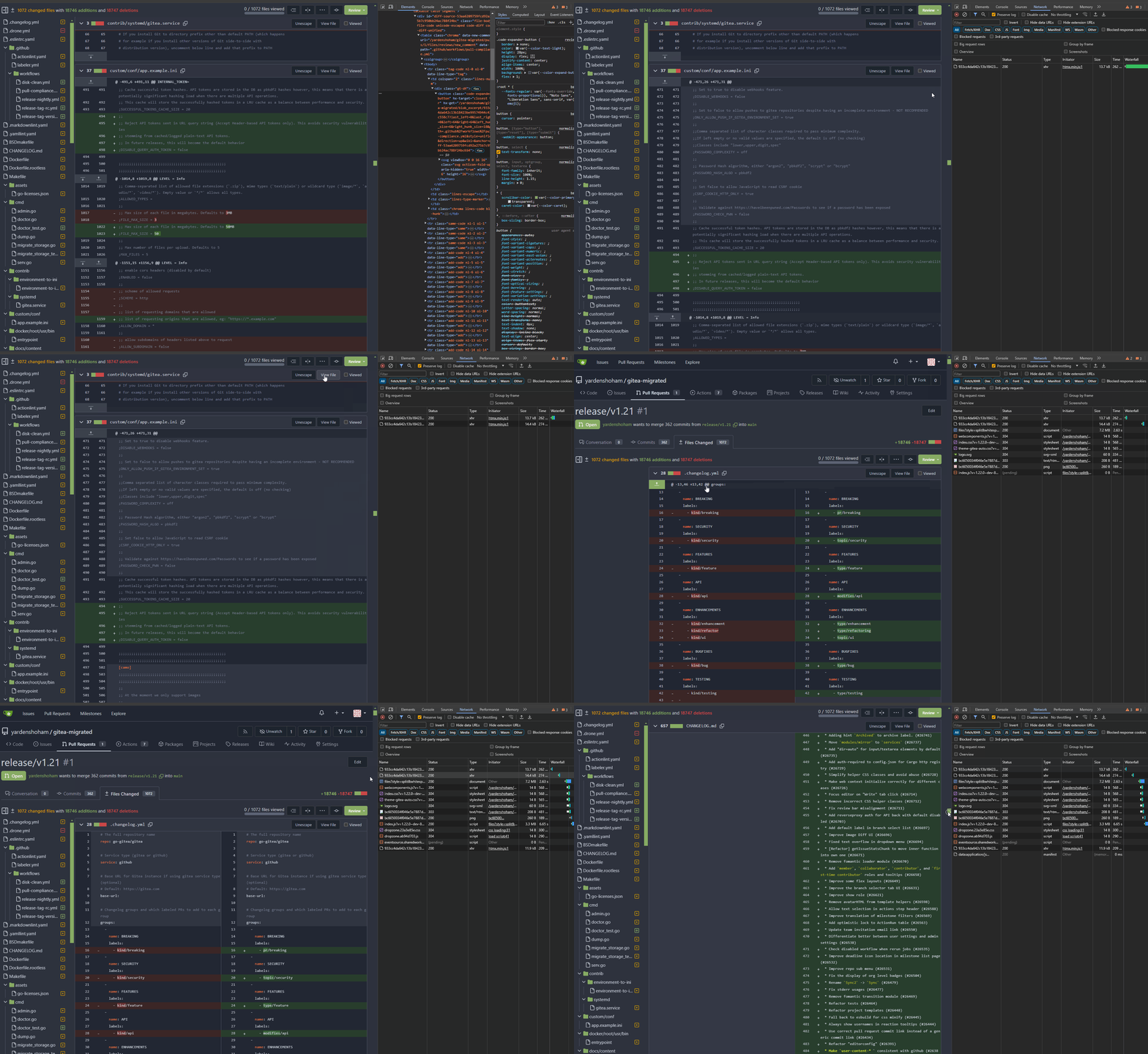
![action](https://github.com/go-gitea/gitea/assets/20454870/afba7442-ed56-4d39-b764-835d1f6c3a9c)

Signed-off-by: Yarden Shoham <git@yardenshoham.com>
(cherry picked from commit 4e3d81e44ee3f504f7262966533305561e04101f)
2024-02-26 22:30:27 +01:00
Yarden Shoham 4a08726c96
Remove jQuery AJAX from the markdown editor preview (#29384)
- Removed all jQuery AJAX calls and replaced with our fetch wrapper
- Tested the markdown editor preview button functionality and it works
as before

# Demo using `fetch` instead of jQuery AJAX

![action](https://github.com/go-gitea/gitea/assets/20454870/3fc7abb8-4fdc-46e9-95f6-087d9526bb52)

Signed-off-by: Yarden Shoham <git@yardenshoham.com>
(cherry picked from commit 1f6de13897fa0ac74087b2d1ec00cbef06caf2f7)
2024-02-26 22:30:27 +01:00
wxiaoguang 29517c54e6
Refactor copy button event handler (#29379)
Use "closest" instead of "for-loop"

(cherry picked from commit 736c98be5c2bed26cef9f7f679c49a95af8161ef)
2024-02-26 22:30:27 +01:00
Yarden Shoham 110b06f88b
Remove jQuery AJAX from the repo commit graph (#29373)
- Removed all jQuery AJAX calls and replaced with our fetch wrapper
- Tested the repo collaborator mode dropdown functionality and it works
as before

# Demo using `fetch` instead of jQuery AJAX

![action](https://github.com/go-gitea/gitea/assets/20454870/7e2f166e-9941-4f26-9666-d00cdf3d9f60)

Signed-off-by: Yarden Shoham <git@yardenshoham.com>
Co-authored-by: Giteabot <teabot@gitea.io>
(cherry picked from commit b616f666b89f57f3c285b70c11693f50ba38bcaa)
2024-02-26 22:30:27 +01:00
Yarden Shoham 5362ce7a42
Remove jQuery AJAX from repo collaborator mode dropdown (#29371)
- Removed all jQuery AJAX calls and replaced with our fetch wrapper
- Tested the repo collaborator mode dropdown functionality and it works
as before

# Demo using `fetch` instead of jQuery AJAX
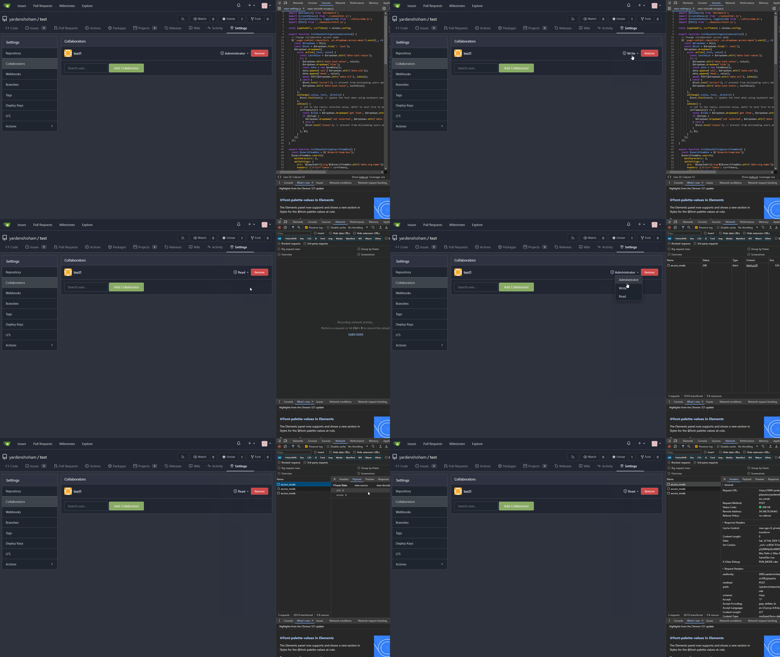
![action](https://github.com/go-gitea/gitea/assets/20454870/04466629-19b2-4469-9231-38820ee13c36)

---------

Signed-off-by: Yarden Shoham <git@yardenshoham.com>
Co-authored-by: delvh <dev.lh@web.de>
Co-authored-by: Giteabot <teabot@gitea.io>
(cherry picked from commit 15d071f4f81a0ad09f260de83cb6402875b4de27)
2024-02-26 22:30:27 +01:00
Yarden Shoham 757567d3bd
Remove jQuery from the Unicode escape button (#29369)
- Switched to plain JavaScript
- Tested the Unicode escape button functionality and it works as before

# Demo using JavaScript without jQuery
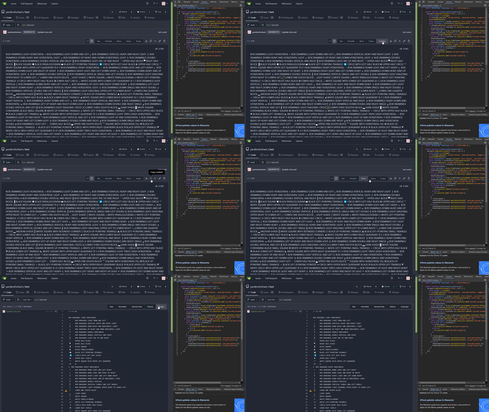
![action](https://github.com/go-gitea/gitea/assets/20454870/664f0ced-876b-4cb7-a668-bd62169fc843)

---------

Signed-off-by: Yarden Shoham <git@yardenshoham.com>
Co-authored-by: wxiaoguang <wxiaoguang@gmail.com>
(cherry picked from commit c86d033a3ec0514efcd9524d03dce1b6551e487f)
2024-02-26 22:30:27 +01:00
Yarden Shoham e91b948613
Remove jQuery from the issue reference context popup (#29367)
- Removed all jQuery calls
- Tested the context popup functionality and it works as before

# Demo without jQuery

![action](https://github.com/go-gitea/gitea/assets/20454870/90b53de5-a8e9-4ed7-9236-1c9dfc324f38)

---------

Signed-off-by: Yarden Shoham <git@yardenshoham.com>
Co-authored-by: Giteabot <teabot@gitea.io>
(cherry picked from commit 267dbb4e938cc42dc09a4a893cca631b2f755557)
2024-02-26 22:30:27 +01:00
Şahin Akkaya 428008ac19
Implement recent commits graph (#29210)
This is the implementation of Recent Commits page. This feature was
mentioned on #18262.

It adds another tab to Activity page called Recent Commits. Recent
Commits tab shows number of commits since last year for the repository.

(cherry picked from commit d3982bcd814bac93e3cbce1c7eb749b17e413fbd)
2024-02-26 22:30:26 +01:00
Şahin Akkaya f097799953
Implement code frequency graph (#29191)
### Overview
This is the implementation of Code Frequency page. This feature was
mentioned on these issues: #18262, #7392.

It adds another tab to Activity page called Code Frequency. Code
Frequency tab shows additions and deletions over time since the
repository existed.

Before:
<img width="1296" alt="image"
src="https://github.com/go-gitea/gitea/assets/32161460/2603504f-aee7-4929-a8c4-fb3412a7a0f6">

After:
<img width="1296" alt="image"
src="https://github.com/go-gitea/gitea/assets/32161460/58c03721-729f-4536-a663-9f337f240963">

---

#### Features
- See additions deletions over time since repository existed
- Click on "Additions" or "Deletions" legend to show only one type of
contribution
- Use the same cache from Contributors page so that the loading of data
will be fast once it is cached by visiting either one of the pages

---------

Co-authored-by: Giteabot <teabot@gitea.io>
(cherry picked from commit 875f5ea6d83c8371f309df99654ca3556623004c)
2024-02-26 22:30:26 +01:00
Yarden Shoham 7bf905a43c
Remove jQuery from the stopwatch (#29351)
- Switched to plain JavaScript
- Tested the stopwatch functionality and it works as before

# Demo using JavaScript without jQuery
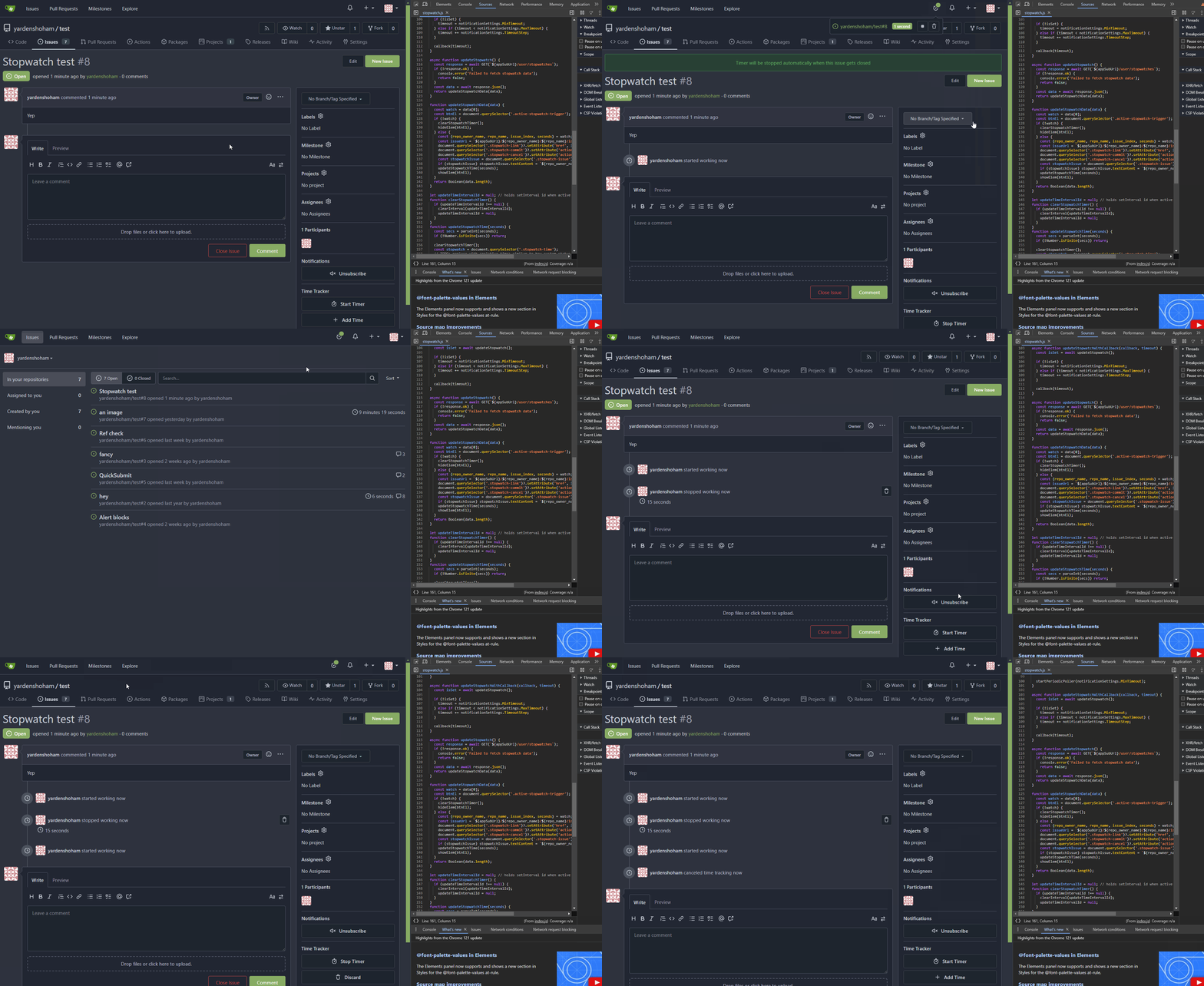
![action](https://github.com/go-gitea/gitea/assets/20454870/c8e9a401-45e5-4a1d-a683-0d655f1d570e)

Signed-off-by: Yarden Shoham <git@yardenshoham.com>
(cherry picked from commit 12d233faf786a54579a33b99b3cd56586c279f56)
2024-02-26 22:30:26 +01:00
Tim-Nicas Oelschläger 4b494d341f
Unify organizations header (#29248)
Unify organizations header

before:

![image](https://github.com/go-gitea/gitea/assets/72873130/74474e0d-33c3-4bbf-9324-d130ea2c62f8)

after:

![image](https://github.com/go-gitea/gitea/assets/72873130/1c65de0d-fa0f-4b17-ab8d-067de8c7113b)

---------

Co-authored-by: silverwind <me@silverwind.io>
(cherry picked from commit 532e422027c88a4a3dc0c2968857f8d5f94d861f)

Conflicts:
	routers/web/shared/user/header.go
	templates/org/home.tmpl
	context
2024-02-26 22:30:26 +01:00
silverwind c432f141bb
Don't show third-party JS errors in production builds (#29303)
So we don't get issues like
https://github.com/go-gitea/gitea/issues/29080 and
https://github.com/go-gitea/gitea/issues/29273 any more. Only active in
[production
builds](https://webpack.js.org/guides/production/#specify-the-mode), in
non-production the errors will still show.

(cherry picked from commit 532da5ed5ee3edb45d2ee63c6ab0fad53473691f)
2024-02-26 22:30:26 +01:00
Yarden Shoham 6db296f1cb
Remove jQuery from the repo commit functions (#29230)
- Switched to plain JavaScript
- Tested the commit ellipsis button functionality and it works as before
- Tested the commits statuses tippy functionality and it works as before
- Tested the last commit loader functionality and it works as before

# Demo using JavaScript without jQuery

![action](https://github.com/go-gitea/gitea/assets/20454870/465516f8-0ff3-438c-a17e-26cbab82750b)

![action](https://github.com/go-gitea/gitea/assets/20454870/968da210-9382-4b50-a4c2-09419dc86e07)

---------

Signed-off-by: Yarden Shoham <git@yardenshoham.com>
Co-authored-by: silverwind <me@silverwind.io>
(cherry picked from commit eaede2de98fbe0ac2156c9f4cd8b5899d2c7cbbf)
2024-02-26 22:30:26 +01:00
Yarden Shoham 01fa6fbb97
Remove jQuery from the image pasting functionality (#29324)
- Switched to plain JavaScript
- Tested the image pasting functionality and it works as before

# Demo using JavaScript without jQuery

![demo](https://github.com/go-gitea/gitea/assets/20454870/018993ff-7b09-4d5f-88e0-f276368bacd6)

Signed-off-by: Yarden Shoham <git@yardenshoham.com>
(cherry picked from commit f390d5eb4f4db21eeacdf2e7a093f6bd4e87c96f)
2024-02-26 22:30:26 +01:00
Lunny Xiao c88ae2e382
Revert #28753 because UI broken. (#29293)
Revert #29255
Revert #28753

(cherry picked from commit e6e50696b83164805bec83a1b20c95a85a4dd7e5)
2024-02-26 22:30:25 +01:00
Yarden Shoham 769db26c5a
Remove jQuery from the installation page (#29284)
- Switched to plain JavaScript
- Tested the installation page functionality and it works as before

# Demo using JavaScript without jQuery

![action](https://github.com/go-gitea/gitea/assets/20454870/286475b3-1919-4d99-b790-def10fa36e66)

Signed-off-by: Yarden Shoham <git@yardenshoham.com>
(cherry picked from commit 4e536edaead97d61a64508db0e93cf781a889472)
2024-02-26 22:30:25 +01:00
DC f803c5c0f4
Update Discord logo (#29285)
Fixes #27057 by changing the discord .svg file and running `make svg`.

Before:

<img width="637"
src="https://private-user-images.githubusercontent.com/85847352/267667100-1eaf5d20-b4e9-4736-bb55-7f1da04bbde7.png?jwt=eyJhbGciOiJIUzI1NiIsInR5cCI6IkpXVCJ9.eyJpc3MiOiJnaXRodWIuY29tIiwiYXVkIjoicmF3LmdpdGh1YnVzZXJjb250ZW50LmNvbSIsImtleSI6ImtleTUiLCJleHAiOjE3MDg0NzAwNDUsIm5iZiI6MTcwODQ2OTc0NSwicGF0aCI6Ii84NTg0NzM1Mi8yNjc2NjcxMDAtMWVhZjVkMjAtYjRlOS00NzM2LWJiNTUtN2YxZGEwNGJiZGU3LnBuZz9YLUFtei1BbGdvcml0aG09QVdTNC1ITUFDLVNIQTI1NiZYLUFtei1DcmVkZW50aWFsPUFLSUFWQ09EWUxTQTUzUFFLNFpBJTJGMjAyNDAyMjAlMkZ1cy1lYXN0LTElMkZzMyUyRmF3czRfcmVxdWVzdCZYLUFtei1EYXRlPTIwMjQwMjIwVDIyNTU0NVomWC1BbXotRXhwaXJlcz0zMDAmWC1BbXotU2lnbmF0dXJlPTIwN2Y2ODc5N2MzZDU5NzgzODRhNDIzZWY3MDk3ODhiYmIzZDU4NWVlYmFmZjc2OTIyZjE3MWM4ZDg0ODZjNTYmWC1BbXotU2lnbmVkSGVhZGVycz1ob3N0JmFjdG9yX2lkPTAma2V5X2lkPTAmcmVwb19pZD0wIn0.C6jVQLFPfq4fhGV8wiY9D-P21PUNTDMkX2d2-kU17Ug">

After:

<img width="637"
src="https://github.com/go-gitea/gitea/assets/106393991/45b197ae-e422-42f4-999e-25dc8f6b7a92">

(cherry picked from commit 3d3c3d9ee5e934c515370d98f1c552ca8ef10f8a)
2024-02-26 21:42:15 +01:00
silverwind 6068537f8a
Remove jQuery .map() and enable eslint rules for it (#29272)
- Use case in `repo-commit` was tested until the point where the POST
request was sent with the same payload.
- Use case in `repo-legacy` was tested completely with comment editing.
- `jquery/no-fade` was disabled as well to stay in sync with
`no-jquery/no-fade`, had no violations.

(cherry picked from commit a5c570c1e02302212a5d8f7cf7d91f24ab0578d5)
2024-02-26 21:42:15 +01:00
Yarden Shoham 0d61f3decc
Remove jQuery from repo wiki creation page (#29271)
- Switched to plain JavaScript
- Tested the wiki creation form functionality and it works as before

# Demo using JavaScript without jQuery

![action](https://github.com/go-gitea/gitea/assets/20454870/2dfc95fd-40cc-4ffb-9ae6-50f798fddd67)

---------

Signed-off-by: Yarden Shoham <git@yardenshoham.com>
Co-authored-by: silverwind <me@silverwind.io>
(cherry picked from commit ade1110e8b7d94dc142a259854e2b73845eab8b9)
2024-02-26 21:42:15 +01:00
Rafael Heard 89eca88643
Left align the input labels for the link account page (#29255)
In a previous [PR](https://github.com/go-gitea/gitea/pull/28753) we
moved the labels to be above the inputs. The PR ensures that the
alignment is also on both tabs of the link account page
(`/user/link_account`).

Before
<img width="1094" alt="before"
src="https://github.com/go-gitea/gitea/assets/6152817/ac1e86bd-c4d6-4e45-87d1-87bb8a736149">

After
<img width="1094" alt="after"
src="https://github.com/go-gitea/gitea/assets/6152817/1b5fc109-f4d2-43ee-b924-0a9e53a0e391">

---------

Co-authored-by: rafh <rafaelheard@gmail.com>
(cherry picked from commit e4e5d76932e9d5ba1f8c63213aefae1493012a81)
2024-02-26 21:42:15 +01:00
Yarden Shoham 58699d21e7
Remove jQuery from the repo migration form (#29229)
- Switched to plain JavaScript
- Tested the repo migration form functionality and it works as before

# Demo using JavaScript without jQuery

![action](https://github.com/go-gitea/gitea/assets/20454870/3496ec05-48a7-449e-8cdd-f8372ba0d589)

---------

Signed-off-by: Yarden Shoham <git@yardenshoham.com>
Co-authored-by: silverwind <me@silverwind.io>
(cherry picked from commit 100031f5f143a15c79ebbe1b77c86091e3b6d489)
2024-02-26 21:42:14 +01:00
Earl Warren 393f98e888 Merge pull request '[BUG] Use correct logout URL' (#2475) from gusted/forgejo-logout-url into forgejo
Reviewed-on: https://codeberg.org/forgejo/forgejo/pulls/2475
Reviewed-by: Earl Warren <earl-warren@noreply.codeberg.org>
2024-02-26 14:51:58 +00:00
Gusted c2280a2009
Fix CSS linting errors
- Trivial auto-fix applied.
- Removed CSS that was no longer needed (either was removed or upstream
already improved the CSS).
- Used existing variables for colors.
- Fix CSS selectors to match existing ones.
2024-02-26 00:40:43 +01:00
Gusted c4a92ec9da
[FRONTEND] fix javascript linting errors 2024-02-25 23:43:58 +01:00
Earl Warren 9560492a84
[FRONTEND] move the gitea svg to web_src/svg
and run make svg to update the forgejo svg as well
2024-02-25 23:41:33 +01:00
Gusted 1272ac4f69
[BUG] Use correct logout URL
- If a `logout` event is send the user should be redirected to the
homepage, there are three mechanism that can do this. The response of
`/user/logout` and the event listener of notifications or stopwatch.
It's essentially a race for what's processed first to determine which
mechanism takes care of redirecting the user.
- Fix that the redirection mechanism of the notification and stopwatch
event listener redirects to an absolute URL.
- Ref: #2135
2024-02-25 21:25:59 +01:00
0ko 186f1f5669 [THEME] refactor display of 404/500 error pages 2024-02-25 15:59:12 +05:00
FuXiaoHei c551d3f3ab
Artifact deletion in actions ui (#27172)
Add deletion link in runs view page.
Fix #26315

![image](https://github.com/go-gitea/gitea/assets/2142787/aa65a4ab-f434-4deb-b953-21e63c212033)

When click deletion button. It marks this artifact `need-delete`.

This artifact would be deleted when actions cleanup cron task.
2024-02-23 09:06:14 +01:00
Panagiotis "Ivory" Vasilopoulos 1668904513 [UI] Actions: Link to Workflow in View 2024-02-22 13:18:06 +01:00
Gusted c6d366e283
[THEMES] Port console colors
- Port 1fd7e3d6be to the Forgejo themes,
they are a copy paste, but have a bit darker console background color to
have better contrast and match better with the overal Forgejo dark
theme's shade.
2024-02-21 12:19:15 +01:00
silverwind b3f2447bc4
Downscale pasted PNG images based on metadata (#29123)
Some images like MacOS screenshots contain
[pHYs](http://www.libpng.org/pub/png/book/chapter11.html#png.ch11.div.8)
data which we can use to downscale uploaded images so they render in the
same dppx ratio in which they were taken.

Before:

<img width="584" alt="image"
src="https://github.com/go-gitea/gitea/assets/115237/50979e3a-5d5a-40dc-a0a4-36eb6e28f14a">

After:

<img width="329" alt="image"
src="https://github.com/go-gitea/gitea/assets/115237/0690902a-f2fe-4c6b-97b3-6fdd67c21bad">

(cherry picked from commit 5e72526da4e915791f03af056890e16821bde052)
2024-02-19 22:58:33 +01:00
silverwind aefc747ccb
Clean up diff header css and reduce global textarea min-height (#29232)
1. Tweak diff header and remove a numbe of unneeded CSS for it:

Before:
<img width="433" alt="Screenshot 2024-02-18 at 01 08 09"
src="https://github.com/go-gitea/gitea/assets/115237/d8b377c0-57bc-44d5-bb57-a582c7d4b3b4">

After:
<img width="463" alt="Screenshot 2024-02-18 at 01 07 56"
src="https://github.com/go-gitea/gitea/assets/115237/d08c17e7-5b86-4d07-81da-6371f4754325">

3. Reduce height of review textarea and also reduce fomantic's CSS from
12em to 8em. Now fits better on my screen:

<img width="1352" alt="image"
src="https://github.com/go-gitea/gitea/assets/115237/5c658d13-295e-4929-94da-13ade888020d">

---------

Co-authored-by: delvh <dev.lh@web.de>
(cherry picked from commit 39f8ab591c18a65cf783ecd17ddc1a5914ceff7a)
2024-02-19 22:58:33 +01:00
Yarden Shoham ca46f7f7e0
Remove jQuery from repo migrate page (#29219)
- Switched to plain JavaScript
- Tested the repo migrate functionality and it works as before

# Demo using JavaScript without jQuery
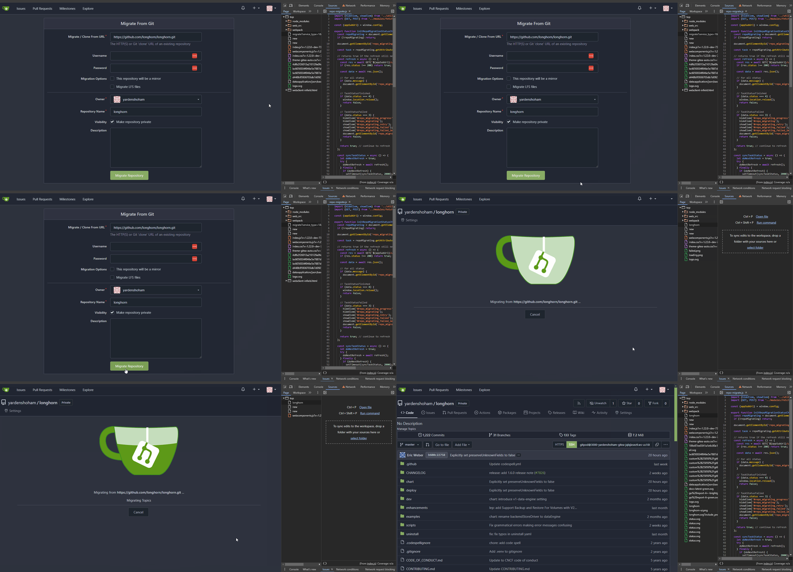
![action](https://github.com/go-gitea/gitea/assets/20454870/44ad134b-832e-44b8-8e77-7cc8603d95fe)

---------

Signed-off-by: Yarden Shoham <git@yardenshoham.com>
Co-authored-by: silverwind <me@silverwind.io>
(cherry picked from commit 5e1bf3efe2ad3ba6cd30db187ca59b94c3fcdafa)
2024-02-19 22:58:32 +01:00
Yarden Shoham 66bae322b4
Remove unneccesary initUserAuthLinkAccountView from "link account" page (#29217)
Signed-off-by: Yarden Shoham <git@yardenshoham.com>
Co-authored-by: wxiaoguang <wxiaoguang@gmail.com>
(cherry picked from commit 3da2c63354eb3804c7aec3c688b066b044f2c30e)
2024-02-19 22:58:32 +01:00
Yarden Shoham 6b1f660db9
Port "Remove jQuery from the repo release form"
Port of https://github.com/go-gitea/gitea/pull/29225. Reworked to not
use global click event listener.

---

- Switched to plain JavaScript
- Tested the repo release form functionality and it works as before
2024-02-19 19:54:22 +01:00
Earl Warren 6c9c0aca76 Merge pull request '[gitea] cherry-pick' (#2375) from earl-warren/forgejo:wip-gitea-cherry-pick into forgejo
Reviewed-on: https://codeberg.org/forgejo/forgejo/pulls/2375
Reviewed-by: Otto <otto@codeberg.org>
2024-02-19 14:42:41 +00:00
Yarden Shoham ca852519b5
Remove jQuery from the webhook editor (#29211)
- Switched to plain JavaScript
- Tested the webhook editing functionality and it works as before

# Demo using JavaScript without jQuery

![action](https://github.com/go-gitea/gitea/assets/20454870/b24c264d-d5e5-4954-8789-e72564a99027)

---------

Signed-off-by: Yarden Shoham <git@yardenshoham.com>
Co-authored-by: wxiaoguang <wxiaoguang@gmail.com>
(cherry picked from commit 27192bc321161a4e648547bd7b071065a7b18326)
2024-02-17 23:24:31 +01:00
Yarden Shoham 99080bd87d
Remove jQuery from issue reference context popup attach (#29216)
- Switched to plain JavaScript
- Tested the context popup functionality and it works as before

# Demo using JavaScript without jQuery

![action](https://github.com/go-gitea/gitea/assets/20454870/1d2f173e-e626-4f7d-82c8-d1539d38d247)

Signed-off-by: Yarden Shoham <git@yardenshoham.com>
(cherry picked from commit c282d378bd1f2f11ffc884cd6d7c073b7b5745f8)
2024-02-17 23:24:31 +01:00
silverwind 59ab49a7eb
Add eslint-plugin-github and fix issues (#29201)
This plugin has a few useful rules. The only thing I dislike about it is
that it pulls in a rather big number of dependencies for react-related
rules we don't use, but it can't really be avoided.

Rule docs:
https://github.com/github/eslint-plugin-github?tab=readme-ov-file#rules

(cherry picked from commit 26b17537e651fe93ef9b64f961633cb4c0b8c2c3)
2024-02-17 23:24:31 +01:00
Yarden Shoham 4b69d9e46d
Remove jQuery from the "quick submit" handler (#29200)
- Switched to plain JavaScript
- Tested the quick submit functionality and it works as before

# Demo using JavaScript without jQuery
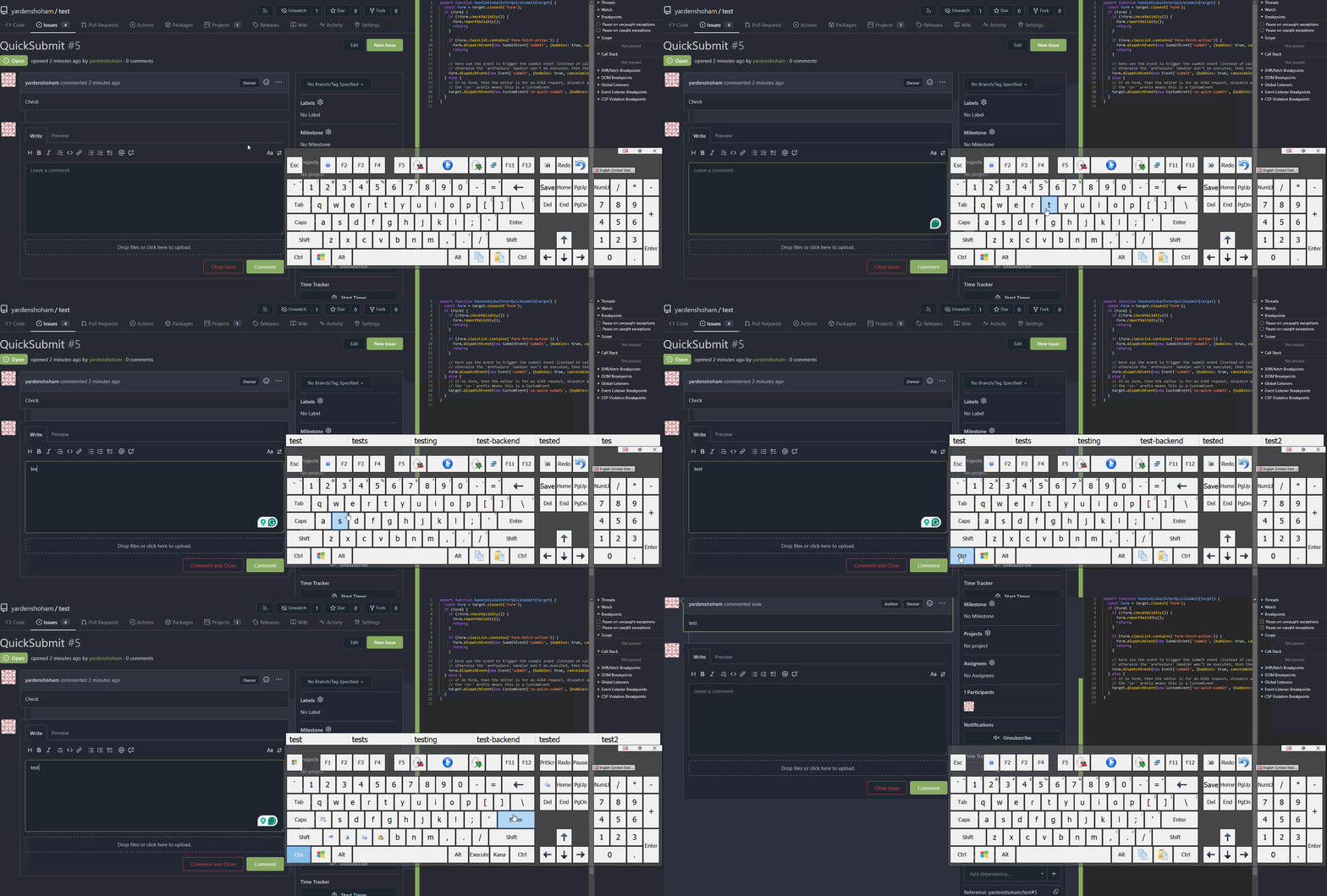
![action](https://github.com/go-gitea/gitea/assets/20454870/abbd6c49-ad0f-4f95-b4ba-e969b85a46e8)

---------

Signed-off-by: Yarden Shoham <git@yardenshoham.com>
(cherry picked from commit d8d4b33b31d959e4b600cc90a7fa1779b69cadf5)
2024-02-17 23:24:31 +01:00
Yarden Shoham 1d4ce531fd
Fix initCompLabelEdit not being called (#29198)
Fix broken `if` from https://github.com/go-gitea/gitea/pull/29195

Signed-off-by: Yarden Shoham <git@yardenshoham.com>
(cherry picked from commit 2d8756a9607ee6029ad7a44985e9751988d5fdaa)
2024-02-17 23:24:31 +01:00
Yarden Shoham 6a4b83fb9d
Remove jQuery from username change prompt and fix its detection (#29197)
- Switched to plain JavaScript
- Tested the user rename prompt toggling functionality and it works as
before
- Fixed bug that allowed pasting with the mouse to avoid the prompt

# Before

![before](https://github.com/go-gitea/gitea/assets/20454870/aa300ad7-612b-461e-bbb2-3f74b3b83ede)

# After

![after](https://github.com/go-gitea/gitea/assets/20454870/f2b5a51b-7b39-43c7-8a4a-62f1f77acae4)

---------

Signed-off-by: Yarden Shoham <git@yardenshoham.com>
Co-authored-by: silverwind <me@silverwind.io>
(cherry picked from commit 0768842ef56758b3290406656c5ebbd605358f6e)
2024-02-17 23:24:31 +01:00
Yarden Shoham 1bf7b70118
Remove jQuery from organization rename prompt toggle (#29195)
- Switched to plain JavaScript
- Tested the organization rename prompt toggling functionality and it
works as before

# Demo using JavaScript without jQuery

![action](https://github.com/go-gitea/gitea/assets/20454870/e6f641b0-aa46-4b85-9693-0d608cca855e)

---------

Signed-off-by: Yarden Shoham <git@yardenshoham.com>
Co-authored-by: silverwind <me@silverwind.io>
(cherry picked from commit 5902372e63db2d3f31150251dfffdb305fa9aaee)
2024-02-17 23:24:31 +01:00
Yarden Shoham 2c336646f1
Remove jQuery from SSH key form parser (#29193)
- Switched to plain JavaScript
- Tested the SSH key title functionality and it works as before

# Demo using JavaScript without jQuery

![action](https://github.com/go-gitea/gitea/assets/20454870/4785c13d-8d30-448e-b74a-263935e2769f)

---------

Signed-off-by: Yarden Shoham <git@yardenshoham.com>
Co-authored-by: silverwind <me@silverwind.io>
(cherry picked from commit 236e12184404998c8edf7efa6de7fccf9d0ee814)
2024-02-17 23:24:31 +01:00
silverwind f35d468b43
Refactor request function (#29187)
- Remove and prevent use of `body` argument, it is not used anywhere
- Remove uppercasing of method, we can require it to be uppercase

(cherry picked from commit c40ee6fb7382bc2d1398dc685f98a0277d3bfb68)
2024-02-17 23:24:31 +01:00
Yarden Shoham 4f050f358a
Auto-update the system status in admin dashboard (#29163)
- Refactor the system status list into its own template
- Change the backend to return only the system status if htmx initiated
the request
- `hx-get="{{$.Link}}/system_status`: reuse the backend handler
- `hx-swap="innerHTML"`: replace the `<div>`'s innerHTML (essentially
the new template)
- `hx-trigger="every 5s"`: call every 5 seconds
- `hx-indicator=".divider"`: the `is-loading` class shouldn't be added
to the div during the request, so set it on an element it has no effect
on
- Render "Since Last GC Time" with `<relative-time>`, so we send a
timestamp

# Auto-update in action GIF
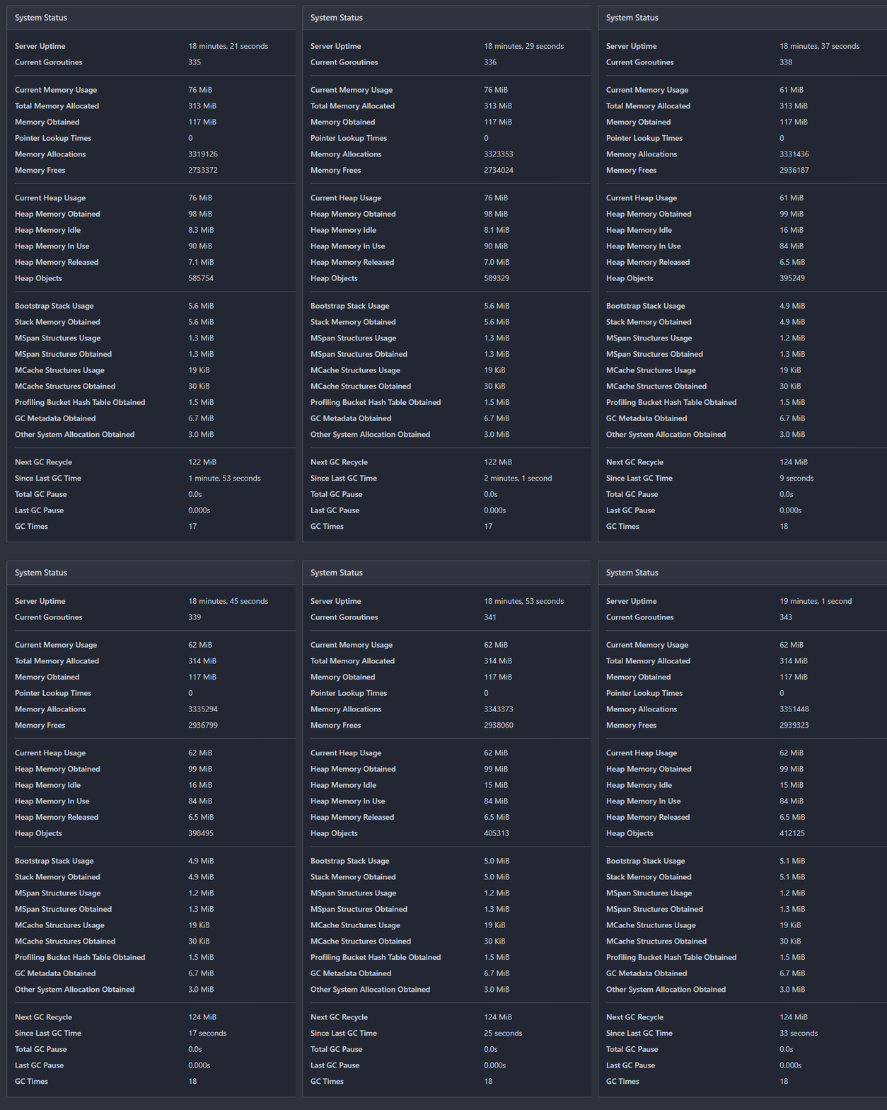
![action](https://github.com/go-gitea/gitea/assets/20454870/c6e1f220-f0fb-4460-ac3b-59f315e30e29)

---------

Signed-off-by: Yarden Shoham <git@yardenshoham.com>
Co-authored-by: silverwind <me@silverwind.io>
(cherry picked from commit c70f65e83bc1876fb368fd117d342573ff18a9e8)
2024-02-17 23:24:31 +01:00
Şahin Akkaya e9be8b25ae
Implement contributors graph (#27882)
Continuation of https://github.com/go-gitea/gitea/pull/25439. Fixes #847

Before:
<img width="1296" alt="image"
src="https://github.com/go-gitea/gitea/assets/32161460/24571ac8-b254-43c9-b178-97340f0dc8a9">

----
After:
<img width="1296" alt="image"
src="https://github.com/go-gitea/gitea/assets/32161460/c60b2459-9d10-4d42-8d83-d5ef0f45bf94">

---
#### Overview
This is the implementation of a requested feature: Contributors graph
(#847)

It makes Activity page a multi-tab page and adds a new tab called
Contributors. Contributors tab shows the contribution graphs over time
since the repository existed. It also shows per user contribution graphs
for top 100 contributors. Top 100 is calculated based on the selected
contribution type (commits, additions or deletions).

---
#### Demo
(The demo is a bit old but still a good example to show off the main
features)

<video src="https://github.com/go-gitea/gitea/assets/32161460/9f68103f-8145-4cc2-94bc-5546daae7014" controls width="320" height="240">
  <a href="https://github.com/go-gitea/gitea/assets/32161460/9f68103f-8145-4cc2-94bc-5546daae7014">Download</a>
</video>

#### Features:

- Select contribution type (commits, additions or deletions)
- See overall and per user contribution graphs for the selected
contribution type
- Zoom and pan on graphs to see them in detail
- See top 100 contributors based on the selected contribution type and
selected time range
- Go directly to users' profile by clicking their name if they are
registered gitea users
- Cache the results so that when the same repository is visited again
fetching data will be faster

---------

Co-authored-by: silverwind <me@silverwind.io>
Co-authored-by: hiifong <i@hiif.ong>
Co-authored-by: delvh <dev.lh@web.de>
Co-authored-by: 6543 <6543@obermui.de>
Co-authored-by: yp05327 <576951401@qq.com>
(cherry picked from commit 21331be30cb8f6c2d8b9dd99f1061623900632b9)
2024-02-17 23:24:31 +01:00
Tim-Nicas Oelschläger 7263b3effe
Change webhook-type in create-view (#29114)
It's now possible to change webhook-type in create-view.

before:

![image](https://github.com/go-gitea/gitea/assets/72873130/9ee1b9fb-843b-4f28-b8d6-6361e5d184f1)

after:

![image](https://github.com/go-gitea/gitea/assets/72873130/9dbf058f-5912-43af-9acd-487271212f2d)

---------

Co-authored-by: silverwind <me@silverwind.io>
Co-authored-by: Giteabot <teabot@gitea.io>
(cherry picked from commit 374e886f5113a996e1e927a60d1775e77262c364)

Conflicts:
	templates/repo/settings/webhook/base_list.tmpl
	templates/shared/webhook/icon.tmpl
2024-02-17 23:24:30 +01:00
Yarden Shoham c2d4c2fca7
Remove jQuery from the comment task list (#29170)
- Switched to plain JavaScript
- Tested the task list functionality and it works as before

---------

Signed-off-by: Yarden Shoham <git@yardenshoham.com>
Co-authored-by: wxiaoguang <wxiaoguang@gmail.com>
Co-authored-by: Giteabot <teabot@gitea.io>
Co-authored-by: silverwind <me@silverwind.io>
(cherry picked from commit 542480a9b0d5cdb497dbfa99752d59fd016df0d6)
2024-02-17 23:24:30 +01:00
Yarden Shoham 0b3193bbbe
Add alert blocks in markdown (#29121)
- Follows https://github.com/go-gitea/gitea/pull/21711
- Closes https://github.com/go-gitea/gitea/issues/28316

Implement GitHub's alert blocks markdown feature

Docs:
-
https://docs.github.com/en/get-started/writing-on-github/getting-started-with-writing-and-formatting-on-github/basic-writing-and-formatting-syntax#alerts
- https://github.com/orgs/community/discussions/16925

### Before

![image](https://github.com/go-gitea/gitea/assets/20454870/14f7b02a-5de5-4fd0-8437-a055dadb31f2)

### After

![image](https://github.com/go-gitea/gitea/assets/20454870/ed06a869-e545-42f1-bf25-4ba20b1be196)

## ⚠️ BREAKING ⚠️

The old syntax no longer works

How to migrate:

If you used
```md
> **Note** My note
```

Switch to
```md
> [!NOTE]
> My note
```

---------

Signed-off-by: Yarden Shoham <git@yardenshoham.com>
Co-authored-by: silverwind <me@silverwind.io>
Co-authored-by: Giteabot <teabot@gitea.io>
2024-02-17 18:04:55 +01:00
Earl Warren bd2ba9f6e5 Merge pull request '[BUG] Fix Ctrl+Enter on submitting review comment' (#2370) from gusted/forgejo-review-ctrlenter into forgejo
Reviewed-on: https://codeberg.org/forgejo/forgejo/pulls/2370
Reviewed-by: Otto <otto@codeberg.org>
Reviewed-by: Earl Warren <earl-warren@noreply.codeberg.org>
2024-02-17 15:15:55 +00:00
Gusted f04589defd
[BUG] Fix Ctrl+Enter on submitting review comment
- When a event is caused by `Ctrl+Enter` jQuery might not wrap the event
and in that case `originalEvent` is not defined. Check for this case.
- Log the error along with showing an toast.
- Resolves #2363
2024-02-17 12:52:11 +01:00
Rafael Heard 4af0944b26
move sign in labels to be above inputs (#28753)
There are a few inconsistencies within Gitea and this PR addresses one of them.
This PR updates the sign-in page layout, including the register and openID tabs,
to match the layout of the settings pages (`/user/settings`) for more consistency.

**Before**
<img width="968" alt="Screenshot 2024-02-05 at 8 27 24 AM"
src="https://github.com/go-gitea/gitea/assets/6152817/fb0cb517-57c0-4eed-be1d-56f36bd1960d">

**After**
<img width="968" alt="Screenshot 2024-02-05 at 8 26 39 AM"
src="https://github.com/go-gitea/gitea/assets/6152817/428d691d-0a42-4a67-a646-05527f2a7b41">

---------

Co-authored-by: rafh <rafaelheard@gmail.com>
(cherry picked from commit 1c14cd0c43d670fef984068e2666641ea5a062db)
2024-02-16 15:20:52 +01:00
Gusted b1aabbf174
Preview: set font-size on preview content
- When previewing the content in a review, no font size was set. This
resulted in the previewed content being bigger than other text and
therefor creating an noticable inconsistency.
- Set the font size of the previewed content, 14px, this is consistent
with how the content would be rendered.
- `comment-code-cloud` is the class used for the review boxes.
`.ui.tab.markup` means it only applies to the preview tab.
2024-02-14 23:02:40 +01:00
silverwind 9c4e0c26f9
[gitea] Remove obsolete border-radius on comment content (#29128)
This border-radius is obsolete since we changed the comment rendering a
few months ago and it caused incorrect display on blockquotes.

Before:
<img width="160" alt="Screenshot 2024-02-10 at 18 42 48"
src="https://github.com/go-gitea/gitea/assets/115237/ccbf4660-acf9-4268-aad9-1ad49d317a67">

After:
<img width="135" alt="Screenshot 2024-02-10 at 18 42 40"
src="https://github.com/go-gitea/gitea/assets/115237/6f588e02-3b2a-49ee-b459-81d8068b2f4e">

(cherry picked from commit 9063fa096386362f9ae602fdf8a39ae8c972b8e0)
2024-02-11 13:47:48 +01:00
Yarden Shoham 7c9387a242
[gitea] Make blockquote border size less aggressive (#29124)
It's too thick

I made it match GitHub's size

![image](https://github.com/go-gitea/gitea/assets/20454870/08c05004-acd9-485e-9219-110d93fe1226)

![image](https://github.com/go-gitea/gitea/assets/20454870/e2e32b6c-4ba8-488e-9405-95d33f80adf7)

Signed-off-by: Yarden Shoham <git@yardenshoham.com>
(cherry picked from commit 5f5b5ba6e3e50ba5385e6cbf5957d4b73805769b)
2024-02-11 13:47:46 +01:00
silverwind 02b03247de
[gitea] Move vitest setup file to root (#29097)
I'm using this convention in other projects and I think it makes sense
for gitea too because the vitest setup file is loaded globally for all
tests, not just ones in web_src, so it makes sense to be in the root.

(cherry picked from commit 98e7e3a5f07b8bc620e26bc1ab6f7a86bccbb7cb)
2024-02-10 10:53:43 +01:00
wxiaoguang 51c6103195
[gitea] Avoid showing unnecessary JS errors when there are elements with different origin on the page (#29081)
Try to fix #29080

(cherry picked from commit f290c24d286b996ac6b512f49a30aa5aef1a2dbe)
2024-02-10 10:53:43 +01:00
silverwind 73e32eae5b
[gitea] Fix gitea-origin-url with default ports (#29085)
When setting `url.host` on a URL object with no port specified (like is
the case of default port), the resulting URL's port will not change.
Workaround this quirk in the URL standard by explicitely setting port
for the http and https protocols.

Extracted the logic to a function for the purpose of testing. Initially
I wanted to have the function in utils.js, but it turns out esbuild can
not treeshake the unused functions which would result in the
webcomponents chunk having all 2kB utils.js inlined, so it seemed not
worth.

Fixes: https://github.com/go-gitea/gitea/issues/29084
(cherry picked from commit b6bf8041d8e8ee845728687b1f358f1d482afff2)
2024-02-10 10:53:43 +01:00
Earl Warren 094c84ed6d
Merge branch 'rebase-forgejo-dependency' into wip-forgejo 2024-02-05 18:58:23 +01:00
Earl Warren d7e1854884
Merge branch 'rebase-forgejo-branding' into wip-forgejo 2024-02-05 18:58:18 +01:00
Gusted 6bec246983
[GITEA] Use vertical tabs on issue filters
- This is actually https://github.com/go-gitea/gitea/pull/19978 &
https://github.com/go-gitea/gitea/pull/19486 but was removed in one of
the UI refactors of v1.20
- This is a very technical fix and is best explained in the CSS
comments. But the short version: When there's an overflow being set, but
you want an element to 'break out' of that overflow with `position:
absolute`, it sometimes doesn't work! You need to set some CSS to let
the browser know that the element needs to use an element outside of
that overflow as 'clip parent'.
- Resolves my internal frustration with the mobile UI constantly getting broken.

(cherry picked from commit 879f842bed)
(cherry picked from commit 6099c9b41b)
(cherry picked from commit 0749d00b16)
(cherry picked from commit ec6a5428a7)
(cherry picked from commit 9d0bee784d)
(cherry picked from commit 61d6ae4882)
(cherry picked from commit 8b3f3639b6)
(cherry picked from commit 2c600ddb2c)
(cherry picked from commit 960a9786ef)
(cherry picked from commit b194354c3b)
(cherry picked from commit 8e7915ee8c)
(cherry picked from commit ba82b0c6fe)
(cherry picked from commit b2dfb233a8)
(cherry picked from commit ff3ec7f612)
(cherry picked from commit ef01240cc7)
(cherry picked from commit 7778b5bb10)
(cherry picked from commit 5f949b1b07)
(cherry picked from commit b387209690)
(cherry picked from commit 5d7e3a542e)
(cherry picked from commit ffef2231fb)
(cherry picked from commit c74cf73ab4)
(cherry picked from commit 4aa9e9fca4)
(cherry picked from commit 6b0dab3ba0)
(cherry picked from commit 374612f61b)
2024-02-05 16:05:50 +01:00
JP 56c8f98e4c
[THEME] Add colorblind theme variants
This PR adds colorblind theme variants of the forgejo themes. I duplicated the forjego light and dark themes and only changed the lines related to diff colors for added and removed rows/words.

I am not a designer, and I am also colorblind, so better suggestions of colors are most welcome. However, this is a good start as I can at least personally see the colors now. I got the colors for the dark theme from the GitHub diff colors, the light ones I couldn't get from GitHub as they use white as a plain background, which Forgejo's theme doesn't, so they were decided on after a bit of random testing.

Resolves #986

(cherry picked from commit dcdb4a372d)
2024-02-05 16:05:02 +01:00
Earl Warren 88171e0030
[BRANDING] add Forgejo Git Service and migration UI
[FEAT] add Forgejo Git Service (squash) register a Forgejo factory

If the Forgejo factory for the Forgejo service is not registered,
newDownloader will fallback to a git service and not migrate issues
etc.

Refs: https://codeberg.org/forgejo/forgejo/issues/1678
(cherry picked from commit 51938cd161)

[FEAT] add Forgero Git Service

Signed-off-by: cassiozareck <cassiomilczareck@gmail.com>
(cherry picked from commit a878adfe62)

Adding description and Forgejo SVG

(cherry picked from commit 13738c0380)

Undo reordering and tmpl redirection

(cherry picked from commit 9ae51c46f4)
(cherry picked from commit 70fffdc61d)
(cherry picked from commit c0ebfa9da3)
(cherry picked from commit 9922c92787)
(cherry picked from commit 00c0effbc7)
(cherry picked from commit e4c9525b13)
(cherry picked from commit 09d7b83211)
(cherry picked from commit bbcd5975c9)
(cherry picked from commit 55c70a0e18)
(cherry picked from commit 76596410c0)
(cherry picked from commit 1308043931)
(cherry picked from commit 919d6aedfe)

[FEAT] add Forgero Git Service (squash) more tests

Previously only Gitea service was being tested under self-hosted migrations. Since Forgejo is also self-hosted and in fact use the same downloader/migrator we can add to this suite another test that will do the same, migrating the same repository under the same local instance but for the Forgejo service (represented by 9)

Reviewed-on: https://codeberg.org/forgejo/forgejo/pulls/1709
Co-authored-by: zareck <cassiomilczareck@gmail.com>
Co-committed-by: zareck <cassiomilczareck@gmail.com>
(cherry picked from commit 40a4b8f1a8)
(cherry picked from commit 3198b4a642)
(cherry picked from commit 4edda1f389)
(cherry picked from commit 4d91b77d29)
(cherry picked from commit afe85c52e3)
(cherry picked from commit 5ea7df79ad)
(cherry picked from commit a667182542)
(cherry picked from commit a9bebb1e71)
(cherry picked from commit 4831a89e46)
(cherry picked from commit e02a74651f)
(cherry picked from commit 05dcef59aa)
(cherry picked from commit c8bac187f9)
(cherry picked from commit c87903a0cc)
2024-02-05 16:05:02 +01:00
Caesar Schinas b5976d4243
[BRANDING] Add Forgejo light, dark, and auto themes
(cherry picked from commit faab0c670e)
(cherry picked from commit b6d59493c7)
(cherry picked from commit 837da0c1f4)
(cherry picked from commit 71ad245e1d)
(cherry picked from commit 85a7032f1b)

Conflicts:
	web_src/css/themes/theme-forgejo-auto.less
	web_src/css/themes/theme-forgejo-dark.less
	web_src/css/themes/theme-forgejo-light.less
	web_src/less/_home.less
        see https://codeberg.org/forgejo/forgejo/pulls/552
(cherry picked from commit 0c2c131bb0)

[BRANDING] Add Forgejo light, dark, and auto themes: fix import

Closes: https://codeberg.org/forgejo/forgejo/issues/562
(cherry picked from commit 2b0dc1f80f)
(cherry picked from commit 494ad6a3b7)
(cherry picked from commit 6940fc22c4)
(cherry picked from commit bd6f00656c)
(cherry picked from commit ebb506a124)
(cherry picked from commit 43d72d3781)
(cherry picked from commit 1a87adca01)
(cherry picked from commit 0704c410b4)
(cherry picked from commit 9039b47c16)
(cherry picked from commit e32bb78924)
(cherry picked from commit 053ad84f91)
(cherry picked from commit a35f1b6da7)
(cherry picked from commit 8cb94c01d5)

[BRANDING] fix invisible label in branch protection settings

(cherry picked from commit 23e5d45721)
(cherry picked from commit f02e4582e5)

[BRANDING] Fix commit label for Forgejo Dark theme (#843)

- Define the `--color-label-text` variable with a light color, which is currently used for commit's SHA

Co-authored-by: Gusted <postmaster@gusted.xyz>
Reviewed-on: https://codeberg.org/forgejo/forgejo/pulls/843
(cherry picked from commit 74c186a380)
(cherry picked from commit 7e185c5ca5)

[BRANDING] Add Forgejo light, dark, and auto themes (squash) variables

Adapt to b6bcb79987 Improve notification
icon and navbar

Refs: https://codeberg.org/forgejo/forgejo/issues/893

[BRANDING] Add Forgejo light variables

Updates the Forgejo light theme with the changes in b6bcb7998

These are the same changes as made in 2574dbcff to the dark theme

Refs: forgejo/forgejo#893
(cherry picked from commit 9e99fe4f9e)
(cherry picked from commit acbb98bd91)
(cherry picked from commit c80245ed87)

[BRANDING] fix code highlight color in Forgejo themes

(cherry picked from commit ffc49a4e99)
(cherry picked from commit c5f45a941e)
(cherry picked from commit eee5427c9d)
(cherry picked from commit 89be50ca27)
(cherry picked from commit 74e4776ef5)
(cherry picked from commit 6c4e07a6a7)

[BRANDING] more accessible text selection color in Forgejo themes

(cherry picked from commit 7407605ffdedef8fa320477a3bd7efa06df263e2)
(cherry picked from commit 5aab3872cc)
(cherry picked from commit 1ec77d8bd0)
(cherry picked from commit 964c89fce7)
(cherry picked from commit 8a8023a441)
(cherry picked from commit 1c9ffeadf5)

[BRANDING] Fix navigation hover color (squash)

- For items in the navigation bar, use different background colours for hover.
- Regression since https://github.com/go-gitea/gitea/pull/25343

(cherry picked from commit 8f3f4b219c)
(cherry picked from commit edfb0eef06)
(cherry picked from commit a6367fa48a)
(cherry picked from commit d5697abe42)
(cherry picked from commit eaf5370919)
(cherry picked from commit 58f11e7310)
(cherry picked from commit 732e1b35d5)
(cherry picked from commit 0d794ae1c9)
(cherry picked from commit ccc8aed308)

Conflicts:
	modules/setting/ui.go
	https://codeberg.org/forgejo/forgejo/pulls/1582
(cherry picked from commit 209059fbaf)
(cherry picked from commit 80ba2df4a7)
(cherry picked from commit 17b325da23)
(cherry picked from commit 3518b87c8d)
(cherry picked from commit 4042143f96)
(cherry picked from commit 07f976f9d7)
(cherry picked from commit 1bbc6b93e9)
(cherry picked from commit 8aa0bba307)
(cherry picked from commit 94c4a14ac3)

Update Forgejo theme (squash)

- Incorporate changes from 79a4c80f8d into the Forgejo themes.
- Fix that there's no focus or active coloring on primary and secondary
buttons for Forgejo themes caused by
023e937141 that moved variablse from
base.css (shared) to the themes.
- Extend hack to make red buttons darker on dark Forgejo theme to
include active styling and remove the unnecessary `!important`.

(cherry picked from commit 2e32da4419)
(cherry picked from commit a4eca09543)
(cherry picked from commit e6e452811d)
(cherry picked from commit e9a5addf3d)
(cherry picked from commit a1b8b5fa0d)

[BRANDING] Update forgejo theme

- Inlcude a103b79f60 and
1b2cd4c4e1 and
376c0e25f7 and 023e937141
into the Forgejo theme.
- Fix tooltips not being visual, due to missing background color.
- Fix labels not having a background color.
- Fix modals not having a dimmed background.
- Fix no syntax highlighting on Forgejo light due to missing imports.
- Incorporate feedback from
https://codeberg.org/forgejo/forgejo/issues/1117 to make the labels
stand out less.

(cherry picked from commit bc21dc21e1)
(cherry picked from commit 82323c09cc)
(cherry picked from commit 2da09af28d)
(cherry picked from commit 978aeb7cde)
(cherry picked from commit 984c264e19)
(cherry picked from commit 6aa7c8db38)
(cherry picked from commit 4379269a46)

Conflicts:
	modules/setting/ui.go
	https://codeberg.org/forgejo/forgejo/pulls/2116
(cherry picked from commit 9414391ec1)
(cherry picked from commit 02c9b776e8)
(cherry picked from commit 7324b417ce)
(cherry picked from commit b20aa3ed17)
2024-02-05 16:02:13 +01:00
Caesar Schinas 95c371d1bb
[BRANDING] Rebrand default config settings for new installs (#140)
Replaces `Gitea` with `Forgejo` in the default config settings for new installs.

This will not affect existing installs.

Co-authored-by: Caesar Schinas <caesar@caesarschinas.com>
Reviewed-on: https://codeberg.org/forgejo/forgejo/pulls/140
Co-authored-by: Caesar Schinas <caesar@noreply.codeberg.org>
Co-committed-by: Caesar Schinas <caesar@noreply.codeberg.org>
(cherry picked from commit ca1319aa16)
(cherry picked from commit 52a4d238a0)
(cherry picked from commit f63536538c)

Conflicts:
	web_src/js/features/install.js
(cherry picked from commit 861cc434e1)
(cherry picked from commit 0e6ea60c80)
(cherry picked from commit 0cbc0ec15d)
(cherry picked from commit 3cc19b0ae2)
(cherry picked from commit 50fcb885fe)
(cherry picked from commit f6039d4df4)
(cherry picked from commit 5ae5c6ba2d)
(cherry picked from commit f0b565e0ed)
(cherry picked from commit adbd4d2015)
(cherry picked from commit d26c540ffd)
(cherry picked from commit 6df6781b42)
(cherry picked from commit b6fb56e1c4)
(cherry picked from commit bb4f98a0ca)
(cherry picked from commit 6779229f27)
(cherry picked from commit c216c85aee)
(cherry picked from commit dff780bced)
(cherry picked from commit 4e036aa3b6)
(cherry picked from commit 8b3bc3e8a6)
(cherry picked from commit 1e4d852332)
(cherry picked from commit 07a15d1844)
(cherry picked from commit fb44b3e10d)
(cherry picked from commit b212d83319)
(cherry picked from commit 5754971be5)
(cherry picked from commit 0c43b4e82c)

Conflicts:
	routers/install/install.go
	https://codeberg.org/forgejo/forgejo/pulls/1351
(cherry picked from commit 2e22a7208a)
(cherry picked from commit 676b0a8a48)
(cherry picked from commit bc4a8bf9bc)
(cherry picked from commit 5e09a4e174)
(cherry picked from commit 712c52a32a)
(cherry picked from commit ba3d93cc4a)
(cherry picked from commit a5a0396abc)
(cherry picked from commit 09b205f30b)
(cherry picked from commit 52b7729e86)
(cherry picked from commit bfe78735e8)
(cherry picked from commit 915c4f7a7b)
(cherry picked from commit 3b1af856bb)
(cherry picked from commit ffe2c0a353)
(cherry picked from commit fd5cc72128)
(cherry picked from commit 95d3555e47)
(cherry picked from commit b9b853f4b0)
(cherry picked from commit 967453eb6f)
(cherry picked from commit 3298f502dd)
(cherry picked from commit 3481d1f816)
(cherry picked from commit 7508c24a0c)
(cherry picked from commit 54e97f7c35)
(cherry picked from commit 492876992f)
2024-02-05 16:02:13 +01:00
Gusted 2da33aae2d
[MODERATION] User blocking
- Add the ability to block a user via their profile page.
- This will unstar their repositories and visa versa.
- Blocked users cannot create issues or pull requests on your the doer's repositories (mind that this is not the case for organizations).
- Blocked users cannot comment on the doer's opened issues or pull requests.
- Blocked users cannot add reactions to doer's comments.
- Blocked users cannot cause a notification trough mentioning the doer.

Reviewed-on: https://codeberg.org/forgejo/forgejo/pulls/540
(cherry picked from commit 687d852480)
(cherry picked from commit 0c32a4fde5)
(cherry picked from commit 1791130e3c)
(cherry picked from commit 37858b7e8f)
(cherry picked from commit a3e2bfd7e9)
(cherry picked from commit 7009b9fe87)

Conflicts: https://codeberg.org/forgejo/forgejo/pulls/1014
        routers/web/user/profile.go
        templates/user/profile.tmpl
(cherry picked from commit b2aec34791)
(cherry picked from commit e2f1b73752)

[MODERATION] organization blocking a user (#802)

- Resolves #476
- Follow up for: #540
- Ensure that the doer and blocked person cannot follow each other.
- Ensure that the block person cannot watch doer's repositories.
- Add unblock button to the blocked user list.
- Add blocked since information to the blocked user list.
- Add extra testing to moderation code.
- Blocked user will unwatch doer's owned repository upon blocking.
- Add flash messages to let the user know the block/unblock action was successful.
- Add "You haven't blocked any users" message.
- Add organization blocking a user.

Co-authored-by: Gusted <postmaster@gusted.xyz>
Reviewed-on: https://codeberg.org/forgejo/forgejo/pulls/802
(cherry picked from commit 0505a10421)
(cherry picked from commit 37b4e6ef9b)
(cherry picked from commit c17c121f2c)

[MODERATION] organization blocking a user (#802) (squash)

Changes to adapt to:

  6bbccdd177 Improve AJAX link and modal confirm dialog (#25210)

Refs: https://codeberg.org/forgejo/forgejo/pulls/882/files#issuecomment-945962
Refs: https://codeberg.org/forgejo/forgejo/pulls/882#issue-330561
(cherry picked from commit 523635f83c)
(cherry picked from commit 4743eaa6a0)
(cherry picked from commit eff5b43d2e)

Conflicts: https://codeberg.org/forgejo/forgejo/pulls/1014
        routers/web/user/profile.go
(cherry picked from commit 9d359be5ed)
(cherry picked from commit b1f3069a22)

[MODERATION] add user blocking API

- Follow up for: #540, #802
- Add API routes for user blocking from user and organization
perspective.
- The new routes have integration testing.
- The new model functions have unit tests.
- Actually quite boring to write and to read this pull request.

(cherry picked from commit f3afaf15c7)
(cherry picked from commit 6d754db3e5)
(cherry picked from commit 2a89ddc0ac)
(cherry picked from commit 4a147bff7e)

Conflicts:
        routers/api/v1/api.go
        templates/swagger/v1_json.tmpl
(cherry picked from commit bb8c339185)
(cherry picked from commit 5a11569a01)
(cherry picked from commit 2373c801ee)

[MODERATION] restore redirect on unblock

 ctx.RedirectToFirst(ctx.FormString("redirect_to"), ctx.ContextUser.HomeLink())

was replaced by

 ctx.JSONOK()

in 128d77a3a Following up fixes for "Fix inconsistent user profile layout across tabs" (#25739)

thus changing the behavior (nicely spotted by the tests). This
restores it.

(cherry picked from commit 597c243707)
(cherry picked from commit cfa539e590)

[MODERATION] Add test case (squash)

- Add an test case, to test an property of the function.

(cherry picked from commit 70dadb1916)

[MODERATION] Block adding collaborators

- Ensure that the doer and blocked user cannot add each other as
collaborators to repositories.
- The Web UI gets an detailed message of the specific situation, the API
gets an generic Forbidden code.
- Unit tests has been added.
- Integration testing for Web and API has been added.
- This commit doesn't introduce removing each other as collaborators on
the block action, due to the complexity of database calls that needs to
be figured out. That deserves its own commit and test code.

(cherry picked from commit 747be949a1)

[MODERATION] move locale_en-US.ini strings to avoid conflicts

Conflicts:
        web_src/css/org.css
        web_src/css/user.css
        https://codeberg.org/forgejo/forgejo/pulls/1180

(cherry picked from commit e53f955c88)

Conflicts:
        services/issue/comments.go
        https://codeberg.org/forgejo/forgejo/pulls/1212
(cherry picked from commit b4a454b576)

Conflicts:
        models/forgejo_migrations/migrate.go
        options/locale/locale_en-US.ini
        services/pull/pull.go
        https://codeberg.org/forgejo/forgejo/pulls/1264

[MODERATION] Remove blocked user collaborations with doer

- When the doer blocks an user, who is also an collaborator on an
repository that the doer owns, remove that collaboration.
- Added unit tests.
- Refactor the unit test to be more organized.

(cherry picked from commit ec87016178)
(cherry picked from commit 313e6174d8)

[MODERATION] QoL improvements (squash)

- Ensure that organisations cannot be blocked. It currently has no
effect, as all blocked operations cannot be executed from an
organisation standpoint.
- Refactored the API route to make use of the `UserAssignmentAPI`
middleware.
- Make more use of `t.Run` so that the test code is more clear about
which block of code belongs to which test case.
- Added more integration testing (to ensure the organisations cannot be
blocked and some authorization/permission checks).

(cherry picked from commit e9d638d075)

[MODERATION] s/{{avatar/{{ctx.AvatarUtils.Avatar/

(cherry picked from commit ce8b30be13)
(cherry picked from commit f911dc4025)

Conflicts:
	options/locale/locale_en-US.ini
	https://codeberg.org/forgejo/forgejo/pulls/1354
(cherry picked from commit c1b37b7fda)
(cherry picked from commit 856a2e0903)

[MODERATION] Show graceful error on comment creation

- When someone is blocked by the repository owner or issue poster and
try to comment on that issue, they get shown a graceful error.
- Adds integration test.

(cherry picked from commit 490646302e)
(cherry picked from commit d3d88667cb)
(cherry picked from commit 6818de13a9)

[MODERATION] Show graceful error on comment creation (squash) typo

(cherry picked from commit 1588d4834a)
(cherry picked from commit d510ea52d0)
(cherry picked from commit 8249e93a14)

[MODERATION] Refactor integration testing (squash)

- Motivation for this PR is that I'd noticed that a lot of repeated
calls are happening between the test functions and that certain tests
weren't using helper functions like `GetCSRF`, therefor this refactor of
the integration tests to keep it: clean, small and hopefully more
maintainable and understandable.
- There are now three integration tests: `TestBlockUser`,
`TestBlockUserFromOrganization` and `TestBlockActions` (and has been
moved in that order in the source code).
- `TestBlockUser` is for doing blocking related actions as an user and
`TestBlockUserFromOrganization` as an organisation, even though they
execute the same kind of tests they do not share any database calls or
logic and therefor it currently doesn't make sense to merge them
together (hopefully such oppurtinutiy might be presented in the future).
- `TestBlockActions` now contain all tests for actions that should be
blocked after blocking has happened, most tests now share the same doer
and blocked users and a extra fixture has been added to make this
possible for the comment test.
- Less code, more comments and more re-use between tests.

(cherry picked from commit ffb393213d)
(cherry picked from commit 85505e0f81)
(cherry picked from commit 0f3cf17761)

[MODERATION] Fix network error (squash)

- Fix network error toast messages on user actions such as follow and
unfollow. This happened because the javascript code now expects an JSON
to be returned, but this wasn't the case due to
cfa539e590127b4953b010fba3dea21c82a1714.
- The integration testing has been adjusted to instead test for the
returned flash cookie.

(cherry picked from commit 112bc25e54)
(cherry picked from commit 1194fe4899)
(cherry picked from commit 9abb95a844)

[MODERATION] Modernize frontend (squash)

- Unify blocked users list.
- Use the new flex list classes for blocked users list to avoid using
the CSS helper classes and thereby be consistent in the design.
- Fix the modal by using the new modal class.
- Remove the icon in the modal as looks too big in the new design.
- Fix avatar not displaying as it was passing the context where the user
should've been passed.
- Don't use italics for 'Blocked since' text.
- Use namelink template to display the user's name and homelink.

(cherry picked from commit ec935a16a3)
(cherry picked from commit 67f37c8346)

Conflicts:
	models/user/follow.go
	models/user/user_test.go
	routers/api/v1/user/follower.go
	routers/web/shared/user/header.go
	routers/web/user/profile.go
	templates/swagger/v1_json.tmpl
	https://codeberg.org/forgejo/forgejo/pulls/1468
(cherry picked from commit 6a9626839c)

Conflicts:
	tests/integration/api_nodeinfo_test.go
	https://codeberg.org/forgejo/forgejo/pulls/1508#issuecomment-1242385
(cherry picked from commit 7378b251b4)

Conflicts:
	models/fixtures/watch.yml
	models/issues/reaction.go
	models/issues/reaction_test.go
	routers/api/v1/repo/issue_reaction.go
	routers/web/repo/issue.go
	services/issue/issue.go
	https://codeberg.org/forgejo/forgejo/pulls/1547
(cherry picked from commit c2028930c1)
(cherry picked from commit d3f9134aee)
(cherry picked from commit 7afe154c5c)
(cherry picked from commit 99ac7353eb)
(cherry picked from commit a9cde00c5c)

Conflicts:
	services/user/delete.go
	https://codeberg.org/forgejo/forgejo/pulls/1736
(cherry picked from commit 008c0cc63d)

[DEADCODE] add exceptions

(cherry picked from commit 12ddd2b10e)

[MODERATION] Remove deadcode (squash)

- Remove deadcode that's no longer used by Forgejo.

(cherry picked from commit 0faeab4fa9)

[MODERATION] Add repo transfers to blocked functionality (squash)

- When someone gets blocked, remove all pending repository transfers
from the blocked user to the doer.
- Do not allow to start transferring repositories to the doer as blocked user.
- Added unit testing.
- Added integration testing.

(cherry picked from commit 8a3caac330)
(cherry picked from commit a92b4cfeb6)
(cherry picked from commit acaaaf07d9)
(cherry picked from commit 735818863c)
(cherry picked from commit f50fa43b32)
(cherry picked from commit e166836433)
(cherry picked from commit 82a0e4a381)
(cherry picked from commit ff233c19c4)
(cherry picked from commit 8ad87d215f)

[MODERATION] Fix unblock action (squash)

- Pass the whole context instead of only giving pieces.
- This fixes CSRF not correctly being inserted into the unblock buttons.

(cherry picked from commit 2aa51922ba)
(cherry picked from commit 7ee8db0f01)
(cherry picked from commit e4f8b999bc)
(cherry picked from commit 05aea60b13)
(cherry picked from commit dc0d61b012)
(cherry picked from commit f53fa583de)
(cherry picked from commit c65b89a58d)
(cherry picked from commit 69e50b9969)
(cherry picked from commit ec127440b8)

[MODERATION] cope with shared fixtures

* There is one more issue in the fixtures and this breaks some tests
* The users in the shared fixtures were renamed for clarity and that
  breaks some tests

(cherry picked from commit 707a4edbdf)

Conflicts:
	modules/indexer/issues/indexer_test.go
	https://codeberg.org/forgejo/forgejo/pulls/1508
(cherry picked from commit 82cc044366)
(cherry picked from commit 2776aec7e8)
(cherry picked from commit 1fbde36dc7)
(cherry picked from commit 1293db3c4e)
(cherry picked from commit 6476802175)
(cherry picked from commit 5740f2fc83)
(cherry picked from commit afc12d7b6e)

[MODERATION] Fix transfer confirmation (squash)

- Fix problem caused by the clearer confirmation for dangerous actions commit.

(cherry picked from commit 3488f4a9cb)
(cherry picked from commit ed7de91f6a)
(cherry picked from commit 2d97929b9b)
(cherry picked from commit 50d035a7b0)
(cherry picked from commit 0a0c07d78a)
(cherry picked from commit 85e55c4dbc)
(cherry picked from commit d8282122ad)
(cherry picked from commit 3f0b3b6cc5)

[MODERATION] Purge issues on user deletion (squash)

(cherry picked from commit 4f529d9596)
(cherry picked from commit f0e3acadd3)
(cherry picked from commit 682c4effe6)
(cherry picked from commit e43c2d84fd)
(cherry picked from commit 9c8e53ccc7)
(cherry picked from commit a9eb7ac783)

[MODERATION] Purge issues on user deletion (squash) revert shared fixtures workarounds

(cherry picked from commit 7224653a40)
(cherry picked from commit aa6e8672f9)
(cherry picked from commit 58c7947e95)
(cherry picked from commit f1aacb1851)
(cherry picked from commit 0bf174af87)
(cherry picked from commit f9706f4335)

[MODERATION] Prepare moderation for context locale changes (squash)

- Resolves https://codeberg.org/forgejo/forgejo/issues/1711

(cherry picked from commit 2e289baea9)
(cherry picked from commit 97b16bc19a)

[MODERATION] User blocking (squash) do not use shared fixture

It conflicts with a fixtured added in the commit
Fix comment permissions (#28213) (#28216)

(cherry picked from commit ab40799dcab24e9f495d765268b791931da81684)
(cherry picked from commit 996c92cafd)
(cherry picked from commit 259912e3a6)

Conflicts:
	options/locale/locale_en-US.ini
	https://codeberg.org/forgejo/forgejo/pulls/1921
(cherry picked from commit 1e82abc032)
(cherry picked from commit a176fee160)
(cherry picked from commit 0480b76dfe)
(cherry picked from commit 4bc06b7b38)
(cherry picked from commit 073094cf72)
(cherry picked from commit ac6201c647)
(cherry picked from commit 7e0812674d)
(cherry picked from commit 068c741e56)

Conflicts:
	models/repo_transfer.go
	models/repo_transfer_test.go
	routers/web/user/profile.go
	https://codeberg.org/forgejo/forgejo/pulls/2298
2024-02-05 15:56:45 +01:00
Earl Warren c3985f05e8
[API] Forgejo API /api/forgejo/v1
(cherry picked from commit 20b5669269)
(cherry picked from commit 1574643a6a)

Update semantic version according to specification

(cherry picked from commit 22510f4130)

Mise à jour de 'Makefile'

(cherry picked from commit c3d85d8409)
(cherry picked from commit 5ea2309851)
(cherry picked from commit ec5217b9d1)
(cherry picked from commit 14f08e364b)
(cherry picked from commit b4465c67b8)

[API] [SEMVER] replace number with version

(cherry picked from commit fba48e6497)
(cherry picked from commit 532ec5d878)

[API] [SEMVER] [v1.20] less is replaced by css

(cherry picked from commit 01ca3a4f42)
(cherry picked from commit 1d928c3ab2)
(cherry picked from commit a39dc804cd)

Conflicts:
	webpack.config.js
(cherry picked from commit adc68578b3)
(cherry picked from commit 9b8d98475f)
(cherry picked from commit 2516103974)
(cherry picked from commit 18e6287963)
(cherry picked from commit e9694e67ab)
(cherry picked from commit a9763edaf0)
(cherry picked from commit e2b550f4fb)
(cherry picked from commit 2edac36701)

[API] Forgejo API /api/forgejo/v1 (squash)

Update semver as v1.20 is entering release candidate mode

(cherry picked from commit 4995098ec3)
(cherry picked from commit 578ccfdd27)
(cherry picked from commit 1bf6ac0952)
(cherry picked from commit 2fe16b2bfe)
(cherry picked from commit 7cd9d027ee)
(cherry picked from commit eaed4be2ae)
(cherry picked from commit cc94f3115f)
(cherry picked from commit d7a77e35cc)
(cherry picked from commit cd8eb68ab7)
(cherry picked from commit 68487ac95f)
(cherry picked from commit 616dceb565)
(cherry picked from commit 545fe5975b)
(cherry picked from commit c042cf8eda)
(cherry picked from commit ae5e5a7468)
(cherry picked from commit 8034ef5fa2)
(cherry picked from commit aaf0293034)
(cherry picked from commit daafa8ce58)
(cherry picked from commit 7ca3681d3e)
(cherry picked from commit 39f72cba71)
(cherry picked from commit 60a5917130)
(cherry picked from commit 4853bd9e16)

[API] Move forgejo api file (squash)

- Move the file to accommodate faa28b5a44

(cherry picked from commit bce89351d2)
(cherry picked from commit 11ae7f6e85)
(cherry picked from commit 25e96cfcb2)
(cherry picked from commit 6d8d19b391)
(cherry picked from commit 5afc5c454b)
(cherry picked from commit 86d07b4c24)
(cherry picked from commit e54d869fda)
(cherry picked from commit ab31ef1bba)
(cherry picked from commit 511cbca2f3)
(cherry picked from commit 333916fea8)
(cherry picked from commit 3802bcd7c9)
(cherry picked from commit 5d0fa034f7)
(cherry picked from commit d15627aa0d)
(cherry picked from commit ba0b21b930)
(cherry picked from commit 39ade66aac)
2024-02-05 14:44:32 +01:00
Bram Hagens 50f55f11c4
Show whether a PR is WIP inside popups (#28975)
Fixes https://codeberg.org/forgejo/forgejo/issues/2257

Draft status of a PR is currently not exposed by the API. This PR adds a
'draft' field to pull requests in the API, which is used to correctly
set the PR color/icon in a ContextPopup.

---

Before:

![image](https://github.com/go-gitea/gitea/assets/5541521/72cbd30e-1175-4338-aa97-ac99c46c5118)

After:

![image](https://github.com/go-gitea/gitea/assets/5541521/111c9eba-460e-4d57-bcca-23a151c3a4f1)
2024-02-04 22:37:45 +00:00
silverwind b71850ea73
Strip trailing newline in markdown code copy (#29019)
Behaviour now matches GH. Safeguard added in the for loop because
`textContent` may be null in which case it does not make sense to render
the copy button.
2024-02-01 15:01:48 -06:00
KN4CK3R c3e462921e
Improve user search display name (#29002)
I tripped over this strange method and I don't think we need that
workaround to fix the value.

old:

![grafik](https://github.com/go-gitea/gitea/assets/1666336/c8b6797b-eb45-4dec-99db-1b0649a34ec5)

new:

![grafik](https://github.com/go-gitea/gitea/assets/1666336/ab1a65ae-de5b-4ce4-9813-3b8b39c7922e)

---------

Co-authored-by: silverwind <me@silverwind.io>
Co-authored-by: wxiaoguang <wxiaoguang@gmail.com>
2024-02-01 17:10:16 +00:00
Yarden Shoham 3e8414179c
Introduce htmx and use it to avoid full page load on Subscribe and Follow (#28908)
- Closes https://github.com/go-gitea/gitea/issues/28880

This change introduces htmx with the hope we could use it to make Gitea
more reactive while keeping our "HTML rendered on the server" approach.

- Add `htmx.js` that imports `htmx.org` and initializes error toasts
- Place `hx-headers='{"x-csrf-token": "{{.CsrfToken}}"}'` on the
`<body>` tag so every request that htmx sends is authenticated
- Place `hx-swap="outerHTML"` on the `<body>` tag so the response of
each htmx request replaces the tag it targets (as opposed to its inner
content)
- Place `hx-push-url="false"` on the `<body>` tag so no changes to the
URL happen in `<form>` tags
- Add the `is-loading` class during request

### Error toasts in action


![errors](https://github.com/go-gitea/gitea/assets/20454870/181a1beb-1cb8-4858-abe8-fa1fc3f5b8f3)

## Don't do a full page load when clicking the subscribe button
- Refactor the form around the subscribe button into its own template
- Use htmx to perform the form submission
- `hx-boost="true"` to prevent the default form submission behavior of a
full page load
- `hx-sync="this:replace"` to replace the current request (in case the
button is clicked again before the response is returned)
  - `hx-target="this"` to replace the form tag with the new form tag
- Change the backend response to return a `<form>` tag instead of a
redirect to the issue page

### Before

![subscribe_before](https://github.com/go-gitea/gitea/assets/20454870/cb2439a2-c3c0-425c-8d3c-5d646b1cdc28)

### After


![subscribe_after](https://github.com/go-gitea/gitea/assets/20454870/6fcd77d8-7b11-40b0-af4f-b152aaad787c)

## Don't do a full page load when clicking the follow button
- Use htmx to perform the button request
- `hx-post="{{.ContextUser.HomeLink}}?action=follow"` to send a POST
request to follow the user
- `hx-target="#profile-avatar-card"` to target the card div for
replacement
- `hx-indicator="#profile-avatar-card"` to place the loading indicator
on the card
- Change the backend response to return a `<div>` tag (the card) instead
of a redirect to the user page

### Before

![follow_before](https://github.com/go-gitea/gitea/assets/20454870/a210b643-6e74-4ff9-8e61-d658c62edf1f)

### After


![follow_after](https://github.com/go-gitea/gitea/assets/20454870/5bb19ae9-0d59-4ae3-b538-4c83334e4722)

---------

Signed-off-by: Yarden Shoham <git@yardenshoham.com>
Co-authored-by: 6543 <m.huber@kithara.com>
Co-authored-by: Giteabot <teabot@gitea.io>
2024-01-30 15:45:54 +01:00
Matheus Sampaio Queiroga 37ede3197a
Fix google logo in security page (#28982)
Fix google logo in user security page: #28701

Before

![before user security
page](https://github.com/go-gitea/gitea/assets/50121801/6c058c28-8013-470a-b047-f47afecdca09)

after

![user security
page](https://github.com/go-gitea/gitea/assets/50121801/36053ee9-18c5-4ef0-a63a-8accc1d00adc)
2024-01-30 02:54:52 +02:00
silverwind 60e4a98ab0
Preserve BOM in web editor (#28935)
The `ToUTF8*` functions were stripping BOM, while BOM is actually valid
in UTF8, so the stripping must be optional depending on use case. This
does:

- Add a options struct to all `ToUTF8*` functions, that by default will
strip BOM to preserve existing behaviour
- Remove `ToUTF8` function, it was dead code
- Rename `ToUTF8WithErr` to `ToUTF8`
- Preserve BOM in Monaco Editor
- Remove a unnecessary newline in the textarea value. Browsers did
ignore it, it seems but it's better not to rely on this behaviour.

Fixes: https://github.com/go-gitea/gitea/issues/28743
Related: https://github.com/go-gitea/gitea/issues/6716 which seems to
have once introduced a mechanism that strips and re-adds the BOM, but
from what I can tell, this mechanism was removed at some point after
that PR.
2024-01-27 18:02:51 +00:00
Yarden Shoham 0e650dca30
Make loading animation less aggressive (#28955)
The current animation loops in a very fast manner, causing a slight
feeling of uncomfortableness. This change slows it a bit for a smoother
experience.

# Before


![before](https://github.com/go-gitea/gitea/assets/20454870/215a722d-feb4-4643-819d-c37a620c5e48)

# After


![after](https://github.com/go-gitea/gitea/assets/20454870/7acb1fab-9157-4f4d-8cc7-45fea0234b47)

Signed-off-by: Yarden Shoham <git@yardenshoham.com>
2024-01-27 20:27:37 +08:00
Jimmy Praet ee3e83eec1
Don't reload timeline page when (un)resolving or replying conversation (#28654)
Fixes #15981
2024-01-24 03:26:28 +00:00
wxiaoguang 5d09023f13
Avoid duplicate JS error messages on UI (#28873)
Gitea treat JS errors seriously, so sometimes the JS errors caused by
3rdparty code (eg: browser extensions) would also be reported on Gitea
UI: TypeError: WeakMap key undefined (caused by extension DarkReader's
bug) #28861

To avoid fill the user's screen with a lot of error messages, this PR
merges the same error messages into one, like this:

```js
<div class="page-content">
  <div class="... js-global-error" data-global-error-msg-compact="testmsg1" data-global-error-msg-count="2">test msg 1 (2)</div>
  <div class="... js-global-error" data-global-error-msg-compact="testmsg2" data-global-error-msg-count="1">test msg 2</div>
</div>
```
2024-01-21 14:23:08 +00:00
6543 49d7663929
Revert adding htmx until we finaly decide to add it (#28879) 2024-01-21 21:42:35 +08:00
Yarden Shoham 14f6fcf448
Don't do a full page load when clicking the subscribe button (#28871)
- Refactor the form around the subscribe button into its own template
- Use htmx to perform the form submission
- `hx-boost="true"` to prevent the default form submission behavior of a
full page load
- `hx-sync="this:replace"` to replace the current request (in case the
button is clicked again before the response is returned)
  - `hx-target="this"` to replace the form tag with the new form tag
  - `hx-push-url="false"` to disable a change to the URL
  - `hx-swap="show:no-scroll"` to preserve the scroll position
- Change the backend response to return a `<form>` tag instead of a
redirect to the issue page
- Include `htmx.org` in javascript imports

This change introduces htmx with the hope we could use it to make Gitea
more reactive while keeping our "HTML rendered on the server" approach.

# Before


![before](https://github.com/go-gitea/gitea/assets/20454870/4ec3e81e-4dbf-4338-9968-b0655c276d4c)

# After


![after](https://github.com/go-gitea/gitea/assets/20454870/8c8841af-9bfe-40b2-b1cd-cd1f3c90ba4d)

---------

Signed-off-by: Yarden Shoham <git@yardenshoham.com>
2024-01-20 20:44:51 +01:00
JakobDev 885cc32b14
Show latest commit for file (#28067)
If you view a file, you can now see the latest commit that changed that file.

![grafik](https://github.com/go-gitea/gitea/assets/15185051/272c3120-6db7-4f88-86e1-60080c9aabe5)

---------

Co-authored-by: Denys Konovalov <kontakt@denyskon.de>
2024-01-15 17:42:15 +01:00
Jimmy Praet 5d3fdd1212
Add branch protection setting for ignoring stale approvals (#28498)
Fixes #27114.

* In Gitea 1.12 (#9532), a "dismiss stale approvals" branch protection
setting was introduced, for ignoring stale reviews when verifying the
approval count of a pull request.
* In Gitea 1.14 (#12674), the "dismiss review" feature was added.
* This caused confusion with users (#25858), as "dismiss" now means 2
different things.
* In Gitea 1.20 (#25882), the behavior of the "dismiss stale approvals"
branch protection was modified to actually dismiss the stale review.

For some users this new behavior of dismissing the stale reviews is not
desirable.

So this PR reintroduces the old behavior as a new "ignore stale
approvals" branch protection setting.

---------

Co-authored-by: delvh <dev.lh@web.de>
2024-01-15 07:20:01 +00:00
Earl Warren 3f342d6dff
Modernize merge button (#28140)
- Make use of the `form-fetch-action` for the merge button, which will
automatically prevent the action from happening multiple times and show
a nice loading indicator as user feedback while the merge request is
being processed by the server.
- Adjust the merge PR code to JSON response as this is required for the
`form-fetch-action` functionality.
- Resolves https://codeberg.org/forgejo/forgejo/issues/774
- Likely resolves the cause of
https://codeberg.org/forgejo/forgejo/issues/1688#issuecomment-1313044

(cherry picked from commit 4ec64c19507caefff7ddaad722b1b5792b97cc5a)

Co-authored-by: Gusted <postmaster@gusted.xyz>
2024-01-15 00:00:47 +02:00
wxiaoguang ad0b637d46
Fix button size in "attached header right" (#28770)
Before:

<details>


![image](https://github.com/go-gitea/gitea/assets/2114189/c82f8615-04d4-408f-95bf-689c227a8814)


![image](https://github.com/go-gitea/gitea/assets/2114189/d01d05a7-09ca-48f3-a0e7-fec48119b426)

</details>

After:


![image](https://github.com/go-gitea/gitea/assets/2114189/e560398e-2fa4-4f46-9229-f6acc70e32ab)


![image](https://github.com/go-gitea/gitea/assets/2114189/bd18961d-0636-4584-b893-c465daaf40af)
2024-01-12 14:43:40 +00:00
wxiaoguang 34a0684397
Improve CSS helper naming (#28769)
* `gt-w-100` => `gt-w-full` to match tailwind
* clarify `gt-hidden` priority
2024-01-12 20:28:01 +08:00
Denys Konovalov 7d62615513
Revamp repo header (#27760)
Redesign repo header with following new aspects:
- responsive & better-looking repo title
- hide repo button text instead of icons in mobile view
- use same tab style as on explore and org page

<details>
<summary>Before:</summary>


![grafik](https://github.com/go-gitea/gitea/assets/47871822/57360b77-d43c-49ac-b798-2363c03da7ec)

![grafik](https://github.com/go-gitea/gitea/assets/47871822/d4117f79-a5f5-4f36-bf65-bbada3e7e73b)

![grafik](https://github.com/go-gitea/gitea/assets/47871822/e26f967f-e264-4337-9925-3d942e04fd6d)

![grafik](https://github.com/go-gitea/gitea/assets/47871822/b4683c8d-9c6a-4089-afa7-8dd219e43a46)


</details>

<details>
<summary>After:</summary>


![grafik](https://github.com/go-gitea/gitea/assets/47871822/8ddbc9f6-53c7-4e4e-bea9-704fd93524ca)

![grafik](https://github.com/go-gitea/gitea/assets/47871822/c0588aa9-788d-469c-98a0-81484fbd220c)

![grafik](https://github.com/go-gitea/gitea/assets/47871822/206e931e-404d-4d1b-92ce-908698addfcc)

![grafik](https://github.com/go-gitea/gitea/assets/47871822/a508f9c8-fadc-4a85-94ba-18796f77e07b)
2024-01-12 03:44:06 +00:00
wxiaoguang 9296c31ff7
Fix incorrect URL for "Reference in New Issue" (#28716)
Gitea prefers to use relative URLs in code (to make multiple domain work
for some users)

So it needs to use `toAbsoluteUrl` to generate a full URL when click
"Reference in New Issues"

And add some comments in the test code
2024-01-07 10:50:03 +00:00
Kyle D e522e774ca
Add merge arrow direction and update styling (#28523)
Close https://github.com/go-gitea/gitea/issues/28522

~Adds some [negative
margin](https://tailwindcss.com/docs/margin#using-negative-values)
helper css classes using tailwind's [prefix
syntax](https://tailwindcss.com/docs/configuration#prefix)~

### Before

![image](https://github.com/go-gitea/gitea/assets/12700993/5bdabf91-facd-41c8-8e36-e1535beb9409)

### After

![image](https://github.com/go-gitea/gitea/assets/12700993/a6f11f6f-9e64-45b6-b9d7-dfea53fbc6d7)
2024-01-05 17:38:56 +00:00
Earl Warren 92711b001e
Apply min-height in wiki only on preview pane (#28687)
In the commit 5a56f9699c (3.) the min-height was applied to all wiki
elements. This resulted in huge blank spaces when viewing the wiki.

This fixes this by only applying the min-height to the preview when
editing.

Refs: https://codeberg.org/forgejo/forgejo/pulls/2080

(cherry picked from commit 8f0baefe5d)

Co-authored-by: Fl1tzi <git@fl1tzi.com>
2024-01-04 02:48:55 +00:00
Denys Konovalov 657b23d635
Fix wrapping of label list (#28684)
The label list needs to wrap the items to avoid unnecessary overflow / incorrect text wrapping.
2024-01-03 20:33:55 +08:00
Yarden Shoham cdc33b29a0
Add global setting how timestamps should be rendered (#28657)
- Resolves https://github.com/go-gitea/gitea/issues/22493
- Related to https://github.com/go-gitea/gitea/issues/4520

Some admins prefer all timestamps to display the full date instead of
relative time. They can do that now by setting

```ini
[ui]
PREFERRED_TIMESTAMP_TENSE = absolute
```

This setting is set to `mixed` by default, allowing dates to render as
"5 hours ago". Here are some screenshots of the UI with this setting set
to `absolute`:

![image](https://github.com/go-gitea/gitea/assets/20454870/f496457f-6afa-44be-a1e7-249ee5fe0706)

![image](https://github.com/go-gitea/gitea/assets/20454870/c03b14f5-063d-4e13-9780-76ab002d76a9)

![image](https://github.com/go-gitea/gitea/assets/20454870/f4b34e28-1546-4374-9199-c43348844edd)

---------

Signed-off-by: Yarden Shoham <git@yardenshoham.com>
Co-authored-by: delvh <dev.lh@web.de>
2024-01-02 09:25:30 +08:00
silverwind ce55a74374
Update JS dependencies (#28537)
- Update all JS dependencies excluding mcaptcha (breaking changes) and
stylelint (plugin not compatible with v16)
- Regenerate SVGs
- Update markdownlint rule names
- Fix one issue of heading in markdown discovered during lint
- Update for monaco options renames
- Fix stylelint rule length-zero-no-unit for custom properties
- Tested editor, swagger, sorting, vue, lint
2023-12-30 05:29:03 +00:00
wxiaoguang 8989d466ed
Fix flex container width (#28603)
Fix #28489
2023-12-24 22:39:02 +08:00
wxiaoguang 6632d1497c
Polyfill SubmitEvent for PaleMoon (#28441) 2023-12-15 07:26:36 +08:00
wxiaoguang 0a794b2bcd
Don't show unnecessary citation JS error on UI (#28433)
Fix #28226
2023-12-12 11:31:11 +00:00
Earl Warren 8b45a4d366
Use appSubUrl for OAuth2 callback URL tip (#28266)
- When crafting the OAuth2 callbackURL take into account `appSubUrl`,
which is quite safe given that its strictly formatted.
- No integration testing as this is all done in Javascript.
- Resolves https://codeberg.org/forgejo/forgejo/issues/1795

(cherry picked from commit 27cb6b7956)

Co-authored-by: Gusted <postmaster@gusted.xyz>
2023-11-29 01:37:12 +00:00
Nanguan Lin 37ed92d6fd
Revert "Fix EOL handling in web editor" (#28101)
Reverts go-gitea/gitea#27141
close #28097
2023-11-22 09:14:16 +00:00
wxiaoguang 247927a9b5
Use "is-loading" to avoid duplicate form submit for code comment (#28143)
When the form is going to be submitted, add the "is-loading" class to
show an indicator and avoid user UI events.

When the request finishes (success / error), remove the "is-loading"
class to make user can interact the UI.
2023-11-21 02:12:31 +00:00
KazzmanK 2de05f9432
Decrease issue font size in project template (#28054)
I propose to decrease font size. 18 is too big and looks ugly, on
windows. 14 is on par with other elements and save a bit of space.

![image](https://github.com/go-gitea/gitea/assets/13328513/bc41f65d-8f48-4fd9-8e3b-d7a73967b0aa)

![image](https://github.com/go-gitea/gitea/assets/13328513/70e78919-9b9b-4f57-a491-d746ea59c048)

Co-authored-by: Nikolay Kobzarev <n.kobzarev@aeronavigator.ru>
2023-11-19 02:02:26 +00:00
sebastian-sauer e31c6cfe6e
Fix Show/hide filetree button on small displays (#27881)
the gt-df's display:flex !important did override the display:none on small displays

---------

Co-authored-by: wxiaoguang <wxiaoguang@gmail.com>
2023-11-17 18:35:51 +00:00
sebastian-sauer 49dddd87b1
Improve PR diff view on mobile (#27883)
1. Show diff stats only on large screens

these are already shown in tabs, so no need for this duplicate
information on small screens


![image](https://github.com/go-gitea/gitea/assets/1135157/1287839d-7490-42eb-a17e-d526dc0bfd9e)

![image](https://github.com/go-gitea/gitea/assets/1135157/e9dcd89d-ed4d-4945-a7aa-4e6fc6d9c3a2)


2. Hide viewed files information on small screens

Github does the same and this gives us more free space on small screens


![image](https://github.com/go-gitea/gitea/assets/1135157/e90b042f-fffb-4f79-a5ae-cd480c9d8334)

![image](https://github.com/go-gitea/gitea/assets/1135157/d2480ffe-58f2-4694-8ae1-a2ab0aae14d4)


3. Review bar now doesn't wrap so we don't need the 77px even on very
small screens

(the sticky headers are still working)


![image](https://github.com/go-gitea/gitea/assets/1135157/42b19b2b-73ef-4b88-8680-c555879b363b)
2023-11-16 11:58:53 +08:00
wxiaoguang f860fe31d9
Move some JS code from fomantic.js to standalone files (#27994)
To improve maintainability, this PR: 

1. Rename `web_src/js/modules/aria` to `web_src/js/modules/fomantic`
(the code there are all for aria of fomantic)
2. Move api/transition related code to
`web_src/js/modules/fomantic/api.js` and
`web_src/js/modules/fomantic/transition.js`

No logic is changed.
2023-11-12 07:15:00 +00:00
Nanguan Lin 6c9e196e54
Show error toast when file size exceeds the limits (#27985)
As title.
Before that, there was no alert at all.
After:

![error_toast](https://github.com/go-gitea/gitea/assets/70063547/c54ffeed-76f8-4c3a-b5dc-b9b3e0f8fc76)
2023-11-10 19:43:18 +08:00
yp05327 4a0103fa29
Add word-break to repo description in home page (#27924)
In #25315, @denyskon fixed UI on mobile view.
But for the repo description, on desktop view there's no word-break. 
So maybe we can just add `gt-word-break` to fix it on both mobile view
and desktop view.

Before:
desktop view:

![image](https://github.com/go-gitea/gitea/assets/18380374/a7659f5b-fbe9-400a-8cc2-cca44778556e)
mobile view:

![image](https://github.com/go-gitea/gitea/assets/18380374/611f1b81-58ac-4213-b165-5c73e24ca79e)

After:
desktop view:

![image](https://github.com/go-gitea/gitea/assets/18380374/f21bf3a7-f6aa-457d-9bfa-5c57659c68b1)
mobile view(almost same?)

![image](https://github.com/go-gitea/gitea/assets/18380374/ad2d1a4d-1172-402c-b5fc-5e910657847d)

---------

Co-authored-by: silverwind <me@silverwind.io>
2023-11-07 23:52:08 +00:00
wxiaoguang 10a6ebb3fd
Fix the overflow style for "Hide all checks" (#27932)
Fix #27928

---------

Co-authored-by: silverwind <me@silverwind.io>
2023-11-07 18:53:35 +00:00
silverwind abd79ddebf
Update JS dependencies (#27922)
- Update all JS dependencies minus @mcaptcha/vanilla-glue (unsolved
error, see https://github.com/mCaptcha/glue/issues/65)
- Migrate deprecated eslint rules to `@stylistic/eslint-plugin-js`
- Enable and autofix `@stylistic/js/no-multiple-empty-lines`
- Regenerate poetry.lock with latest poetry
- Tested Mermaid, Swagger, Citation, Vue
2023-11-06 21:14:32 +00:00
yp05327 7a2ff6c162
Fix edit topic UI (#27925)
Before:
desktop view:

![image](https://github.com/go-gitea/gitea/assets/18380374/c04d8730-5dac-4318-9643-72801da0ca16)
mobile view:

![image](https://github.com/go-gitea/gitea/assets/18380374/187220d3-1fcc-4db8-9cf8-ee88fe92d989)
after click `Save` btn:

![image](https://github.com/go-gitea/gitea/assets/18380374/c3242470-7e6f-4ddc-a2ac-d896bbd39529)

![image](https://github.com/go-gitea/gitea/assets/18380374/82e03ba5-a6d2-4437-b074-387e7ad5b6ba)
refresh the page, you will see that `gt-m-0` is missing after save
topic:

![image](https://github.com/go-gitea/gitea/assets/18380374/26914820-9363-483c-af70-78b76de47523)


After:
desktop view:

![image](https://github.com/go-gitea/gitea/assets/18380374/12d878e1-351e-4983-b3d9-5216e9f30a19)
mobile view:

![image](https://github.com/go-gitea/gitea/assets/18380374/4adf9b0f-977b-4bbc-a42f-b9bfb2d648dd)
after click `Save` btn:

![image](https://github.com/go-gitea/gitea/assets/18380374/064c911e-d074-4432-8a55-8ff8ddb93989)
2023-11-06 09:23:50 +00:00
delvh 1f501dae9e
Fix JS NPE when viewing specific range of PR commits (#27912)
This should be the easiest fix.
While other solutions might be possible that exterminate the root cause,
they will not be as trivial.
2023-11-06 02:05:24 +00:00
yp05327 dcb648ee71
Add Hide/Show all checks button to commit status check (#26284)
Step one for a GitHub like commit status check ui:

![image](https://github.com/go-gitea/gitea/assets/18380374/22953b88-1f91-4d19-bc57-ad92d33fa11f)

![image](https://github.com/go-gitea/gitea/assets/18380374/78572a49-c9b0-472b-86a8-8293197e807b)

![image](https://github.com/go-gitea/gitea/assets/18380374/bc5c8d1c-2ab5-4b03-b8c6-20c34b86d856)

Step two:

![image](https://github.com/go-gitea/gitea/assets/18380374/938b359e-8823-4192-b82d-55fa40b986fd)

![image](https://github.com/go-gitea/gitea/assets/18380374/2de5bb8f-40f5-462a-8d6d-bac13a32bc2a)

The design now will list all commit status checks which takes too much
space.
This is a pre-improve for #26247

---------

Co-authored-by: delvh <dev.lh@web.de>
Co-authored-by: silverwind <me@silverwind.io>
Co-authored-by: wxiaoguang <wxiaoguang@gmail.com>
2023-11-02 14:49:02 +00:00
silverwind dc52f26d46
Reduce margin/padding on flex-list items and divider (#27872)
Small CSS tweak, reduces margin/padding from 14px to 10px, which I think
looks better
2023-11-02 12:30:38 +08:00
KN4CK3R 3c78cb832d
Change katex limits (#27823)
Fixes #27812

Use higher defaults again but limit the input size.

![grafik](https://github.com/go-gitea/gitea/assets/1666336/23cdf572-de30-4799-b9cf-ef386b1623b9)
2023-10-29 01:52:02 +00:00
silverwind 05aa91e6da
Add dedicated class for empty placeholders (#27788)
Fixes: https://github.com/go-gitea/gitea/issues/27784

<img width="1033" alt="Screenshot 2023-10-25 at 19 07 15"
src="https://github.com/go-gitea/gitea/assets/115237/1a363851-1a86-48cb-99ec-0a573371bb6e">
<img width="1051" alt="Screenshot 2023-10-25 at 19 07 41"
src="https://github.com/go-gitea/gitea/assets/115237/add4b606-2264-430a-af35-249ef005817f">

Co-authored-by: KN4CK3R <admin@oldschoolhack.me>
2023-10-25 23:42:14 +02:00
Brecht Van Lommel 7a286e4753
Improve pull request command line instructions (#27778)
* Show checkout instructions also when there is no permission to push,
for anyone who wants to locally test the changes.
* First checkout the branch exactly as is, without immediately having to
solve merge conflicts. Leave this to the merge step, since it's often
convenient to test a change without worrying about this.
* Use `git fetch -u`, so an existing local branch is updated when
re-testing the same pull request. But not the more risky `git fetch -f`
in to handle force pushes, as we don't want to accidentally overwrite
important local changes.
* Show different merge command depending on the chosen merge style,
interactively updated.
2023-10-25 15:01:31 +00:00
yp05327 f39256f035
Add word-break to organization name and description (#26624)
Fix #24318

Before:

![image](https://github.com/go-gitea/gitea/assets/18380374/38282e5e-0b4d-4568-a853-59352798e826)

![image](https://github.com/go-gitea/gitea/assets/18380374/79d89ee6-61f6-45a7-af0b-d1c23fead25a)

![image](https://github.com/go-gitea/gitea/assets/18380374/39b45fae-52e2-4697-b83a-7cd10f76ac43)

After:

![image](https://github.com/go-gitea/gitea/assets/18380374/09e8cfcf-0150-494e-9f63-0868f529da65)

![image](https://github.com/go-gitea/gitea/assets/18380374/d2c348d3-fe03-466a-a5f4-878b7a93a318)

![image](https://github.com/go-gitea/gitea/assets/18380374/7f75b807-300c-42d5-b2c3-bae9e45e3c08)

![image](https://github.com/go-gitea/gitea/assets/18380374/06eca901-f5cf-4100-bb65-92457ad106e3)
2023-10-25 10:40:39 +00:00
Nanguan Lin 3602a1987d
Add border to file tree 'sub-items' and add padding to 'item-file' (#27593)
## Add border to file tree 'sub-items'
close #24766 
view in `gitea-light` 
<img width="275" alt="image"
src="https://github.com/go-gitea/gitea/assets/70063547/f1bf8736-2db3-454f-86f5-d050a2fae3eb">
view in `gitea-dark`
<img width="296" alt="image"
src="https://github.com/go-gitea/gitea/assets/70063547/053e2e6e-28f7-41d2-a139-1dae4df45929">
## Change the 'item-file' padding 
Before that the 'item-file' only have padding when they in
'item-directory', which is too compact when 'item-file' after
'item-directory'
<details>

![)RW`SDJ_UQL@$}0
PL(3DS7](https://github.com/go-gitea/gitea/assets/70063547/5fa523a4-44c3-4cb9-a882-a3ea6d944673)

---------

Co-authored-by: silverwind <me@silverwind.io>
2023-10-25 18:00:53 +08:00
silverwind fba4ee7efc
Add gap between diff boxes (#27776)
Before (almost no gap between files):
<img width="1240" alt="Screenshot 2023-10-24 at 19 43 32"
src="https://github.com/go-gitea/gitea/assets/115237/30cdbdbc-d102-479c-89ce-3f68837ae0cd">

After (with 8px gap):
<img width="1241" alt="Screenshot 2023-10-24 at 19 43 22"
src="https://github.com/go-gitea/gitea/assets/115237/72b26a30-8730-4a36-8de9-be143b684b98">
2023-10-25 00:47:17 +02:00
Nanguan Lin 51d1dc22ff
Fix duplicate project board when hitting enter key (#27746)
When hitting the `enter` key to create a new project column, the request
is sent twice because the `submit` event and `key up` event are both
triggered.
Probably a better solution is to rewrite these parts of the code to
avoid using native jQuery but reuse the `form-fetch-action` class. But
it's beyond my ability.
2023-10-23 12:40:33 +00:00
silverwind d8c09c25d1
Enable followCursor for language stats bar (#27713)
Fixes: https://github.com/go-gitea/gitea/issues/27600


![](https://github.com/go-gitea/gitea/assets/115237/96743d90-0712-4f13-84ec-66f84e6ed2d7)

Also tested together with https://github.com/go-gitea/gitea/pull/27704,
works well.
2023-10-22 13:06:04 +00:00
silverwind b39bb958cc
Improve diff tree spacing (#27714)
1. Un-indent top-level items, matching GitHub rendering
2. Increase item padding and add 1px gap between items

Before and After:

<img width="247" alt="Screenshot 2023-10-20 at 18 37 32"
src="https://github.com/go-gitea/gitea/assets/115237/43c1ce86-1814-4a8a-9dd2-0c4a82a2be7c">
<img width="241" alt="Screenshot 2023-10-20 at 18 40 46"
src="https://github.com/go-gitea/gitea/assets/115237/b541b85b-c428-4903-becd-773ae5807495">

---------

Co-authored-by: 6543 <m.huber@kithara.com>
2023-10-21 10:38:19 +00:00
MrDevil 510d07506e
[FIX] resolve confusing colors in languages stats by insert a gap (#27704)
The current language stats are too obsessed with color matching. Similar
colors are always next to each other. It is a bit troublesome to find
the place where the color matching is generated, so just follow the
example of github and add a gap.

## before

<img width="883" alt="image"
src="https://github.com/go-gitea/gitea/assets/12915306/cf54430c-616c-4b37-b561-5a37c20b2d94">

## after

<img width="877" alt="image"
src="https://github.com/go-gitea/gitea/assets/12915306/e518ea36-2b8f-4f11-a867-a58dc393db85">
2023-10-20 17:33:05 +00:00
silverwind 4539a7b0b4
Fix sticky diff header background (#27697)
Fixes: https://github.com/go-gitea/gitea/issues/27604

Add negative margins so the header covers any shadow of active elements.
No rendering change of the content of the header because the padding
counteracts the effect.

<img width="128" alt="image"
src="https://github.com/go-gitea/gitea/assets/115237/3d0f55b6-9351-4985-a290-da9a92d15b4e">
2023-10-20 14:56:19 +00:00
silverwind 0b654fa8dc
Clipboard copy enhancements (#27669)
1. Do not show temporary tooltips that are triggered from within
dropdowns. Previously this resulted in the tooltip being stuck to
top-left of the page like seen on issue comment URL copy. I could not
figure out any tippy options that prevent this, so I think it's better
to just not show it.
1. Refactor `initGlobalCopyToClipboardListener` so that it does not run
a often useless `document.querySelector` on every click, make
`data-clipboard-text-type` work with `data-clipboard-target`. No use in
current code base but still good to have. Finally some minor code
cleanup in the function.

Point 1 is for this copy button:

<img width="229" alt="image"
src="https://github.com/go-gitea/gitea/assets/115237/81f34746-8ea5-43d9-8c6f-f6f417a9e4ad">

---------

Co-authored-by: Giteabot <teabot@gitea.io>
2023-10-18 15:16:06 +00:00
puni9869 4adc2a828d
Hide archived labels by default from the suggestions when assigning labels for an issue (#27451)
Followup of #27115
Finally closes #25237

## Screenshots
### Issue Sidebar
<img width="513" alt="image"
src="https://github.com/go-gitea/gitea/assets/80308335/9f7fda2f-5a03-4684-8619-fd3498a95b41">

### PR sidebar
<img width="367" alt="image"
src="https://github.com/go-gitea/gitea/assets/80308335/53db9b64-faec-4a67-91d6-76945596a469">

### PR sidebar with archived labels shown
<img width="352" alt="image"
src="https://github.com/go-gitea/gitea/assets/80308335/9dc5050f-4e69-4f76-bb83-582480a2281e">

---------

Signed-off-by: puni9869 <punitinani1@hotmail.com>
Co-authored-by: silverwind <me@silverwind.io>
2023-10-17 16:10:45 +02:00
wxiaoguang 6c501b1498
Improve dropdown button alignment and fix hover bug (#27632)
1. fix #27631 , and add samples to devtest page
2. fix incorrect color for "ui dropdown button" when hover
2023-10-16 07:26:08 +00:00
silverwind 532f166c4d
Enable shorthands in declaration-strict-value linter (#27597)
Enable [shorthand
matching](https://github.com/AndyOGo/stylelint-declaration-strict-value#expandshorthand)
in this lint rule and match color properties by regex. Patterns like
this will now fail lint:

```css
background: #123456;
border: 1px sold rgba(0,0,0,0);
```
2023-10-13 08:19:21 +00:00
silverwind 73b63d9311
Replace ajax with fetch, improve image diff (#27267)
1. Dropzone attachment removal, pretty simple replacement
2. Image diff: The previous code fetched every image twice, once via
`img[src]` and once via `$.ajax`. Now it's only fetched once and a
second time only when necessary. The image diff code was partially
rewritten.

---------

Co-authored-by: Giteabot <teabot@gitea.io>
2023-10-11 12:34:21 +00:00
Kyle D ac4ae35542
Remove max-width and add hide text overflow (#27359)
Closes https://github.com/go-gitea/gitea/issues/27358
2023-10-09 19:04:31 -04:00
wxiaoguang 43632d9d34
Improve dropdown's behavior when there is a search input in menu (#27526)
Follow #27225

The change in #27225 is not ideal, this should be the complete fix:
support the layout which Fomantic doesn't support.
2023-10-09 06:48:51 +00:00
silverwind 5bf367f904
Restore warning commit status (#27504)
Partial revert of https://github.com/go-gitea/gitea/pull/25839. This
commit status is used by a number of external integrations, so I think
we should not remove it (See
https://github.com/go-gitea/gitea/pull/25839#issuecomment-1729002077).
This is a rare case where an existing migration needed to be alterted to
avoid data loss.

---------

Co-authored-by: delvh <dev.lh@web.de>
Co-authored-by: Giteabot <teabot@gitea.io>
2023-10-08 22:16:06 +00:00
Gary Wang abe8fe3527
Add hover background to wiki list page (#27507)
This patch adds a hover background for the wiki row in wiki list page,
which make its behavior more close to repo's file list page.

This patch also make the wiki-git-entry visible on the row is hovered
instead of the cel, so users won't be confused since the 'grid' is not
visible from the web page.

After the patch: (when the wiki named 'Home' is hovered)

![image](https://github.com/go-gitea/gitea/assets/10095765/f6c67c41-ad54-4ce4-a3b1-8c7551396ce0)
2023-10-08 10:07:55 +00:00
silverwind 08efeb5cdc
Fix mermaid flowchart margin issue (#27503)
Fixes: https://github.com/go-gitea/gitea/issues/27435
Related: https://github.com/mermaid-js/mermaid/issues/4907

<img width="924" alt="image"
src="https://github.com/go-gitea/gitea/assets/115237/494a1d2e-4c56-48d0-9843-82a5e5aa977e">
2023-10-08 03:20:12 +00:00
silverwind 0bccf078c9
Update JS and PY dependencies (#27501)
- Update all JS and PY dependencies
- Enable eslint `prefer-object-has-own` and autofix issue
- Fix styling on citation buttons
- Tested citation, mermaid, monaco, swagger, katex

Citation button issue was that these buttons were not filled:

<img width="136" alt="Screenshot 2023-10-07 at 14 05 08"
src="https://github.com/go-gitea/gitea/assets/115237/435f0c91-28ac-46b3-bae4-dad768b29c05">

Co-authored-by: techknowlogick <techknowlogick@gitea.com>
2023-10-08 00:16:20 +00:00
silverwind 023e937141
Rename the default themes to gitea-light, gitea-dark, gitea-auto (#27419)
Part of https://github.com/go-gitea/gitea/issues/27097:

- `gitea` theme is renamed to `gitea-light`
- `arc-green` theme is renamed to `gitea-dark`
- `auto` theme is renamed to `gitea-auto`

I put both themes in separate CSS files, removing all colors from the
base CSS. Existing users will be migrated to the new theme names. The
dark theme recolor will follow in a separate PR.

## ⚠️ BREAKING ⚠️

1. If there are existing custom themes with the names `gitea-light` or
`gitea-dark`, rename them before this upgrade and update the `theme`
column in the `user` table for each affected user.
2. The theme in `<html>` has moved from `class="theme-name"` to
`data-theme="name"`, existing customizations that depend on should be
updated.

---------

Co-authored-by: Lunny Xiao <xiaolunwen@gmail.com>
Co-authored-by: Giteabot <teabot@gitea.io>
2023-10-06 09:46:36 +02:00
wxiaoguang 9f8d59858a
Refactor system setting (#27000)
This PR reduces the complexity of the system setting system.

It only needs one line to introduce a new option, and the option can be
used anywhere out-of-box.

It is still high-performant (and more performant) because the config
values are cached in the config system.
2023-10-05 09:08:19 +08:00
Denys Konovalov 33de64cb21
link to file from its history (#27354)
Fixes #3852
Fixes https://github.com/go-gitea/gitea/issues/26707

Add a button on file history which directs you to the file at the
selected commit.

Co-authored-by: silverwind <me@silverwind.io>
2023-10-02 04:04:32 +00:00
puni9869 50070550a8
Hide archived labels when filtering by labels on the issue list (#27115)
Followup  https://github.com/go-gitea/gitea/pull/26820
## Archived labels UI for issue filter and issue filter actions for
issues/pull request pages.

Changed:
* Enhanced the Issue filter and Issue filter actions UI page to
seamlessly incorporate a list of archived labels.
* Pagination functionality is same as before. If archived label checkbox
is checked then we are adding a query string`archived=true` in the url
to save the state of page.
* Issue filter actions menu is separated into different template.
* Adding the archived flag in issue url labels.
* Pull Request page is also work the same.

Outsourced:
* Defer the implementation of specialized handling for archived labels
to upcoming pull requests. This step will be undertaken subsequent to
the successful merge of this pull request.

Screenshots
### Issue page
<img width="1360" alt="image"
src="https://github.com/go-gitea/gitea/assets/80308335/d7efb2ef-5b2b-449d-83f0-d430a32ec432">

### Issue page with label filter on archived label checkbox when not
checked --> No archived label is there in list
<img width="1249" alt="image"
src="https://github.com/go-gitea/gitea/assets/80308335/ceea68ef-91f2-4693-910f-2e25e236bfc9">

### Issue page with label filter on archived label checkbox when checked
--> Show archived label in the list.
<img width="710" alt="image"
src="https://github.com/go-gitea/gitea/assets/80308335/2414d26b-2079-4c3c-bd9e-f2f5411bcabf">

### Issue page with label filter on issue action menu on archived label
checkbox when checked --> Show archived label in the list.
<img width="409" alt="image"
src="https://github.com/go-gitea/gitea/assets/80308335/259cac87-3e21-4778-99a2-a6a0b8c81178">


### Applied the archived=true in Issue labels when archived checkbox is
checked.
<img width="984" alt="image"
src="https://github.com/go-gitea/gitea/assets/80308335/657ce3db-c0ae-402e-b12d-3b580d3c2ed0">

---


Part of https://github.com/go-gitea/gitea/issues/25237

---------

Signed-off-by: puni9869 <punitinani1@hotmail.com>
Co-authored-by: delvh <dev.lh@web.de>
Co-authored-by: Giteabot <teabot@gitea.io>
2023-10-01 09:04:39 -04:00
silverwind 83f571628d
Feed UI Improvements (#27356)
Various improvements related to feeds:

- Fix markdown rendering
- Increase font size from 13px to default 14px via `flex-item`
- Add style to hashes
- Move the timestamp to title line. I realize it's not optimal for
translation, we may need to change all these translations

Before:
<img width="768" alt="Screenshot 2023-09-29 at 22 52 58"
src="https://github.com/go-gitea/gitea/assets/115237/edda8b84-23cf-4a43-90ad-a892798f4e6c">

After:
<img width="781" alt="Screenshot 2023-09-29 at 22 58 09"
src="https://github.com/go-gitea/gitea/assets/115237/7097474d-efcf-4f22-a2ab-834a4e25c4e8">
2023-09-30 15:48:34 +00:00
Rafael Heard 4cb51cb985
Absolute positioned checkboxes overlay floated elements (#26870)
Currently, checkboxes are positioned as absolute. This positioning
causes the input to overlay an element that has been floated within the
editor. Floated elements are useful if you want your text to wrap around
this element. This PR fixes the overlaying of checkboxes by removing the
absolute positioning, updating the `ul` padding, and
displaying`.task-list-item` `flex` to ensure inputs and the associated
label are on the same line.

Screenshots:

Before:
<img width="762" alt="Screenshot 2023-09-01 at 3 40 59 PM"
src="https://github.com/go-gitea/gitea/assets/6152817/570247c7-7f5c-4697-bfc9-ad4655e37991">

After:
<img width="762" alt="Screenshot 2023-09-01 at 3 42 20 PM"
src="https://github.com/go-gitea/gitea/assets/6152817/db53df45-1294-4eee-84c0-b21ac4fdf805">

---------

Co-authored-by: rafh <rafaelheard@gmail.com>
2023-09-30 09:30:44 +00:00
wxiaoguang 1f00bc44b2
Fix review UI (#27322)
Close #26730


1. The `diff-detail-box` was abused, it shouldn't be used for
"DiffFileList/DiffFileTree".
2. Fix the sticky position for various screens.


![image](https://github.com/go-gitea/gitea/assets/2114189/558a5c06-c94c-4e5c-8395-d38473dd21c2)


![image](https://github.com/go-gitea/gitea/assets/2114189/3390fb0e-7dc7-457f-bd0c-398fdb6d24c0)


![image](https://github.com/go-gitea/gitea/assets/2114189/d19dd350-aecf-4909-8ef9-73b09d94560e)
2023-09-28 10:00:26 +00:00
wxiaoguang 72c68177ab
Improve issue history dialog and make poster can delete their own history (#27323)
Fix #27313 (see the comment)

And some UI improvements:

### Before


![image](https://github.com/go-gitea/gitea/assets/2114189/420a314d-8f34-4e30-a557-f41cf4f0d2f2)


![image](https://github.com/go-gitea/gitea/assets/2114189/60ca0be4-b55e-4e65-be73-fd53e0d4fc36)


### After


![image](https://github.com/go-gitea/gitea/assets/2114189/d354f815-5a0c-4e63-8d59-d03ed344dbea)


![image](https://github.com/go-gitea/gitea/assets/2114189/6ef437a4-aa6f-4917-a260-00625ee71e79)


![image](https://github.com/go-gitea/gitea/assets/2114189/9d88a36c-616b-4dc9-8c6b-76adaad8acf6)
2023-09-28 08:43:20 +00:00
wxiaoguang 7ea2a910ce
Improve branch list UI (#27319)
1. Put the `"octicon-shield-lock"` into the flex container, then it
doesn't need a separate flex box
2. Remove some unnecessary `gt-df` helpers
3. Make `btn` button has the same flex behavior as `ui button`


![image](https://github.com/go-gitea/gitea/assets/2114189/60ce75f7-7fac-4157-9c42-91c7dee9300e)


![image](https://github.com/go-gitea/gitea/assets/2114189/ea606baf-6f52-41e1-b964-c4840d3b1529)
2023-09-28 04:04:32 +00:00
silverwind ee27b94b2c
Use vitest globals (#27102)
Enable [globals](https://vitest.dev/config/#globals) in vitest, reducing
the noise in test files.
2023-09-27 04:37:13 +00:00
wxiaoguang 6967c13ad2
Fix some animation bugs (#27287)
Fix #27286
Replace #27279
2023-09-27 01:15:58 +00:00
silverwind 709c2fad8a
Add missed return to actions view fetch (#27289)
Should fix: #27213
2023-09-27 08:34:52 +08:00
silverwind 6af34c09a7
Use mask-based fade-out effect for .new-menu (#27181)
The `.new-menu` was using a pseudo-element based fade-out effect.
Replace this with a more modern mask-based effect which in this case
required a child element to avoid fading out the background as well, so
I applied it to child `new-menu-inner` which was present on all these
menus except explore where I added it.

There is no visual difference except that the items on the explore page
have no `gap` between them any longer, making it consistent with other
menus. Before and after:

<img width="221" alt="Screenshot 2023-09-21 at 21 13 19"
src="https://github.com/go-gitea/gitea/assets/115237/b4a38ce2-cee1-4c54-84a5-e1d0bfd79e29">
<img width="222" alt="Screenshot 2023-09-21 at 21 32 36"
src="https://github.com/go-gitea/gitea/assets/115237/bb6b1335-d935-4ad4-bb85-3b0fc3027c2b">

Also, this cleans up the related CSS vars:

- `--color-header-wrapper-transparent` is removed, no longer needed
- `--color-header-wrapper` is defined in base theme as well, was
previously unset and therefor transparent.

[no whitespace
diff](https://github.com/go-gitea/gitea/pull/27181/files?diff=unified&w=1)
[demo of mask fade](https://jsfiddle.net/silverwind/tsfadb3u/)
2023-09-25 01:03:00 +00:00
silverwind a50002c75c
Fix z-index on markdown completion (#27237)
Fixes: https://github.com/go-gitea/gitea/issues/27230
2023-09-25 01:29:36 +02:00
silverwind 3a187eace5
Fix EOL handling in web editor (#27141)
Fixes https://github.com/go-gitea/gitea/issues/27136.

This does the following for Monaco's EOL setting:

1. Use editorconfig setting if present
2. Use the file's dominant line ending as detected by monaco, which uses
LF for empty file
2023-09-24 19:51:02 +00:00
Denys Konovalov 63b25e816d
fix issues on action runners page (#27226)
- switch from some weird status badge to label
- translate untranslated `Reset registration token` string
- change documentation link from act_runner README to Gitea Docs site
- fix "No runners available" message width
- use `ctx.Locale.Tr` where possible


![grafik](https://github.com/go-gitea/gitea/assets/47871822/65547228-f9ed-4f80-9cfd-df5e55513a44)
2023-09-24 14:12:21 -04:00
wxiaoguang efd5176278
Fix Fomantic UI dropdown icon bug when there is a search input in menu (#27225)
Fix #27224

And add the case to the devtest page.
2023-09-24 21:07:57 +08:00
wxiaoguang c2cabe7b28
Fix repo sub menu (#27169)
Fix #27166
2023-09-21 21:16:14 +08:00
silverwind ae8e8f055e
Use fetch helpers instead of fetch (#27026)
WIP because:

- [x] Some calls set a `content-type` but send no body, can likely
remove the header
- [x] Need to check whether `charset=utf-8` has any significance on the
webauthn calls, I assume not as it is the default for json content.
- [x] Maybe `no-restricted-globals` is better for eslint, but will
require a lot of duplication in the yaml or moving eslint config to a
`.js` extension.
- [x] Maybe export `request` as `fetch`, shadowing the global.
2023-09-19 00:50:30 +00:00
silverwind 8099238618
Change green buttons to primary color (#27099)
I think it's better if the primary actions have primary color instead of
green which fits better into the overall single-color UI design. This PR
currently replaces every green button with primary:

<img width="141" alt="Screenshot 2023-09-16 at 14 07 59"
src="https://github.com/go-gitea/gitea/assets/115237/843c1e50-4fb2-4ec6-84ba-0efb9472dcbe">
<img width="161" alt="Screenshot 2023-09-16 at 14 07 51"
src="https://github.com/go-gitea/gitea/assets/115237/9442195a-a3b2-4a42-b262-8377d6f5c0d1">

Modal actions now use uncolored/primary instead of previous green/red
colors. I also removed the box-shadow on all basic buttons:

<img width="259" alt="Screenshot 2023-09-16 at 14 16 39"
src="https://github.com/go-gitea/gitea/assets/115237/5beea529-127a-44b0-8d4c-afa7b034a490">
<img width="261" alt="Screenshot 2023-09-16 at 14 17 42"
src="https://github.com/go-gitea/gitea/assets/115237/4757f7b2-4d46-49bc-a797-38bb28437b88">

The change currently includes the "Merge PR" button, for which we might
want to make an exception to match the icon color there:

<img width="442" alt="Screenshot 2023-09-16 at 14 33 53"
src="https://github.com/go-gitea/gitea/assets/115237/993ac1a5-c94d-4895-b76c-0d872181a70b">
2023-09-18 22:05:31 +00:00
puni9869 a50d9af876
Display archived labels specially when listing labels (#26820)
Follow up https://github.com/go-gitea/gitea/pull/26741

Changes:
Added archived label for org labels and added into issue filter list.


Part of https://github.com/go-gitea/gitea/issues/25237

---------

Signed-off-by: puni9869 <punitinani1@hotmail.com>
Co-authored-by: silverwind <me@silverwind.io>
2023-09-18 04:54:05 +00:00
wxiaoguang e97baed800
Remove a gt-float-right and some unnecessary helpers (#27110)
Follow  Remove polluted .ui.right #26825 

Remove more `gt-float-right`, remove unnecessary helpers, remove
negative margin tricks.

![image](https://github.com/go-gitea/gitea/assets/2114189/2785c6e6-7823-4699-a4f3-184eef50ceda)
2023-09-18 12:25:36 +08:00
puni9869 a1b2a11812
Ui correction in mobile view nav bar left aligned items. (#27046)
As title
From the long time I was looking for this UI, Now its the time to fix
it.

Before
<img width="252" alt="image"
src="https://github.com/go-gitea/gitea/assets/80308335/963f2cb4-5cfd-4a14-ab85-88e25c3daef5">

<img width="502" alt="image"
src="https://github.com/go-gitea/gitea/assets/80308335/58453ef1-2555-4568-95d0-5293055b33b8">

---------

Co-authored-by: wxiaoguang <wxiaoguang@gmail.com>
Co-authored-by: Giteabot <teabot@gitea.io>
2023-09-16 16:09:25 +02:00
yp05327 076eca8158
Fix incorrect default branch label while switching between branches (#27053)
Fix #27008
2023-09-14 03:54:25 +00:00
Nanguan Lin da50be7360
Replace 'userxx' with 'orgxx' in all test files when the user type is org (#27052)
Currently 'userxx' and 'orgxx' are both used as username in test files
when the user type is org, which is confusing. This PR replaces all
'userxx' with 'orgxx' when the user type is org(`user.type==1`).
Some non-trivial changes
1. Rename `user3` dir to `org3` in `tests/git-repositories-meta` 
2. Change `end` in `issue reference` because 'org3' is one char shorter
than 'user3'

![ksnip_20230913-112819](https://github.com/go-gitea/gitea/assets/70063547/442988c5-4cf4-49b8-aa01-4dd6bf0ca954)
3. Change the search result number of `user/repo2` because
`user3/repo21` can't be searched now

![ksnip_20230913-112931](https://github.com/go-gitea/gitea/assets/70063547/d9ebeba4-479f-4110-9a85-825efbc981fd)
4. Change the first org name getting from API because the result is
ordered by alphabet asc and now `org 17` is before `org25`
![JW8U7NIO(J$H
_YCRB36H)T](https://github.com/go-gitea/gitea/assets/70063547/f55a685c-cf24-40e5-a87f-3a2327319548)
![)KFD411O4I8RB5ZOH7E0
Z3](https://github.com/go-gitea/gitea/assets/70063547/a0dc3299-249c-46f6-91cb-d15d4ee88dd5)

Other modifications are just find all and replace all.
Unit tests with SQLite are all passed.

---------

Co-authored-by: caicandong <1290147055@qq.com>
2023-09-14 02:59:53 +00:00
Kerwin Bryant a38eca3f52
Fix Fomantic's line-height causing vertical scrollbars to appear (#26961)
Before:

![before](https://github.com/go-gitea/gitea/assets/3371163/bc5a3b20-3490-4e14-ab1d-2fcfbc4a2e20)

After:

![after](https://github.com/go-gitea/gitea/assets/3371163/70e8be6a-11a2-46af-9e1e-78ac153cd2a4)

---  

1. **Remove the scroll bar exception that in the a tag**  
2. **Reduce the actual width of the a tag to the actual width of the
content**

![c363a5b5883e105a0c65d7337893b50](https://github.com/go-gitea/gitea/assets/3371163/789d9b83-ad14-46d2-8a1b-df551a063f6a)
As shown in the screenshot, the red box area should not be clickable
2023-09-13 09:08:45 +00:00
puni9869 0989f437df
Dashboard context dropdown position fix on landing page in mobile view. (#27047)
as title.

Screensots

before 

![image](https://github.com/go-gitea/gitea/assets/80308335/d72da379-1fb1-4d75-9f3e-f70e06ad4065)

after

![image](https://github.com/go-gitea/gitea/assets/80308335/110ea806-feed-4947-bf56-2985b1e1ec5f)
2023-09-13 15:15:36 +08:00
wxiaoguang 739e47cd80
Improve repo/user/org search (#27030)
* Fix a regression from #26809 (the `data-org` is missing)
* Remove unnecessary style

Screenshots:


![image](https://github.com/go-gitea/gitea/assets/2114189/3f5cf628-db7f-4705-898a-7a4a1fbfbba8)


![image](https://github.com/go-gitea/gitea/assets/2114189/453d1fad-1090-4524-bf45-6c5da2465f04)


![image](https://github.com/go-gitea/gitea/assets/2114189/f14d9808-7596-42c8-84b4-0d57a0bf2278)
2023-09-12 16:44:48 +00:00
wxiaoguang 1875362383
Fix "delete" modal dialog for issue/PR (#27015)
Close #27012

By the way, rename the single-word ID to a long ID.


![image](https://github.com/go-gitea/gitea/assets/2114189/9f05ecc3-0a3d-4612-85e0-da60f7a45d2e)


![image](https://github.com/go-gitea/gitea/assets/2114189/9133808c-bd89-4265-99c5-83b986bd266f)
2023-09-11 17:06:05 +00:00
silverwind 6d96f0b0d1
Add fetch wrappers, ignore network errors in actions view (#26985)
1. Introduce lightweight `fetch` wrapper functions that automatically
sets csfr token, content-type and use it in `RepoActionView.vue`.
2. Fix a specific issue on `RepoActionView.vue` where a fetch network
error is shortly visible during page reload sometimes. It can be
reproduced by F5-in in quick succession on the actions view page and was
also producing a red error box on the page.

Once approved, we can replace all current `fetch` uses in UI with this
in another PR.

---------

Co-authored-by: Giteabot <teabot@gitea.io>
2023-09-11 10:25:10 +02:00
wxiaoguang dd6e8ab57b
Improve "language stats" UI (#26968)
Before:

* The layout is quite complex 
* The UI flickers when switch the stats (https://try.gitea.io/)

After:

* Simplify the code
* The UI doesn't flicker
2023-09-10 18:27:23 +08:00
wxiaoguang 58abd4f06c
Improve issue list layout (#26983)
Align everything with a new layout.

* Use "baseline" for some special elements, the "flex-item-icon" is for
the issue list only at the moment and I think it should be general
enough now (but not using "flex-item-leading" anymore in this case).
* Make the labels stretch themselves.
2023-09-09 20:23:57 +08:00
silverwind 4693bdbda0
Chroma color tweaks (#26978) 2023-09-08 11:03:01 -05:00
wxiaoguang ffa4949eaa
Improve flex list UI (#26970)
1. There is already `gt-ac`, so no need to introduce `flex-item-center`
2. The `flex-item-baseline` and `.flex-item-icon svg { margin-top: 1px
}` seem to be a tricky patch, they don't resolve the root problem, and
still cause misalignment in some cases.
* The root problem is: the "icon" needs to align with the sibling
"title"
    * So, make the "icon" and the "title" both have the same height 
3. `flex-text-inline` could only be used if the element is really
"inline", otherwise its `vertical-align` would make the box size change.
In most cases, `flex-text-block` is good enough.


![image](https://github.com/go-gitea/gitea/assets/2114189/1b7acfc2-b1c7-4e9c-a983-2fa932026479)

---------

Co-authored-by: silverwind <me@silverwind.io>
Co-authored-by: Giteabot <teabot@gitea.io>
2023-09-08 13:57:18 +00:00
wxiaoguang 80d14b8f4a
Check newly added node type before "attachDirAuto" (#26972) 2023-09-08 18:17:08 +08:00
wxiaoguang 1221221595
Add "dir=auto" for input/textarea elements by default (#26735)
Co-authored-by: silverwind <me@silverwind.io>
Co-authored-by: Giteabot <teabot@gitea.io>
2023-09-07 08:00:20 +00:00
wxiaoguang 419003adb2
Improve SSH Key / GPG Key / Deploy Key UI (#26949)
1. In many cases, the `flex-list` has previous and next `gt-hidden`
siblings, so relax the CSS selector to remove all ".segument .flex-list"
paddings.
2. Make the "Add key" button can toggle
3. Move help message into the related segment(panel). Otherwise users
would misread the message, eg: the SSH help seemed for GPG because they
are so near
4. Move modal element into the segment element, otherwise it affects the
layout
2023-09-07 01:13:11 +00:00
wxiaoguang 2715ef6558
Fix scoped label layout (#26932)
Fix #26931
2023-09-06 12:22:38 +00:00
Kerwin Bryant 113eb5fc24
Fix UI anomalies (#26929) 2023-09-06 07:00:45 +00:00
silverwind 97aa749578
Vendor jquery.are-you-sure with strict mode fixes (#26901)
Extract from https://github.com/go-gitea/gitea/pull/25940 and because
https://github.com/go-gitea/gitea/pull/26743 does seem to need more
work.

This will be required if we are to run our JS in [strict
mode](https://developer.mozilla.org/en-US/docs/Web/JavaScript/Reference/Strict_mode).

Previously, the two variables `$fields` and `$dirtyForms` polluted
`window`:

<img width="1145" alt="image"
src="https://github.com/go-gitea/gitea/assets/115237/e0270a0e-b881-4ed7-9cc4-e9ab25c0a2bc">
2023-09-06 00:02:44 +00:00
wxiaoguang 682552378f
More fixes for the "commit-body" (#26898)
The changes for "commit-body" in #26877 are not ideal.

The reason is: the "commit-body" is usually a `<pre>`, it has default
margins. In most cases, we do not need that large margin. So, this PR
introduces a general but small margin for all "commit-body" elements.
Then these `gt-m-0` could be removed.

The `:not` selector is not needed, because the `.timeline-item` selector
is already clear enough.
2023-09-04 13:38:59 +00:00
wxiaoguang 51cfe0e7de
Remove CSS has selector and improve various styles (#26891)
Replace  #26850

Major changes:

1. Remove all `has` selectors, it is still not supported by firefox.
Actually there could be some more general and clearer approaches
2. Remove `two-toggle-buttons`, the `.ui.buttons` just works well
3. Rewrite the `.ui.buttons` border styles, see the screenshots
4. Remove the "fine-tuning" paddings from the the flex children, they
could layout themselves well.

![image](https://github.com/go-gitea/gitea/assets/2114189/a32ed6f3-60f7-43d5-9492-62c45d2397f6)

![image](https://github.com/go-gitea/gitea/assets/2114189/5cb173c5-c942-4237-8cb4-2697220b3f06)

![image](https://github.com/go-gitea/gitea/assets/2114189/8a1c12b3-a632-48ff-b1a7-a01a4417f821)

![image](https://github.com/go-gitea/gitea/assets/2114189/46bde1bd-9113-4231-965d-6ec9076f6a3b)
2023-09-04 18:22:46 +08:00
wxiaoguang fba7150ca9
Refactor "shortsha" (#26877)
The old code used complex `if` blocks and strange HTML layouts.

<details>


![image](https://github.com/go-gitea/gitea/assets/2114189/7fbee2b8-d150-4e6b-b67e-83400fa290eb)

</details>

This PR refactors the template code and remove legacy CSS styles. The UI
doesn't change much.


![image](https://github.com/go-gitea/gitea/assets/2114189/3e195df9-0ab5-4182-bcb2-bb20cad823f2)


![image](https://github.com/go-gitea/gitea/assets/2114189/f707a49f-be41-4dfe-871f-2869f2230380)
2023-09-03 02:58:52 +00:00
silverwind 9a3de436f4
Reorder blocks in vue SFCs (#26874)
The [recommended order](https://vuejs.org/guide/scaling-up/sfc.html) for
SFC blocks is script -> template -> style, which we were violating
because template and script were swapped. I do find script first also
easier to read because the imports are on top, letting me immideatly see
a component's dependencies.

This is a pure cut-paste refactor with some removal of some empty lines.

---------

Co-authored-by: Lauris BH <lauris@nix.lv>
2023-09-02 14:59:07 +00:00
6543 79f7329971
Make it posible to customize nav text color via css var (#26807)
---
*Sponsored by Kithara Software GmbH*
2023-09-02 05:10:41 +02:00
wxiaoguang fcb4941d47
Remove some unused CSS styles (#26852)
1. `icons`: globally searched, no use in templates.
2. toast's `display: inline-block;`: there is a `display: flex` below.
2023-09-01 08:59:38 +02:00
silverwind 9b76df53dc
Minor dashboard tweaks, fix flex-list margins (#26829)
Some small dashboard tweaks:

- Remove margin-bottom from divider so first item does not appear to
have un-equal margins
- Restore previous icon color
- Add slight margin-right to icon

Before:
<img width="783" alt="Screenshot 2023-08-31 at 00 10 28"
src="https://github.com/go-gitea/gitea/assets/115237/b75f70d7-8704-4afb-866d-fea0484c52d4">

After:
<img width="783" alt="Screenshot 2023-08-31 at 00 10 08"
src="https://github.com/go-gitea/gitea/assets/115237/50ed0c47-6f7c-449e-a054-13091369d43f">

---------

Co-authored-by: wxiaoguang <wxiaoguang@gmail.com>
2023-08-31 21:28:45 +00:00
wxiaoguang d5703d4a1b
Remove "TODO" tasks from CSS file (#26835)
1. Use `gt-invisible` instead of `invisible`.
2. Use `gt-word-break` instead of `dont-break-out` (there is a slight
different "hyphens", but I think it won't affect too much since it is
only used for the "full name").
3. Remove `.small.button:has(svg)` , now our buttons could layout SVG
correctly, and actually I didn't see this CSS class is used in code.
2023-08-31 10:49:53 +00:00
Denys Konovalov 5b5bb8d354
User details page (#26713)
This PR implements a proposal to clean up the admin users table by
moving some information out to a separate user details page (which also
displays some additional information).

Other changes:
- move edit user page from `/admin/users/{id}` to
`/admin/users/{id}/edit` -> `/admin/users/{id}` now shows the user
details page
- show if user is instance administrator as a label instead of a
separate column
- separate explore users template into a page- and a shared one, to make
it possible to use it on the user details page
- fix issue where there was no margin between alert message and
following content on admin pages

<details>

<summary>Screenshots</summary>


![grafik](https://github.com/go-gitea/gitea/assets/47871822/1ad57ac9-f20a-45a4-8477-ffe572a41e9e)


![grafik](https://github.com/go-gitea/gitea/assets/47871822/25786ecd-cb9d-4c92-90f4-e7f4292c073b)


</details>

Partially resolves #25939

---------

Co-authored-by: Giteabot <teabot@gitea.io>
2023-08-31 11:21:18 +02:00
silverwind 3d109861dd
Render code blocks in repo description (#26830)
Backtick syntax now works in repo description too. Also, I replaced the
CSS for this was a new single class, making it more flexible and not
dependent on a parent. Also, very slightly reduced font size from 16.8px
to 16px.

---------

Co-authored-by: wxiaoguang <wxiaoguang@gmail.com>
2023-08-31 05:01:01 +00:00
silverwind c35b16a9a4
Remove joinPaths function (#26833)
Extract from https://github.com/go-gitea/gitea/pull/25940.

`assetUrlPrefix` is guaranteed to not contain trailing slashes, making
this function unneeded.
2023-08-31 02:46:44 +00:00
wxiaoguang 19a1e1b20e
Remove polluted .ui.right (#26825)
Each change is tested manually line by line. There are too many changes
so I can't share dozens of screenshots.

In short:

1. `ui right` could be still used in `ui top attached header`, because
there is a special case.
2. A lot of `ui right` are just no-op, so they can be removed safely.
3. Some of the `ui right` should be replaced by `gt-float-right` (to
avoid breaking, leave them to the future).
4. A few of the `ui right` could be rewritten by flex.
2023-08-31 02:29:59 +00:00
wxiaoguang 1bb9b1c4d9
Remove polluted ".ui.left" style (#26809) 2023-08-30 21:46:24 +08:00
delvh 2590707122
Remove fomantic text module (#26777)
Corollary to #26775:
All selectors I found that are actually used and not necessarily present
in the current code have been copied to `web_src/css/base.css`.
Everything else should be a clean removal.
2023-08-30 10:37:17 +00:00
silverwind 508de3a58d
Fix Uint8Array comparisons and update vitest (#26805)
Compare those `Uint8Array` via conversion to Array which are properly
comparable, so that we don't have to worry about whether `TextEncoder`
and `UInt8Array` from the environment are compatible or not.

---------

Co-authored-by: delvh <dev.lh@web.de>
2023-08-30 01:56:44 +00:00
wxiaoguang 1a9998ce91
Improve flex list item padding (#26779)
Replace #26761

It's better to keep children elements simple, and let parent containers
layout the necessary padding/margin.

The old `not(:last-child)` and `.flex-item + .flex-item` are not easy to
maintain (for example, what if the developer would like to use a "tiny
height" item?)

The old approach also makes some UI look strange because the first item
doesn't have proper padding-top.

In this PR, we just simply use `.flex-item { padding: ... }`:

* Developers could manually set the item height they want easily
* It's easier to make it work with various containers -- with padding
(`ui segment`) and without padding (`div`)

And added more samples/examples.


![image](https://github.com/go-gitea/gitea/assets/2114189/719ea712-0241-4426-b67f-5723993c4ed7)

Co-authored-by: Giteabot <teabot@gitea.io>
2023-08-29 23:13:30 +00:00
wxiaoguang 96ba747ff2
Fix notification circle (border-radius) (#26794)
`border-radius` means `radius`, not `diameter`, so it should be `50%` and `boxHeight / 2`
2023-08-29 14:03:34 +00:00
yp05327 008f5d8cf1
Add default label in branch select list (#26697) 2023-08-29 12:15:19 +00:00
silverwind db09b35590
Remove fomantic item module (#26775)
All selectors had `.ui.items` prefix and I did not find it in any of the
templates or JS, so this is a pretty safe removal.

Co-authored-by: Giteabot <teabot@gitea.io>
2023-08-29 10:14:33 +00:00
wxiaoguang 0ab70d4f2f
Improve modal dialog UI (#26764)
1. Fine tune the CSS styles, and add more examples
2. Add necessary "dimmer" animation for modal dialogs, otherwise the UI
seems flicking (follow #26469)
2023-08-28 23:49:21 +00:00
delvh dca2f9371d
Unify border-radius behavior (#26770)
## Changes
- no more hardcoded `border-radius`es (apart from `0`)
- no more value inconsistencies
- no more guessing what pixel value you should use
- two new variables:
- `--border-radius-medium` (for elements where the normal border radius
does not suffice)
  - `--border-radius-circle` (for displaying circles)

---------

Co-authored-by: silverwind <me@silverwind.io>
2023-08-28 19:43:59 +00:00
wxiaoguang 4803766f7a
Refactor some CSS styles and simplify code (#26771)
Refactor some CSS styles and simplify code.

Some styles are not in use, remove them.
2023-08-28 22:14:51 +08:00
wxiaoguang 67daa7bcb0
Remove some transition related code (#26755)
Remove transition related code because the transition module has been
removed by #26469
2023-08-28 01:26:23 +00:00
puni9869 e0a796a641
Adding hint Archived to archive label. (#26741)
Followup  https://github.com/go-gitea/gitea/pull/26478
## Archived labels UI

Changed:
* Enhanced the Filtered UI page to seamlessly incorporate a list of
archived labels.

Outsourced:
* Defer the implementation of specialized handling for archived labels
to upcoming pull requests. This step will be undertaken subsequent to
the successful merge of this pull request.

Screenshots

![image](https://github.com/go-gitea/gitea/assets/80308335/1f33cfb2-2bac-46f0-9103-9e62d235b1d2)

![image](https://github.com/go-gitea/gitea/assets/80308335/3609acd0-b1ba-4ee9-8c4e-1a34dbc37dd7)

![image](https://github.com/go-gitea/gitea/assets/80308335/9860196d-2391-409b-a9a0-1205ab4b412b)

---

Part of https://github.com/go-gitea/gitea/issues/25237

---------

Co-authored-by: Giteabot <teabot@gitea.io>
Co-authored-by: silverwind <me@silverwind.io>
2023-08-27 09:32:54 +00:00
wxiaoguang 4fdb09de58
Fix incorrect "tabindex" attributes (#26733)
Fix #26731

Almost all "tabindex" in code are incorrect.

1. All "input/button" by default are focusable, so no need to use "tabindex=0"
2. All "div/span" by default are not focusable, so no need to use "tabindex=-1"
3. All "dropdown" are focusable by framework, so no need to use "tabindex"
4. Some tabindex values are incorrect (eg: `new_form.tmpl`), so remove them

Co-authored-by: Giteabot <teabot@gitea.io>
2023-08-26 10:44:00 +08:00
wxiaoguang 576644d815
Simplify helper CSS classes and avoid abuse (#26728)
Removed CSS helper classes (some of them are not useful while some of
them are abused often)

* `gt-db`: in most cases it could be replaced by `gt-df` and the flex
layout should be encouraged. Other cases: either it does need the
`gt-df` (eg: by using `div` directly) or it is an abuse (eg: the warning
message in a form)
* `gt-di`: it doesn't seem useful, or it could be replaced by `gt-dib`
in most cases.
* `gt-dif`: not useful, it could be replaced by `flex-text-inline` or
`gt-df`
* `gt-js`: never used
* All `<i class="icon gt-df gt-ac gt-jc">` could be written as `<i
class="icon">`


## Some UI samples

### Admin Notice


![image](https://github.com/go-gitea/gitea/assets/2114189/d02010d4-dc7d-463f-bc99-dcc9b6e2e2ac)

### Admin Stacktrace


![image](https://github.com/go-gitea/gitea/assets/2114189/4045695c-a8c4-4e37-b720-e77a61b1e965)

### Org Home


![image](https://github.com/go-gitea/gitea/assets/2114189/069f02d0-76ad-4052-8a80-700d7e501d40)

### Org Team Repo


![image](https://github.com/go-gitea/gitea/assets/2114189/dc8d6106-bb6b-4f60-83ac-06cb28df3ab5)

### Release List


![image](https://github.com/go-gitea/gitea/assets/2114189/0845e8a5-d1a9-487a-9d25-3c200ad54c17)


### User Setting Application Token Scope


![image](https://github.com/go-gitea/gitea/assets/2114189/fffbde27-432b-49c6-827e-17b8cd3457ff)

Co-authored-by: Giteabot <teabot@gitea.io>
2023-08-26 01:35:10 +02:00
silverwind 8b5c081d76
Remove fomantic loader module (#26670)
Replace Fomantic `loader` CSS module with our existing `is-loading`
spinner. Only three places in the UI used this module, which are
pictured here:

imagediff:
<img width="1237" alt="Screenshot 2023-08-22 at 22 18 01"
src="https://github.com/go-gitea/gitea/assets/115237/b0d82531-f05e-43c6-9e5b-1bfc268c056d">

webauthn:
<img width="894" alt="Screenshot 2023-08-22 at 22 05 05"
src="https://github.com/go-gitea/gitea/assets/115237/7b583425-d944-474a-a57a-22a65bbd8b29">

heatmap (I removed the previous loading text, it was unreadable because
it was tiny and on fast machines only visible for a fraction of a
second):
<img width="764" alt="Screenshot 2023-08-22 at 22 18 44"
src="https://github.com/go-gitea/gitea/assets/115237/1c7472d6-3e17-4224-a992-d8c0b380cc73">

Also, heatmap container does not resize any more after loading now and
previous duplicate id `user-heatmap` is gone.

---------

Co-authored-by: wxiaoguang <wxiaoguang@gmail.com>
2023-08-25 16:03:14 +00:00
silverwind 21b8ec29aa
Add eslint-plugin-vue-scoped-css (#26720)
Adds
[eslint-plugin-vue-scoped-css](https://github.com/future-architect/eslint-plugin-vue-scoped-css)
and fixes discovered issues which are:

- 1 unused selector
- 3 selectors with `.full.height` parent in a `<style scoped>` block so
the rule could not find the parent. Move these into the unscoped block
instead. They worked before and after.
2023-08-25 13:47:27 +00:00
Viktor Suprun 7b05d66e60
Fixed text overflow in dropdown menu (#26694)
Fixes #26622


![image](https://github.com/go-gitea/gitea/assets/683358/168b7e4d-97ba-4b5f-a5f5-33ee67e8b4be)

Co-authored-by: Giteabot <teabot@gitea.io>
2023-08-25 11:15:21 +00:00
wxiaoguang ee9e83b230
Remove incorrect CSS helper classes (#26712) 2023-08-25 06:47:59 +00:00
silverwind 636b6eaf2a
Focus editor on "Write" tab click (#26714)
Focus the editor when clicking the "Write" tab. Works for both Textarea
and EasyMDE. Does for some reason not work without the
`requestAnimationFrame`.
2023-08-25 13:26:32 +08:00
wxiaoguang 390ec619f3
Fix review bar misalignment (#26711) 2023-08-24 23:46:30 +08:00
wxiaoguang 8ac83043f5
Use "small-loading-icon" insead of "btn-octicon is-loading" (#26710)
The "btn-octicon is-loading" was introduced by #21842 , it is only used
by the "Copy Content" button, but the "btn-octicon" selector would
affect too many uncertain elements.

Now there is a general "small-loading-icon" class, so the "btn-octicon
is-loading" could be removed.
2023-08-24 10:21:41 -04:00
wxiaoguang 09faf43ef8
Improve Image Diff UI (#26696)
1. Use `is-loading` instead of `ui loader`
2. Introduce class name `image-diff-tabs`, instead of searching `gt-hidden`, which is fragile
3. Align the UI elements, see the screenshots.
2023-08-24 12:13:23 +00:00
wxiaoguang f67f57a4c2
Handle "comment form combo editor init" more gracefully (#26688)
Now Gitea exposes unhandled promise rejection messages as error message on the UI.

The "comment form" was quite unclear before, so it should be handled more gracefully to avoid such error.
2023-08-23 23:15:06 +08:00
wxiaoguang af33a1187b
Fix doubled box-shadow in branch dropdown menu (#26678) 2023-08-23 08:13:04 +00:00
wxiaoguang a428591f6b
Refactor toast module (#26677)
1. Do not use "async"
2. Call `hideToast` instead of `removeElement` for manual closing
2023-08-23 07:25:13 +00:00
wxiaoguang e4b2bdfbc0
More improvements for the "flex list" and the dashboard list (#26675)
Follow #26649 and #25790 and add one more example (text truncate) in the devtest page
2023-08-23 04:23:30 +00:00
wxiaoguang 8f2e2878e5
Use line-height: normal by default (#26635)
Fix #26537 again because 1.15 is too small for some fonts.
2023-08-22 10:19:15 +00:00
yp05327 c052f76266
Fix organization list in dashboard (#26650)
Fix ui problem comes from #26326

Before:

![image](https://github.com/go-gitea/gitea/assets/18380374/c59264c9-ed63-48ae-8f76-779058e4b226)

After:

![image](https://github.com/go-gitea/gitea/assets/18380374/77d69274-6988-494a-970a-42fe69767e1e)
2023-08-22 08:49:00 +00:00
wxiaoguang 7934602a4c
Improve some flex layouts (#26649)
Fix #26617

1. Separate the "flex-list" examples into a dedicated template, and add some more examples
2. Use `flex-basis` instead of `flex-shrink` for `flex-item-trailing`, to avoid wrapping the texts too aggressively
3. Some `flex-wrap: wrap;` are removed
2023-08-22 12:57:02 +08:00
yp05327 a4a567f29f
Check disabled workflow when rerun jobs (#26535)
In GitHub, we can not rerun jobs if the workflow is disabled.

---------

Co-authored-by: silverwind <me@silverwind.io>
Co-authored-by: wxiaoguang <wxiaoguang@gmail.com>
2023-08-22 10:30:02 +08:00
wxiaoguang 42cbe6005a
Improve the branch selector tab UI (#26631) 2023-08-21 13:35:02 +00:00
silverwind facdaee47b
Replace box-shadow for floating dropdown as well (#26581)
Add `box-shadow` replacement to the `floating` dropdown variant as well,
which was missed in https://github.com/go-gitea/gitea/pull/26469. The
Fomantic style has `!important`, so this has to have too. Also made a
tiny adjustment to shadow color on dark theme.

<img width="305" alt="Screenshot 2023-08-18 at 16 40 34"
src="https://github.com/go-gitea/gitea/assets/115237/a0aac9cb-6393-4d69-b0b3-00eaac5ccf9f">
<img width="202" alt="Screenshot 2023-08-18 at 16 40 22"
src="https://github.com/go-gitea/gitea/assets/115237/0a5fa3aa-7452-4dbd-86ed-ccbc1c872ebb">

Co-authored-by: Giteabot <teabot@gitea.io>
2023-08-21 12:49:49 +02:00
yp05327 f6e7798405
Add link to job details and tooltip to commit status in repo list in dashboard (#26326)
Tooltip:

![image](https://github.com/go-gitea/gitea/assets/18380374/237cb545-7844-424b-b995-1008eaaaedec)

Link to the target job:

![image](https://github.com/go-gitea/gitea/assets/18380374/0c11a97f-6517-47f2-8773-f381488c084e)
2023-08-21 15:26:10 +08:00
wxiaoguang ead52dd96c
Use "input" event instead of "keyup" event for migration form (#26602)
Otherwise, "pasted" content won't update the UI.
2023-08-20 16:36:07 +02:00
silverwind 5feef6d5c0
Update JS dependencies (#26586)
- Update all JS dependencies
- Adapt `ansi_up` import for ESM
- Tested Mermaid and Ansi rendering
2023-08-19 10:18:39 +02:00
wxiaoguang 48c4a7e75c
Rewrite the DiffFileTreeItem and fix misalignment (#26565)
Fix some layout / user-interaction problems and close #25650 , the code
has been simplified (+46 −108)

<details>


![image](https://github.com/go-gitea/gitea/assets/2114189/55c38812-3338-4048-9137-0cae0ef213e8)

</details>

---------

Co-authored-by: delvh <dev.lh@web.de>
2023-08-18 19:55:56 +00:00
silverwind 30e5278d1b
Allow text selection in actions step header (#26588) 2023-08-18 18:38:29 +00:00
wxiaoguang e5b3f53d36
Add minimum polyfill to support "relative-time-element" in PaleMoon (#26575)
Close #26525
2023-08-18 17:27:11 +08:00
wxiaoguang fe2b9274b1
Fix various line-height styles (#26553)
Fix #26537

Use the same default line-height as "normalize.css" instead of "1". "1"
is not right because it doesn't work with descent part and causes
overflow problems.


![image](https://github.com/go-gitea/gitea/assets/2114189/3f2e8fb5-b326-4889-bfff-c79c75f1b7f4)

---------

Co-authored-by: silverwind <me@silverwind.io>
2023-08-17 21:50:32 +00:00
silverwind 376c0e25f7
Remove fomantic transition module (#26469)
Removes all dropdown and dimmer animations. Works everywhere as far as I
can tell, but need to give this thorough testing. Removes around 70kb
JS/CSS.

Note, I'm not 100% sure regarding the various callbacks, those will need
more investigation, but it appears to work nonetheless.

Fixes: https://github.com/go-gitea/gitea/issues/15709
2023-08-16 22:12:40 +00:00
silverwind 3e044d2c9f
Use unique class for breadcrumb divider (#26524)
Fix regression from https://github.com/go-gitea/gitea/pull/25539:
https://github.com/go-gitea/gitea/pull/26519#issuecomment-1678825200.

Before:
<img width="429" alt="Screenshot 2023-08-15 at 15 46 12"
src="https://github.com/go-gitea/gitea/assets/115237/a818f60a-77a2-48fe-8e6f-363d152ccb1e">

After:
<img width="424" alt="Screenshot 2023-08-15 at 15 46 19"
src="https://github.com/go-gitea/gitea/assets/115237/c90159e2-ced2-4a74-8a0f-a1b2b5d0b565">

<img width="605" alt="Screenshot 2023-08-15 at 15 56 11"
src="https://github.com/go-gitea/gitea/assets/115237/3ded6f57-86f4-422a-86cb-56dd2c216dee">
2023-08-16 00:08:23 +00:00
yp05327 8703b6c954
Improve clickable area in repo action view page (#26115)
Before:

![image](https://github.com/go-gitea/gitea/assets/18380374/52e4dda1-0221-440b-93e1-242db8bd5885)
After:

![image](https://github.com/go-gitea/gitea/assets/18380374/dda5e72b-205e-44f7-b4a9-83703021f2d1)

In current design, the clickable area is too small, and it is hard to
find the correct clickable area as the area with background color (div
with class name `job-brief-item selected`) is bigger than it.

---------

Co-authored-by: Giteabot <teabot@gitea.io>
2023-08-16 00:44:43 +02:00
wxiaoguang c7fd9ad8b4
Fix dark theme highlight for "NameNamespace" (#26519)
The color is taken from "Name"

Before:


![image](https://github.com/go-gitea/gitea/assets/2114189/b94d7521-770c-4e14-a63b-f30c44fe883f)


After:


![image](https://github.com/go-gitea/gitea/assets/2114189/d99c1f13-a0c0-4dc8-82ab-bfdd451e46ec)

Co-authored-by: Giteabot <teabot@gitea.io>
2023-08-16 00:10:10 +02:00
silverwind 7563891cc4
Remove duplicate CSS import for chroma/base.css (#26523) 2023-08-16 05:13:56 +08:00
silverwind 27e4ac3e40
Use hidden over clip for text truncation (#26520)
Avoid browser bugs:

- Firefox not cutting off -
https://github.com/go-gitea/gitea/pull/26354#issuecomment-1678456052
- Safari not showing ellipsis -
https://github.com/go-gitea/gitea/pull/26354#issuecomment-1678812801
2023-08-15 13:23:51 +00:00
wxiaoguang d317c983bc
Set "type=button" for editor's toolbar buttons (#26510)
The editor usually is in a form, so the buttons should have
"type=button", avoid conflicting with the form's submit.
2023-08-15 19:31:48 +08:00
a1012112796 19872063a3
add disable workflow feature (#26413)
As title, that's simmilar with github.


![image](https://github.com/go-gitea/gitea/assets/25342410/9e8b2444-63e0-4e87-80da-730c1e4d09d6)


![image](https://github.com/go-gitea/gitea/assets/25342410/6c3a3345-3ba7-48c9-9acd-3e621632491b)

---------

Signed-off-by: a1012112796 <1012112796@qq.com>
Co-authored-by: silverwind <me@silverwind.io>
Co-authored-by: Jason Song <i@wolfogre.com>
2023-08-14 15:14:30 +00:00
wxiaoguang 253737eb36
Move dropzone progress bar to bottom to show filename when uploading (#26492)
1. Make the "filename" visible
2. Avoiding UI flicker when the uploading is completing
2023-08-14 22:36:53 +08:00
puni9869 cafce3b4b5
Allow to archive labels (#26478)
## Archived labels 

This adds the structure to allow for archived labels.
Archived labels are, just like closed milestones or projects, a medium to hide information without deleting it.
It is especially useful if there are outdated labels that should no longer be used without deleting the label entirely.

## Changes

1. UI and API have been equipped with the support to mark a label as archived
2. The time when a label has been archived will be stored in the DB

## Outsourced for the future

There's no special handling for archived labels at the moment.
This will be done in the future.

## Screenshots

![image](https://github.com/go-gitea/gitea/assets/80308335/208f95cd-42e4-4ed7-9a1f-cd2050a645d4)

![image](https://github.com/go-gitea/gitea/assets/80308335/746428e0-40bb-45b3-b992-85602feb371d)

Part of https://github.com/go-gitea/gitea/issues/25237

---------

Co-authored-by: delvh <dev.lh@web.de>
Co-authored-by: wxiaoguang <wxiaoguang@gmail.com>
2023-08-14 11:56:14 +02:00
silverwind 56b6b2b88e
Fix tooltip of commit select button (#26472)
Previously, the tooltip for this button was only shown after opening and
closing it once because it was only set after the server response, now
it shows before opening it.
2023-08-14 02:16:40 +00:00
Denys Konovalov ab78c39e41
Refactor project templates (#26448)
This PR refactors a bunch of projects-related code, mostly the
templates.
The following things were done:
  - rename boards to columns in frontend code
  - use the new `ctx.Locale.Tr` method
  - cleanup template, remove useless newlines, classes, comments
  - merge org-/user and repo level project template together
    - move "new column" button into project toolbar
- move issue card (shared by projects and pinned issues) to shared
template, remove useless duplicated styles
- add search function to projects (to make the layout more similar to
milestones list where it is inherited from 😆)
  - maybe more changes I forgot I've done 😆 

Closes #24893

After:
![Bildschirmfoto vom 2023-08-10
23-02-00](https://github.com/go-gitea/gitea/assets/47871822/cab61456-1d23-4373-8163-e567f1b3b5f9)
![Bildschirmfoto vom 2023-08-10
23-02-26](https://github.com/go-gitea/gitea/assets/47871822/94b55d60-5572-48eb-8111-538a52d8bcc6)
![Bildschirmfoto vom 2023-08-10
23-02-46](https://github.com/go-gitea/gitea/assets/47871822/a0358f4b-4e05-4194-a7bc-6e0ecba5a9b6)

---------

Co-authored-by: silverwind <me@silverwind.io>
2023-08-12 10:30:28 +00:00
wxiaoguang 74930b1ccd
Avoiding accessing undefined mentionValues (#26461)
The `window.config.mentionValues` might be undefined: 

```
{{if or .Participants .Assignees .MentionableTeams}}
    mentionValues: ...
{{end}}
```
2023-08-12 08:36:23 +00:00
silverwind 2fc0eb913c
Tweak actions menu (#26278)
Ressurect lost changes from
https://github.com/go-gitea/gitea/pull/24451.

- Always show icons for each entry in the menu
- Make all checkboxes toggle only their feature, e.g. "seconds" and
"timestamps" can now be toggled on together.
- Reorder the items

<img width="845" alt="Screenshot 2023-08-01 at 19 19 27"
src="https://github.com/go-gitea/gitea/assets/115237/8a76e9bf-7966-42a6-87c9-e88cdddaec82">

---------

Co-authored-by: Giteabot <teabot@gitea.io>
2023-08-12 08:26:53 +00:00
yp05327 918d0f033d
Fix the display of orgs listed in user profile (#26424)
Before:

![image](https://github.com/go-gitea/gitea/assets/18380374/55759aad-cbf7-4d91-8559-b7781d184911)
After:

![image](https://github.com/go-gitea/gitea/assets/18380374/9de5136b-d0a0-4756-9426-125fd4b603d3)

In #26214, we changed each row's display into `flex` which caused this
problem.

![image](https://github.com/go-gitea/gitea/assets/18380374/66546e7e-a224-45e7-9008-224f0f2952c6)

![image](https://github.com/go-gitea/gitea/assets/18380374/e5190f88-e561-4361-894a-86c5fe88837e)
In old version:

![image](https://github.com/go-gitea/gitea/assets/18380374/36e58e98-7d75-4a63-844a-2beee460997a)

Maybe we can add paddings here?

![image](https://github.com/go-gitea/gitea/assets/18380374/dc61acd2-8995-46d4-b606-eb10c77dd877)
In old version;

![image](https://github.com/go-gitea/gitea/assets/18380374/478acba7-0bbc-4852-b208-3ae43fcea976)
2023-08-11 03:28:36 +08:00
Maxim Slipenko c2b6897e35
Fix text truncate (#26354)
Fixes: https://github.com/go-gitea/gitea/issues/25597

Before:

![image](https://github.com/go-gitea/gitea/assets/36362599/c8c27bcb-469f-4def-8521-d9e054c16ecb)


After:


![image](https://github.com/go-gitea/gitea/assets/36362599/2405b6e8-fc5c-4b13-b66b-007bc11edbc4)

Co-authored-by: Giteabot <teabot@gitea.io>
2023-08-07 22:44:04 +02:00
Kerwin Bryant 865d2221c0
Add Retry button when creating a mirror-repo fails (#26228)
fixed #26156 
* Added a retry button in the frontend (only displayed when the status
is abnormal)
* After clicking Retry, the backend adds the task back to the task queue


![7UJDNM671RI})EA8~~XPL39](https://github.com/go-gitea/gitea/assets/3371163/e088fd63-5dcc-4bc6-8849-7db3086511b7)

![T83F1WL9)VGHR@MB956$VT9](https://github.com/go-gitea/gitea/assets/3371163/744425bb-dde1-4315-be2e-5c99ac3a44d4)

---------

Co-authored-by: wxiaoguang <wxiaoguang@gmail.com>
2023-08-04 10:21:32 +08:00
wxiaoguang 539015403f
Fix the topic validation rule and suport dots (#26286)
1. Allow leading and trailing spaces by user input, these spaces have
already been trimmed at backend
2. Allow using dots in the topic
2023-08-03 09:18:06 +00:00
Earl Warren 6ed4626ed5
Merge templates/projects/list.tmpl and templates/repo/projects/list.tmpl together (#26265)
(cherry picked from commit 473862a1d5)

Refs: https://codeberg.org/forgejo/forgejo/pulls/1126

Co-authored-by: Louis Seubert <louis.seubert.ls@gmail.com>
Co-authored-by: Giteabot <teabot@gitea.io>
2023-08-01 16:54:54 +00:00
Denys Konovalov b9baed2c74
Introduce flex-list & flex-item elements for Gitea UI (#25790)
This PR introduces a new UI element type for Gitea called `flex-item`.
It consists of a horizontal card with a leading, main and trailing part:


![grafik](https://github.com/go-gitea/gitea/assets/47871822/395dd3f3-3906-4481-8f65-be6ac0acbe03)

The idea behind it is that in Gitea UI, we have many cases where we use
this kind of layout, but it is achieved in many different ways:
  - grid layout
  - `.ui.list` with additional hacky flexbox
- `.ui.key.list` - looks to me like a style set originally created for
ssh/gpg key list, was used in many other places
  - `.issue.list` - created for issue cards, used in many other places
  - ...

This new style is based on `.issue.list`, specifically the refactoring
of it done in #25750.

In this PR, the new element is introduced and lots of templates are
being refactored to use that style. This allows to remove a lot of
page-specific css, makes many of the elements responsive or simply
provides a cleaner/better-looking way to present information.

A devtest section with the new style is also available.

<details>
<summary>Screenshots (left: before, right: after)</summary>

![Bildschirmfoto vom 2023-07-09
21-01-21](https://github.com/go-gitea/gitea/assets/47871822/545b7da5-b300-475f-bd6d-b7d836950bb5)
![Bildschirmfoto vom 2023-07-09
21-01-56](https://github.com/go-gitea/gitea/assets/47871822/b6f70415-6795-4f71-a5ea-117d56107ea1)
![Bildschirmfoto vom 2023-07-09
21-02-45](https://github.com/go-gitea/gitea/assets/47871822/47407121-3f2a-4778-8f6d-ad2687c2e7b3)
![Bildschirmfoto vom 2023-07-09
21-03-44](https://github.com/go-gitea/gitea/assets/47871822/76167aaf-c3b2-46f6-9ffd-709f20aa6a34)
![Bildschirmfoto vom 2023-07-09
21-04-52](https://github.com/go-gitea/gitea/assets/47871822/af8fdde5-711e-4524-99cf-fb5d68af85b9)
![Bildschirmfoto vom 2023-07-09
21-05-25](https://github.com/go-gitea/gitea/assets/47871822/ae406946-e3e4-4109-abfe-b3588a07b468)
![Bildschirmfoto vom 2023-07-09
21-06-35](https://github.com/go-gitea/gitea/assets/47871822/2dbacc04-24d6-4f91-9e42-e16d6e4b5f1f)
![Bildschirmfoto vom 2023-07-09
21-09-03](https://github.com/go-gitea/gitea/assets/47871822/d3ca4e56-a72f-4179-adc8-98bfd638025b)
![Bildschirmfoto vom 2023-07-09
21-09-44](https://github.com/go-gitea/gitea/assets/47871822/df1fa689-499c-4e54-b6fb-3b81644b725f)
![Bildschirmfoto vom 2023-07-09
21-10-27](https://github.com/go-gitea/gitea/assets/47871822/b21cac71-a85a-4c8c-bb99-ab90373d8e09)
![Bildschirmfoto vom 2023-07-09
21-11-12](https://github.com/go-gitea/gitea/assets/47871822/89be39cf-0af9-4f2d-9fca-42f9eb5e7824)
![Bildschirmfoto vom 2023-07-09
21-12-01](https://github.com/go-gitea/gitea/assets/47871822/079579ea-1ecb-49c0-b32b-b59ed957caec)
![Bildschirmfoto vom 2023-07-09
21-17-44](https://github.com/go-gitea/gitea/assets/47871822/61ac6ec4-a319-4d5c-9c99-2e02a77295ba)
![Bildschirmfoto vom 2023-07-09
21-18-27](https://github.com/go-gitea/gitea/assets/47871822/5b55b73f-6244-47f7-a3e6-c5e4a7474585)
![Bildschirmfoto vom 2023-07-09
21-19-18](https://github.com/go-gitea/gitea/assets/47871822/c1b7c22e-3e5a-46d4-b8d6-5560db478c0b)
![Bildschirmfoto vom 2023-07-09
21-29-13](https://github.com/go-gitea/gitea/assets/47871822/82ffca8d-ab2e-4a18-9954-5b685bf6a422)
![Bildschirmfoto vom 2023-07-09
21-30-11](https://github.com/go-gitea/gitea/assets/47871822/ad2fdccc-2be8-41bb-bfdc-a084aa387b61)
![Bildschirmfoto vom 2023-07-09
21-32-44](https://github.com/go-gitea/gitea/assets/47871822/2d298ba7-d084-48b5-a139-f86d56262110)
![Bildschirmfoto vom 2023-07-09
21-33-28](https://github.com/go-gitea/gitea/assets/47871822/4cbd838e-9de8-4ad0-8ed9-438da5c9a5cb)


</details>

---------

Co-authored-by: Giteabot <teabot@gitea.io>
2023-08-01 00:13:42 +02:00
Panagiotis "Ivory" Vasilopoulos d58c542579
Add 'Show on a map' button to Location in profile, fix layout (#26214)
Not too important, but I think that it'd be a pretty neat touch.

Also fixes some layout bugs introduced by a previous PR.

---------

Co-authored-by: Gusted <postmaster@gusted.xyz>
Co-authored-by: Caesar Schinas <caesar@caesarschinas.com>
Co-authored-by: wxiaoguang <wxiaoguang@gmail.com>
2023-07-31 08:44:45 +00:00
silverwind 7e160f8824
Reduce margins on user settings page, introduce flex-container (#26046)
Same as https://github.com/go-gitea/gitea/pull/26026 but for the user
settings page. It introduces a new `flex-container` class and shares it
across both pages.

Before and After:
<img width="1264" alt="Screenshot 2023-07-21 at 19 35 57"
src="https://github.com/go-gitea/gitea/assets/115237/1358dab4-55c0-40ce-a4d5-673099304f3d">
<img width="1269" alt="Screenshot 2023-07-21 at 19 35 42"
src="https://github.com/go-gitea/gitea/assets/115237/34812f6d-dc65-4009-b977-90e03efdc6d1">
2023-07-31 07:16:03 +00:00
silverwind aa723dea9b
Don't autosize textarea in diff view (#26233)
Resizing the comment editor can be a very expensive operation because it
triggers page reflows, which on large PRs can take upwards of seconds to
complete. Disable this mechanism on the diff page only where we know
that the page can get large.

Fixes https://github.com/go-gitea/gitea/issues/26201 for the textarea
editor.

I don't think this can be fixed for EasyMDE because as far as I can
tell, it exposes no option to disable this resizing.

---------

Co-authored-by: Giteabot <teabot@gitea.io>
2023-07-31 00:11:15 +02:00
silverwind 72d89eb8dd
Fix attachment clipboard copy on insecure origin (#26224)
Fixes: https://github.com/go-gitea/gitea/issues/26202

Actually later I found out the code did not use `clippie`, so I fixed
it. The bug was never in the clippie module like I initially suspected.
Also, I added a tooltip for feedback.

<img width="139" alt="image"
src="https://github.com/go-gitea/gitea/assets/115237/da501670-9c15-4412-969a-b559773c7ab9">

---------

Co-authored-by: Giteabot <teabot@gitea.io>
2023-07-30 00:56:45 +02:00
sebastian-sauer 55532061c8
Add commits dropdown in PR files view and allow commit by commit review (#25528)
This PR adds a new dropdown to select a commit or a commit range
(shift-click like github) of a Pull Request.
After selection of a commit only the changes of this commit will be shown.
When selecting a range of commits the diff of this range is shown.

This allows to review a PR commit by commit or by viewing only commit ranges.
The "Show changes since your last review" mechanism github uses is implemented, too.
When reviewing a single commit or a commit range the "Viewed" functionality is disabled.

## Screenshots

### The commit dropdown

![image](https://github.com/go-gitea/gitea/assets/51889757/0db3ae62-1272-436c-be64-4730c5d611e3)

### Selecting a commit range

![image](https://github.com/go-gitea/gitea/assets/51889757/ad81eedb-8437-42b0-8073-2d940c25fe8f)

### Show changes of a single commit only

![image](https://github.com/go-gitea/gitea/assets/51889757/6b1a113b-73ef-4ecc-adf6-bc2340bb8f97)

### Show changes of a commit range

![image](https://github.com/go-gitea/gitea/assets/51889757/6401b358-cd66-4c09-8baa-6cf6177f23a7)


Fixes https://github.com/go-gitea/gitea/issues/20989
Fixes https://github.com/go-gitea/gitea/issues/19263

---------

Co-authored-by: silverwind <me@silverwind.io>
Co-authored-by: KN4CK3R <admin@oldschoolhack.me>
Co-authored-by: wxiaoguang <wxiaoguang@gmail.com>
Co-authored-by: delvh <dev.lh@web.de>
2023-07-28 21:18:12 +02:00
puni9869 1d8d90fd37
Fixing the align of commit stats in commit_page template. (#26161)
Fixing the align center to row and space around for commit_page
template.
2023-07-28 13:12:44 -04:00
wxiaoguang d88fed0db1
Hide branch/tag icon if branches/tags are empty (#26204)
The branch/tag icons aren't hidden correctly if there is no branch/tag. This PR fixes it.
2023-07-28 23:05:24 +08:00
Earl Warren eaea530d6b
Render plaintext task list items for markdown files (#26186)
- The library that's being used for org-mode, [doesn't render the status
of list items](https://github.com/niklasfasching/go-org/issues/63).
- Add a modified version of the proposed CSS snippet to still display
the status for the list items. The alternative was parsing HTML and
transforming it, which is too complicated for this small task.
- Resolves https://codeberg.org/Codeberg/Community/issues/1099

(cherry picked from commit 9753c7e4b8)

Refs: https://codeberg.org/forgejo/forgejo/pulls/1071

Co-authored-by: Gusted <postmaster@gusted.xyz>
2023-07-27 14:15:31 +00:00
delvh bd6ef71854
Show branches and tags that contain a commit (#25180)
Now, you can see for a commit which existing branches and tags contain it.
You first have to click on the `load branches and tags` button, they are not preloaded by default.
All branches and tags are ordered descending by creation date.
You can even see without much hassle if the given commit is already part of the default branch.

Closes #25152 

## Screenshots

### Initial

![image](https://github.com/go-gitea/gitea/assets/51889757/84db2c0b-aaef-4f69-ab92-0b812793d2ad)

### Loaded

![image](https://github.com/go-gitea/gitea/assets/51889757/a9b84e66-8e44-4c55-b017-c37f4a45f41b)

---------

Co-authored-by: silverwind <me@silverwind.io>
Co-authored-by: wxiaoguang <wxiaoguang@gmail.com>
2023-07-27 12:47:41 +02:00
yp05327 36732005b4
Disable download action logs button when there's no logs (#26114)
If there's no logs, you can also click the download button, then you
will get `job is not started` page

![image](https://github.com/go-gitea/gitea/assets/18380374/c0dad309-1fb9-4505-99da-bf0038423744)
https://gitea.com/yp05327/testrepo/actions/runs/38

After:
If there's no steps displayed, the download button will be disabled.

![image](https://github.com/go-gitea/gitea/assets/18380374/5f51ba70-3d0b-46d8-ad77-f02c4c8fa52c)
2023-07-26 20:51:26 +02:00
Jason Song a5e09a5595
Fix UI regression of asciinema player (#26159)
It was caused by updating `asciinema-player`, the upstream changed the
CSS class prefix:
`40505e479e`

<details>
<summary>Before:</summary>

<img width="1320" alt="image"
src="https://github.com/go-gitea/gitea/assets/9418365/b91a2cf5-c1da-43d6-bac2-bc278728b11e">

</details>


<details>
<summary>After:</summary>

<img width="1311" alt="image"
src="https://github.com/go-gitea/gitea/assets/9418365/c9872d25-e0bb-43d4-8b1e-d87c6b03c0a2">

</details>
2023-07-26 09:46:59 +00:00
Lunny Xiao 5dc37ef97a
Display deprecated warning in admin panel pages as well as in the log file (#26094)
This PR includes #26007 's changes but have a UI to prompt administrator
about the deprecated settings as well as the log or console warning.
Then users will have enough time to notice the problem and don't have
surprise like before.

<img width="1293" alt="图片"
src="https://github.com/go-gitea/gitea/assets/81045/c33355f0-1ea7-4fb3-ad43-cd23cd15391d">

---------

Co-authored-by: wxiaoguang <wxiaoguang@gmail.com>
2023-07-26 03:53:37 +00:00
silverwind e62ea96ada
Increase table cell horizontal padding (#26140)
Extract from https://github.com/go-gitea/gitea/pull/26043, just the
padding increase.

Before and After (hard to notice, but it's there):
<img width="427" alt="Screenshot 2023-07-25 at 19 37 12"
src="https://github.com/go-gitea/gitea/assets/115237/9543dcda-eccb-4739-b7dd-06b076108ab4">
<img width="420" alt="Screenshot 2023-07-25 at 19 37 26"
src="https://github.com/go-gitea/gitea/assets/115237/0a9c3724-81a1-4c67-a13b-4b728a51fc3a">

Co-authored-by: Giteabot <teabot@gitea.io>
2023-07-25 23:54:20 +02:00
puni9869 5a56f9699c
Fix UI for release tag page / wiki page / subscription page (#25948)
Agenda:
This PR contains UI fixes for release tag page / wiki page /
subscription page.
Here is the list of changes made in this PR.
1. Release tag page
a. In the New Release page the whole ui got change. Now it is covering
in full page page with mobile view port. Description about the release
the editor preview now has a min-height. and the check boxes for
`Prerelease` and option are left aligned. Couple of divider are added.

2. Subscription page: 
a. In the subscription page the ui was distorted in mobile view. Now its
fix. Couple of unused styles were removed.

3. Create Wiki page:- 
a. In the page the preview of markdown is now contains a fix min-height
so this it will not distorted in desktop view and a divider is added
before action buttons. Couple of unused styles were removed.

# Before

## Release page

<img width="1391" alt="image"
src="https://github.com/go-gitea/gitea/assets/80308335/319dec2e-08cf-40c5-920a-d651930ee28e">

<img width="494" alt="image"
src="https://github.com/go-gitea/gitea/assets/80308335/03249f40-2d36-4552-bb93-43832aac2f8b">

<img width="1390" alt="image"
src="https://github.com/go-gitea/gitea/assets/80308335/bf8b2d31-4857-480b-abd9-66a3ae6e24d8">

<img width="484" alt="image"
src="https://github.com/go-gitea/gitea/assets/80308335/c3a58210-a337-4c8e-89a6-edb3975986bb">

Editor 
<img width="958" alt="image"
src="https://github.com/go-gitea/gitea/assets/80308335/3bdd299d-d12b-4774-ace9-7184b1a57b18">

Editor preview
<img width="1293" alt="image"
src="https://github.com/go-gitea/gitea/assets/80308335/2b61c528-c018-4800-ab86-07aae56adecd">

<img width="484" alt="image"
src="https://github.com/go-gitea/gitea/assets/80308335/ff7bc5ee-9dc0-4f78-a0b1-94277ab27700">

#### After
<img width="1439" alt="image"
src="https://github.com/go-gitea/gitea/assets/80308335/94f7e073-5977-40bd-98ef-0711ed0815cc">

<img width="1384" alt="image"
src="https://github.com/go-gitea/gitea/assets/80308335/83e3105f-c1ee-4329-b90f-8bb724dac50f">
<img width="1440" alt="image"
src="https://github.com/go-gitea/gitea/assets/80308335/05f024a5-52eb-4072-8599-d6ca12f6fad1">
<img width="1387" alt="image"
src="https://github.com/go-gitea/gitea/assets/80308335/c73f069b-572a-4a13-aaa9-fc5b4dd3420d">

<img width="1440" alt="image"
src="https://github.com/go-gitea/gitea/assets/80308335/2f98f012-8e64-4a12-9595-5acdef18f85c">

Markdown preview change
<img width="1368" alt="image"
src="https://github.com/go-gitea/gitea/assets/80308335/31e583ec-48f6-4f1a-8b56-0164fcb127a5">


Wiki page

Before
<img width="1393" alt="image"
src="https://github.com/go-gitea/gitea/assets/80308335/9c9cfdf6-3c2a-4f47-883b-76624d96f9a0">
<img width="499" alt="image"
src="https://github.com/go-gitea/gitea/assets/80308335/522ad573-1ad2-4fa2-8bf7-48a3dded14e7">


Preview of mark down. 
<img width="488" alt="image"
src="https://github.com/go-gitea/gitea/assets/80308335/998f3c25-9fca-43c8-b1ff-648aab291727">

Footer 
<img width="490" alt="image"
src="https://github.com/go-gitea/gitea/assets/80308335/89c6cf4e-4599-4403-bac8-285efdd9361a">

After

<img width="1389" alt="image"
src="https://github.com/go-gitea/gitea/assets/80308335/1ee0fc72-f864-44c0-b2e4-e0e8a8470204">
<img width="498" alt="image"
src="https://github.com/go-gitea/gitea/assets/80308335/b35b9a5d-8e26-4869-a6ed-6cef1f4a87a6">
<img width="499" alt="image"
src="https://github.com/go-gitea/gitea/assets/80308335/b40bcbaa-fca6-42ab-9556-f950811b565d">

Preview tab block has min-height 
<img width="1392" alt="image"
src="https://github.com/go-gitea/gitea/assets/80308335/4a53d6c2-596c-423a-91b1-533cef734f93">


Mobile view
<img width="496" alt="image"
src="https://github.com/go-gitea/gitea/assets/80308335/c5ffc4c9-3c21-4cad-bc32-2ea3f0644a08">

<img width="497" alt="image"
src="https://github.com/go-gitea/gitea/assets/80308335/08dd560f-4333-41ec-95b9-8154910d2254">
<img width="496" alt="image"
src="https://github.com/go-gitea/gitea/assets/80308335/9fba8f55-727b-4756-a4a6-2070c719b15b">


## Subscription page

### Before

<img width="1393" alt="image"
src="https://github.com/go-gitea/gitea/assets/80308335/0a7d561b-f56c-4ebe-93bd-952abecd437f">

<img width="492" alt="image"
src="https://github.com/go-gitea/gitea/assets/80308335/4dc44d0c-ea81-4130-8afb-8f271c029e8a">

After
<img width="1394" alt="image"
src="https://github.com/go-gitea/gitea/assets/80308335/a3567e30-2b5b-49d6-9ecb-2ab481ea4d36">


<img width="494" alt="image"
src="https://github.com/go-gitea/gitea/assets/80308335/024da9e2-dfc4-4672-95cc-a6ac034d9712">

<img width="508" alt="image"
src="https://github.com/go-gitea/gitea/assets/80308335/b748ecea-427c-4f8b-a1bf-08f82f9a42e6">
2023-07-25 17:53:16 +00:00
wxiaoguang ad5ce59800
Improve commit graph alignment and truncating (#26112)
Fix #26101

![image](https://github.com/go-gitea/gitea/assets/2114189/7507d201-822e-4534-8b20-e659d56b1268)
2023-07-25 10:17:41 +00:00
JakobDev 6598d0291c
Allow Organisations to have a E-Mail (#25082)
Resolves #25057

This adds a E-Mail field to Organisations. The E-Mail is just shown on
the Profile when it is visited by a logged in User. The E-mail is not
used for something else.

**Screenshots:**

![grafik](https://github.com/go-gitea/gitea/assets/15185051/a8d622b3-7278-4c08-984b-9c5ebfdb5471)

![grafik](https://github.com/go-gitea/gitea/assets/15185051/6dcb1dd7-d04b-49eb-bc96-6582cfe9757b)

---------

Co-authored-by: Denys Konovalov <kontakt@denyskon.de>
Co-authored-by: Denys Konovalov <privat@denyskon.de>
Co-authored-by: wxiaoguang <wxiaoguang@gmail.com>
Co-authored-by: Giteabot <teabot@gitea.io>
2023-07-25 08:26:27 +00:00
wxiaoguang a7e8273574
Fix the truncate and alignment problem for some admin tables (#26042)
Some "text truncate email" code were just copied&pasted, they are not
suitable for most admin tables.

For the table layouts, some "max-width" helpers could be very helpful.
At least, we can get rid of the confusing "email" CSS class.

![image](https://github.com/go-gitea/gitea/assets/2114189/0b0bd068-56fc-41cf-b4a3-ed45eb797401)

![image](https://github.com/go-gitea/gitea/assets/2114189/e7f843a3-5f46-4205-b383-4c7ef647ce83)

![image](https://github.com/go-gitea/gitea/assets/2114189/ce8d65e1-7e03-466e-a03b-9bd33815da91)
2023-07-22 10:54:48 +00:00
HesterG 2f0e79e639
Use frontend fetch for branch dropdown component (#25719)
- Send request to get branch/tag list, use loading icon when waiting for
response.
- Only fetch when the first time branch/tag list shows.
- For backend, removed assignment to `ctx.Data["Branches"]` and
`ctx.Data["Tags"]` from `context/repo.go` and passed these data wherever
needed.
- Changed some `v-if` to `v-show` and used native `svg` as mentioned in
https://github.com/go-gitea/gitea/pull/25719#issuecomment-1631712757 to
improve perfomance when there are a lot of branches.
- Places Used the dropdown component:

     Repo Home Page
    
<img width="1429" alt="Screen Shot 2023-07-06 at 12 17 51"
src="https://github.com/go-gitea/gitea/assets/17645053/6accc7b6-8d37-4e88-ae1a-bd2b3b927ea0">

    Commits Page

<img width="1431" alt="Screen Shot 2023-07-06 at 12 18 34"
src="https://github.com/go-gitea/gitea/assets/17645053/2d0bf306-d1e2-45a8-a784-bc424879f537">

    Specific commit -> operations -> cherry-pick
    
<img width="758" alt="Screen Shot 2023-07-06 at 12 23 28"
src="https://github.com/go-gitea/gitea/assets/17645053/1e557948-3881-4e45-a625-8ef36d45ae2d">

    Release Page
    
<img width="1433" alt="Screen Shot 2023-07-06 at 12 25 05"
src="https://github.com/go-gitea/gitea/assets/17645053/3ec82af1-15a4-4162-a50b-04a9502161bb">

- Demo


https://github.com/go-gitea/gitea/assets/17645053/d45d266b-3eb0-465a-82f9-57f78dc5f9f3

- Note:

UI of dropdown menu could be improved in another PR as it should apply
to more dropdown menus.

Fix #14180

---------

Co-authored-by: silverwind <me@silverwind.io>
Co-authored-by: wxiaoguang <wxiaoguang@gmail.com>
2023-07-21 11:20:04 +00:00
Yarden Shoham dbbae67f44
Remove commit status running and warning from the dashboard repo list (#26036)
Also added comments so the next time the dashboard repo list won't be
forgotten

Follows #25839

Signed-off-by: Yarden Shoham <git@yardenshoham.com>
2023-07-21 10:32:25 +00:00